Enterprise UX · Sales and coverage · 2025 — present

Everything you can do to a grid, in one place beside it

An internal Sales & Coverage Platform at a Tier-1 international bank. Twenty-plus modules — coverage, client lists, onboarding, approvals, workflows, admin — rebuilt around a new visual language and a single configuration surface.

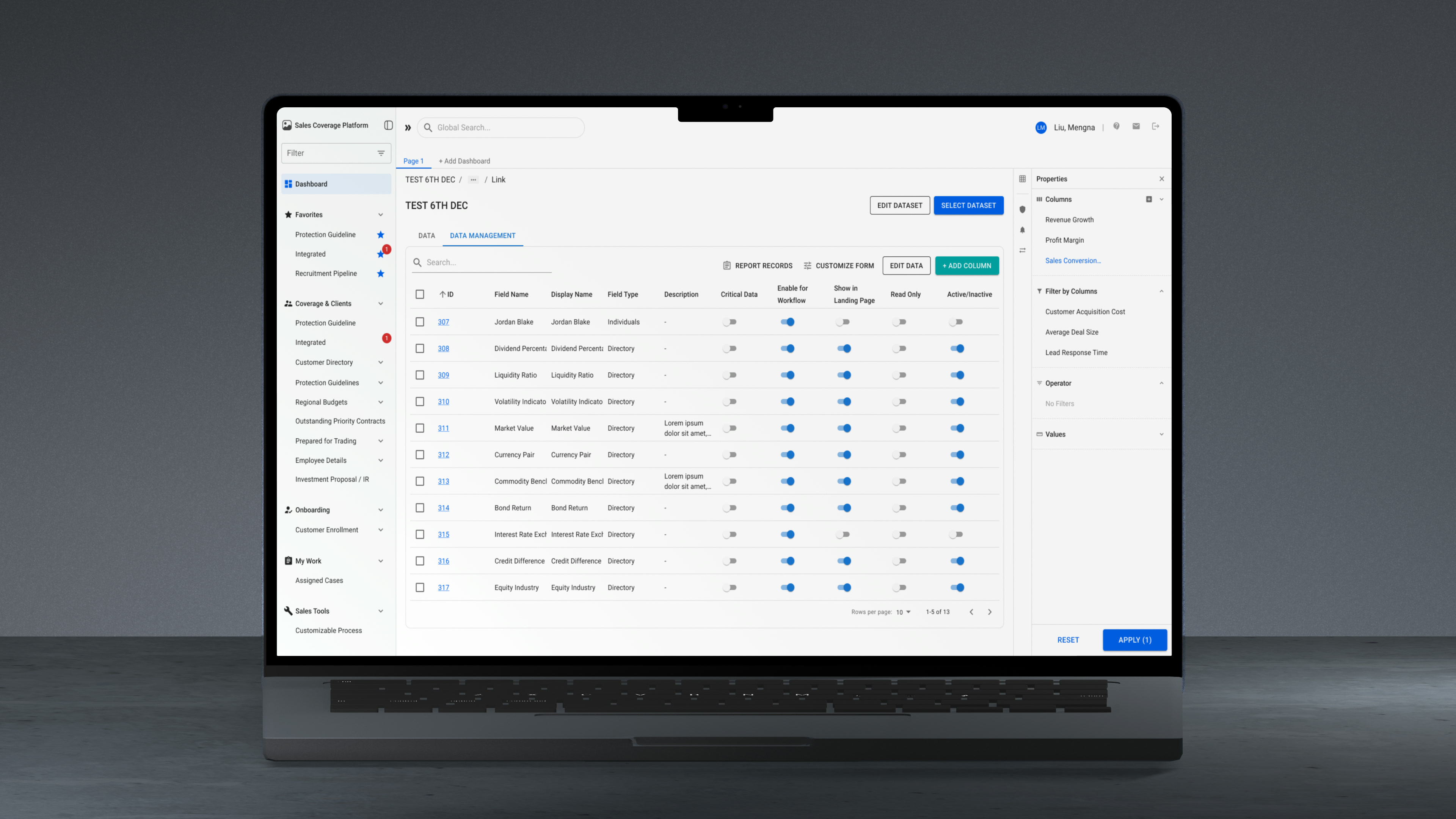
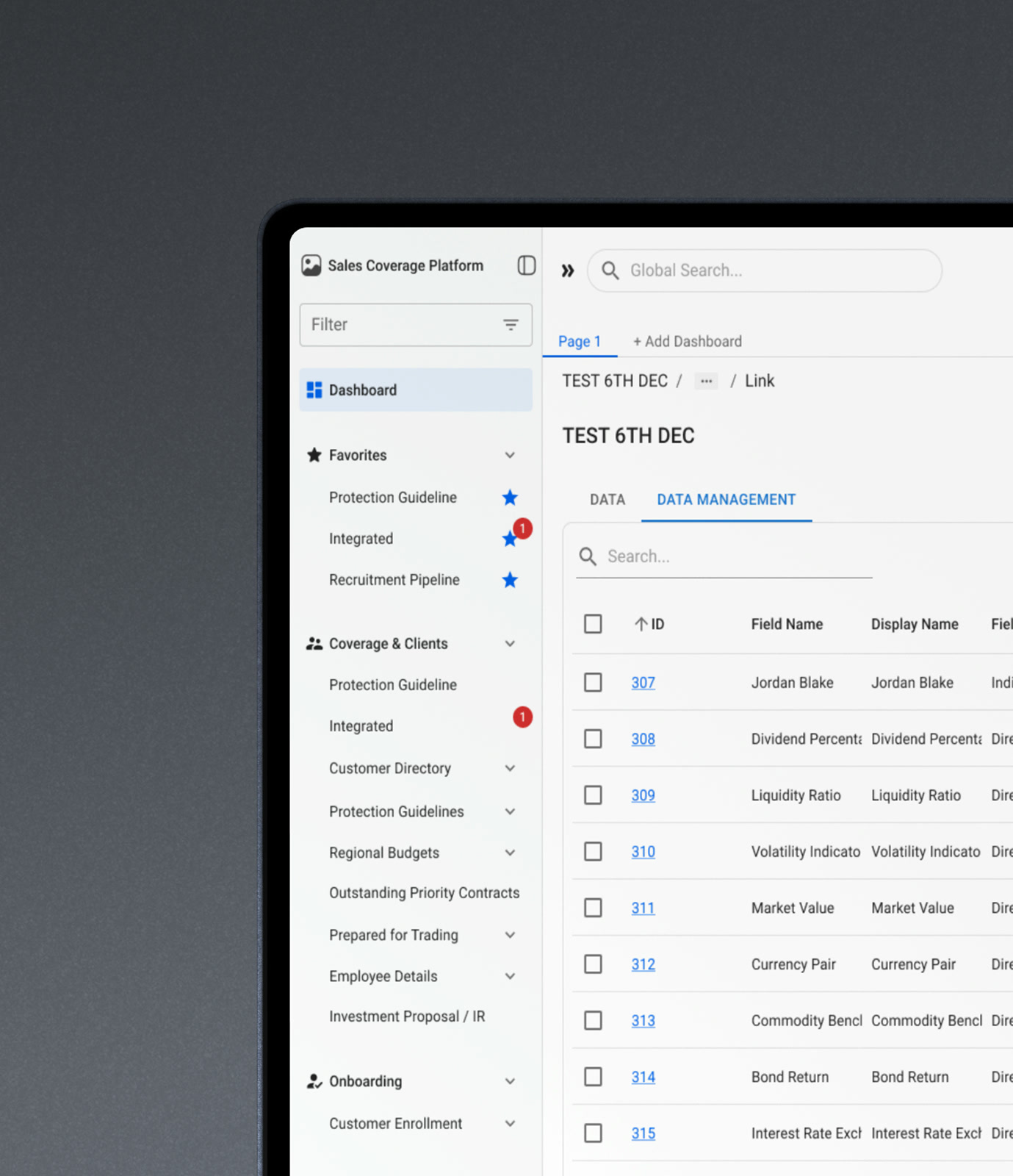
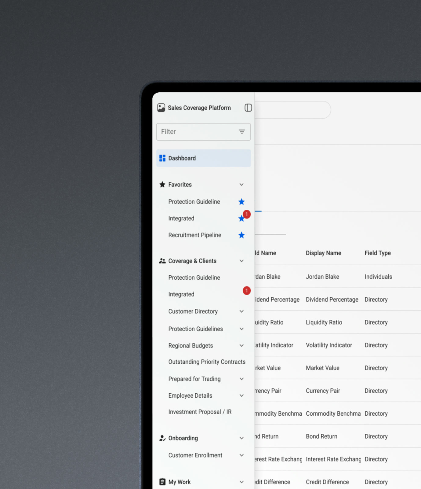
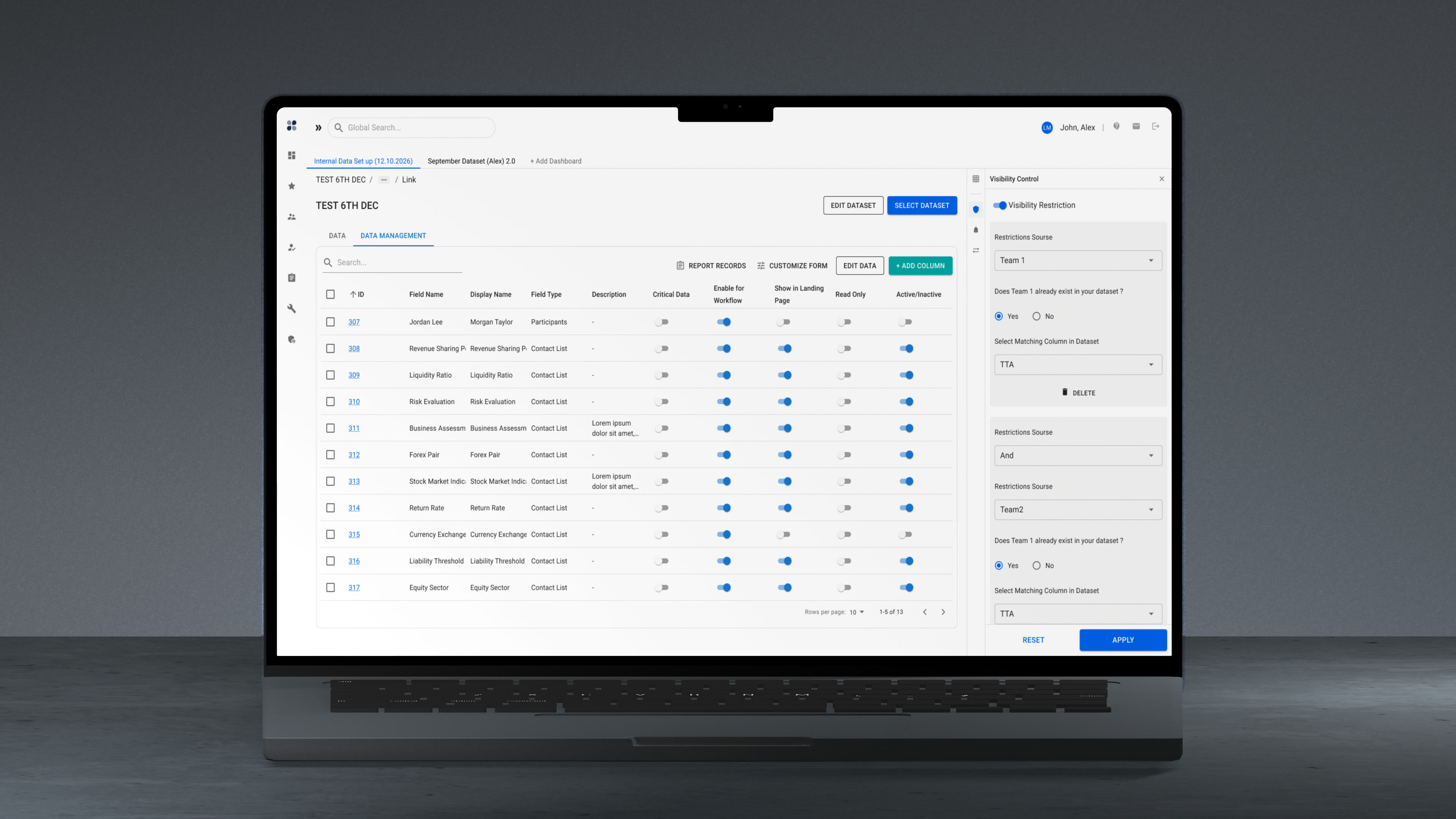
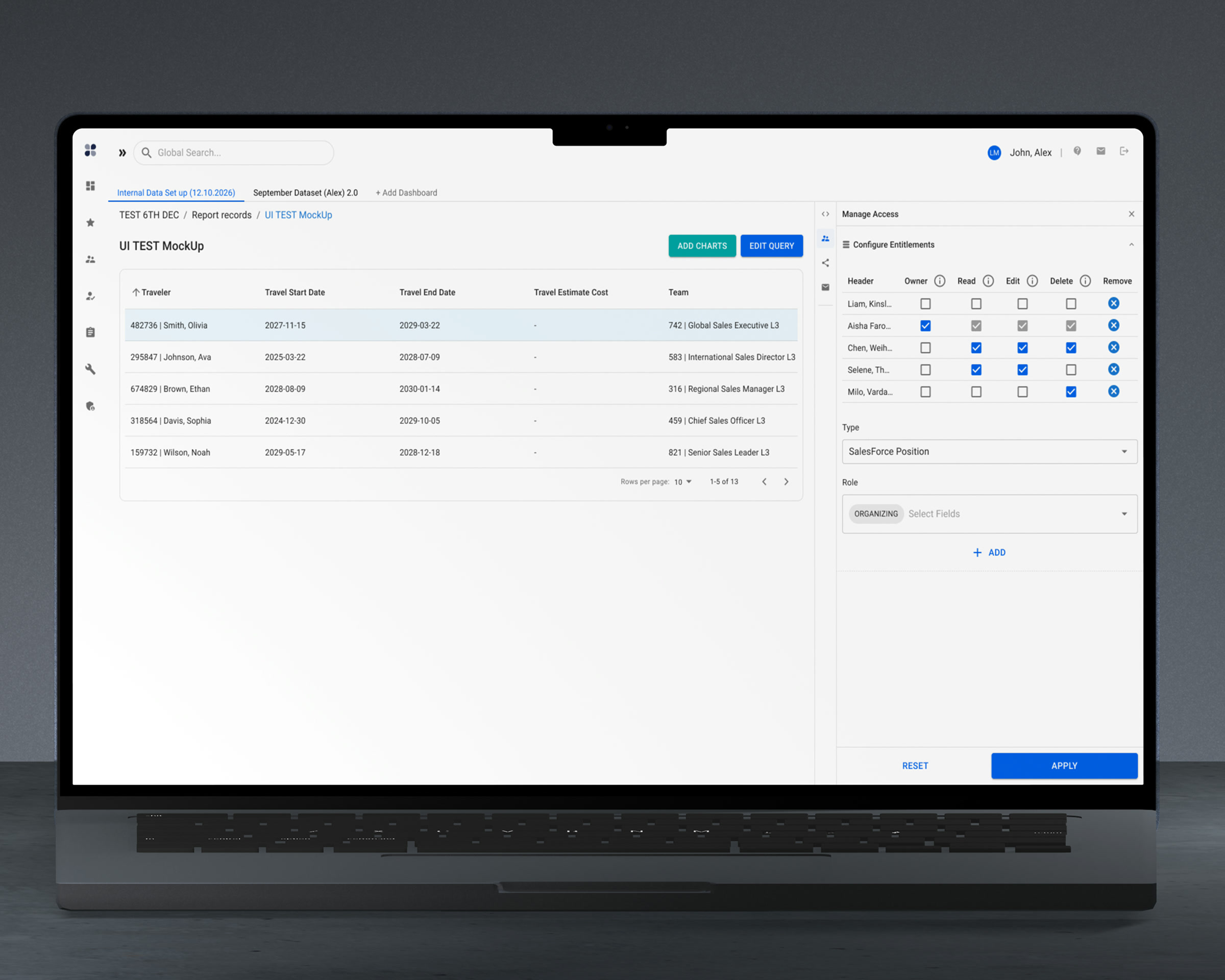
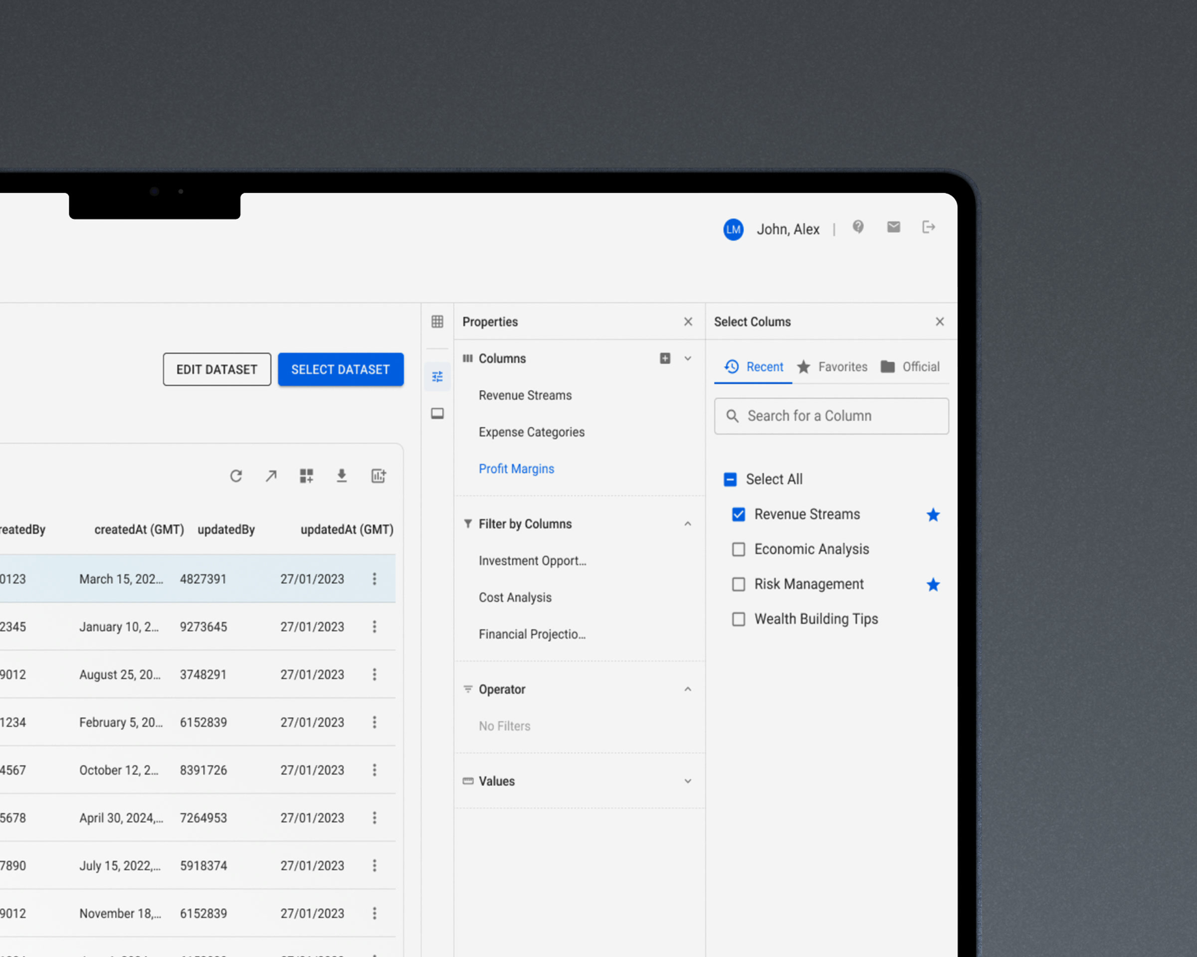
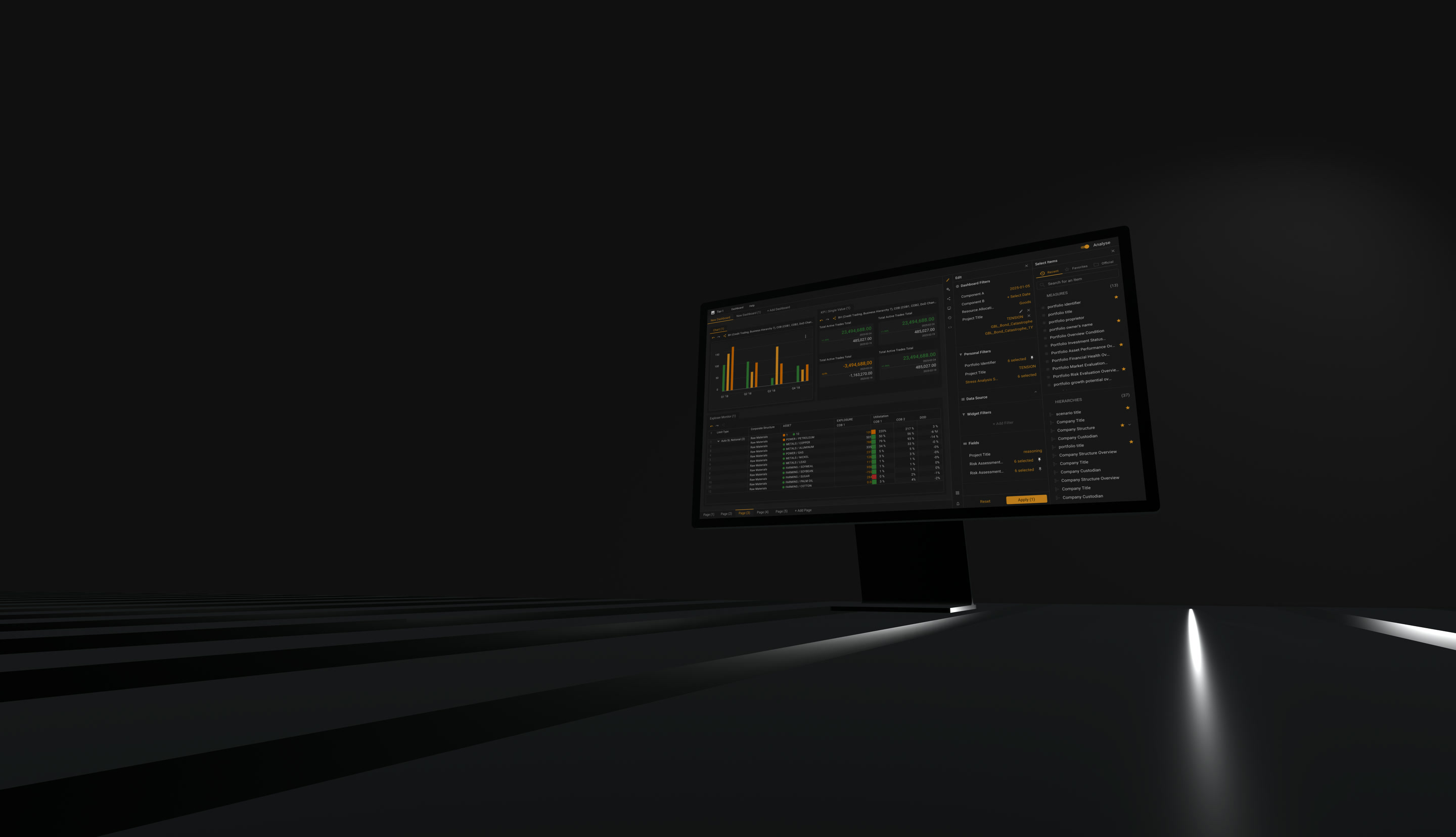
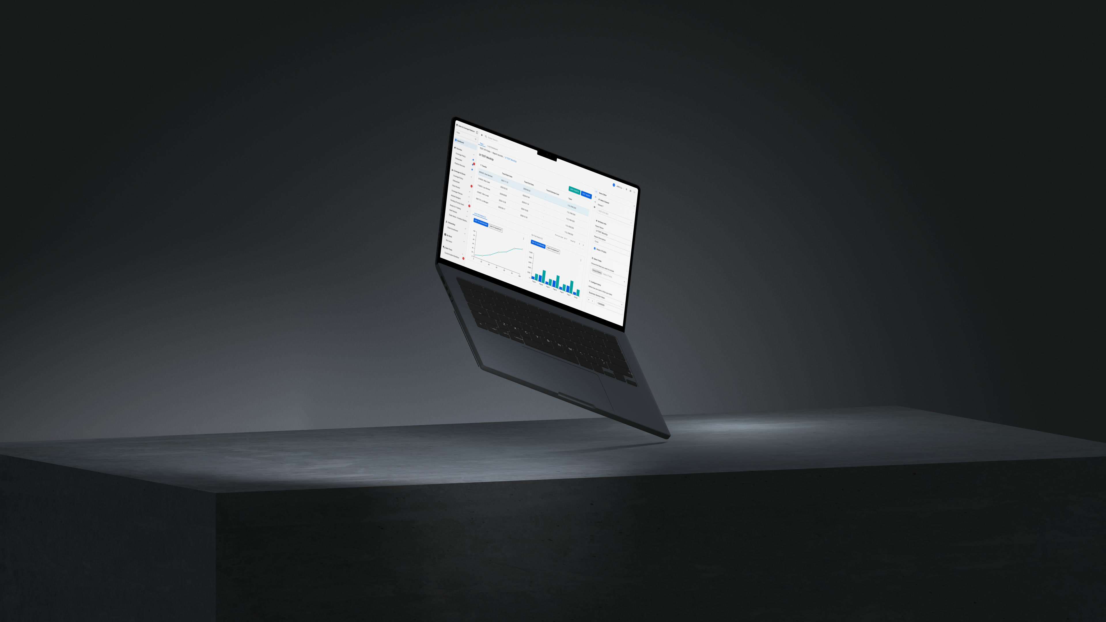
Dense enterprise grid with a configuration panel and its icon rail.
Twenty-plus modules, one configuration surface, one new visual language.
Role
UX Designer (via Luxoft)
Period
2025 — present
Domain
Sales coverage, client onboarding, approvals, internal reporting
Scope
20+ modules · dataset and report tooling · new visual language
Foundation
Material Design 3 as the base, with a bespoke system built on top
Confidentiality
Client and system names under NDA. All visuals rebuilt on synthetic data. The mark itself is client property and not shown.

(Modules)

20+

(Configuration surface)

01

(Navigation modes)

3

(Decisions)

08

The platform did everything. It just did it somewhere else. Settings for one grid lived in four different menus. Charts lived inside the reports that made them. Links to useful screens lived in people's inboxes. Nothing was missing — it was scattered, and the cost of that was paid every morning.

Rule 1

The data never leaves the screen

Carried over from the market risk platform

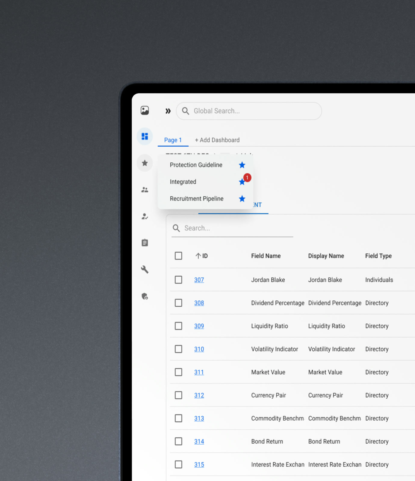
Configuration sits beside the data, never on top of it. The right-hand panel carries its own rail: columns, display, query, charts, access, notifications, linkage. You change what a grid shows while the grid is still showing it.

This rule was established on the market risk platform at the same bank and moved here deliberately. Different product, different problem — there it was filter state, here it is everything a dataset can be configured to do — and the same rule held.

Trade-off

The panel takes horizontal space from tables that never have enough. It collapses, and on narrow viewports it overlays rather than pushes.

Rule 2

The platform was somewhere you went. It became somewhere you work

Live charts from every report, reports that deliver themselves on a schedule, saved entry points to any screen, named pages inside the application. The product stopped being a set of destinations you navigate to and became one surface that already holds your work when you open it.

Research Method

How this was researched

A small population of expert users, most of them in the product daily for years, and no direct line to any of them. What existed instead was better than a survey and worse than a room: a document of complaints and requests the bank had already compiled for its own maintenance, and the people who sit between a designer and a user. Access was the constraint, and it set the shape of every proposal.

  1. 01

    What was already written down

    A consolidated document of user complaints and requests, compiled by the bank before any redesign was proposed. Not a research artefact — a maintenance one, and useful for exactly that reason: nobody wrote it to be read by a designer, so nothing in it was phrased to be agreeable.

  2. 02

    The people in between

    Every proposal went to QA first, then to review with the project manager and the application owner. QA knows every workaround in a mature product — they reproduce them daily — and they are reachable in a way that fifty busy specialists are not.

  3. 03

    Variants, not proposals

    Because a question costs a round trip, work went out as options standing side by side rather than as one recommendation waiting for approval. Feedback sessions with the people who live in the product then chose between them. One trip, several answers.

    This is why three navigation modes stayed instead of one. The variants already existed, the disagreement between them was real, and picking a winner would have cost another trip to learn something the sessions had already said.

A revision does not go back to the person who raised it. It re-enters at the start of the cycle — QA, then the owner and the PM, then the users. Slower, and the only way the answer stays the same answer for everyone.

Considered instead

Holding proposals until direct sessions with users could be arranged. It is the cleaner method and it stops the work: the access was never going to widen, and the complaints document was already sitting there, unanswered.

The first rule is about where configuration lives. The second is about what the product does before you ask it anything. The decisions below follow the product itself — the shell you move through, then the data, then the reports, then the page it all lands on.

02

Named pages inside the applicationRequested by users

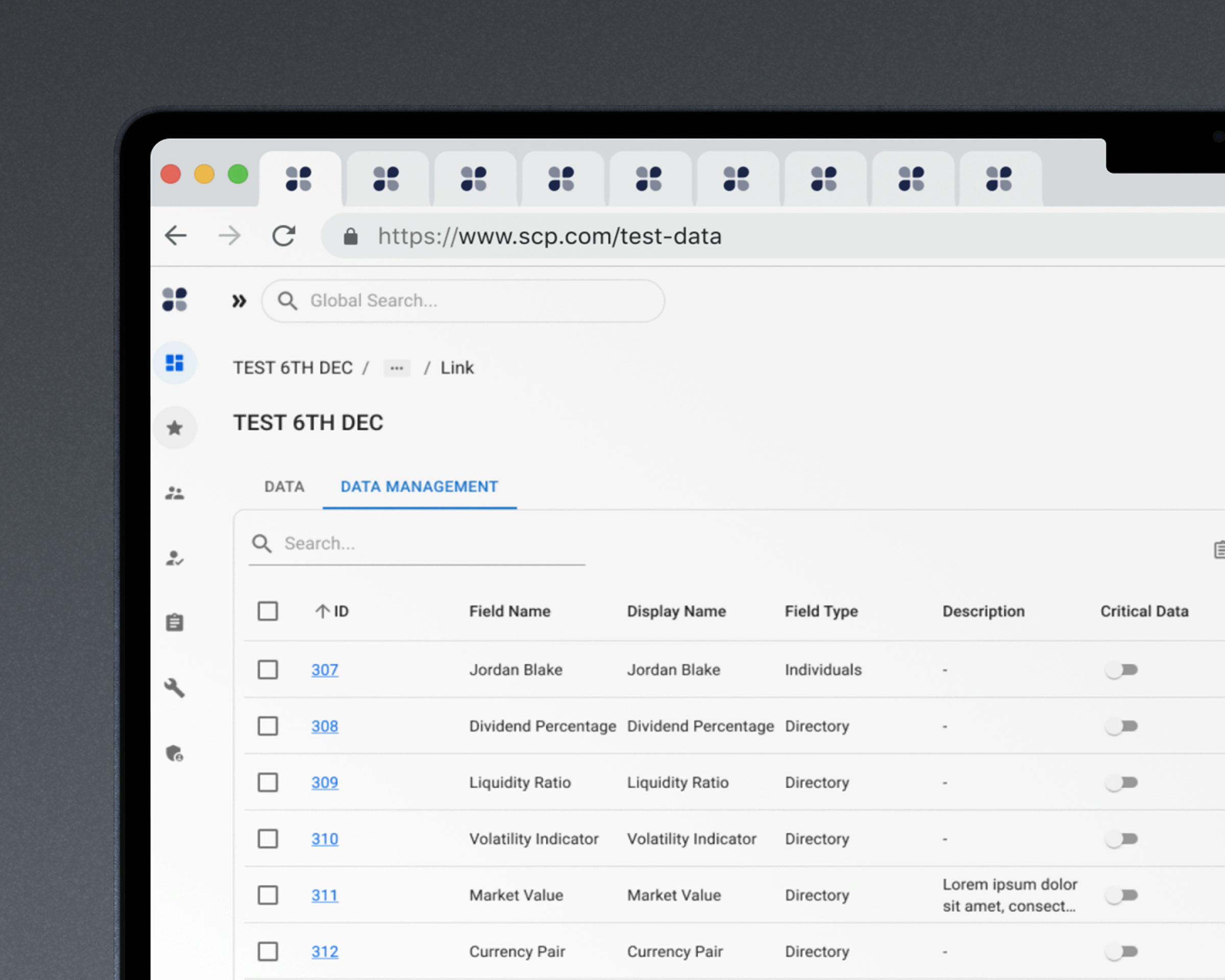
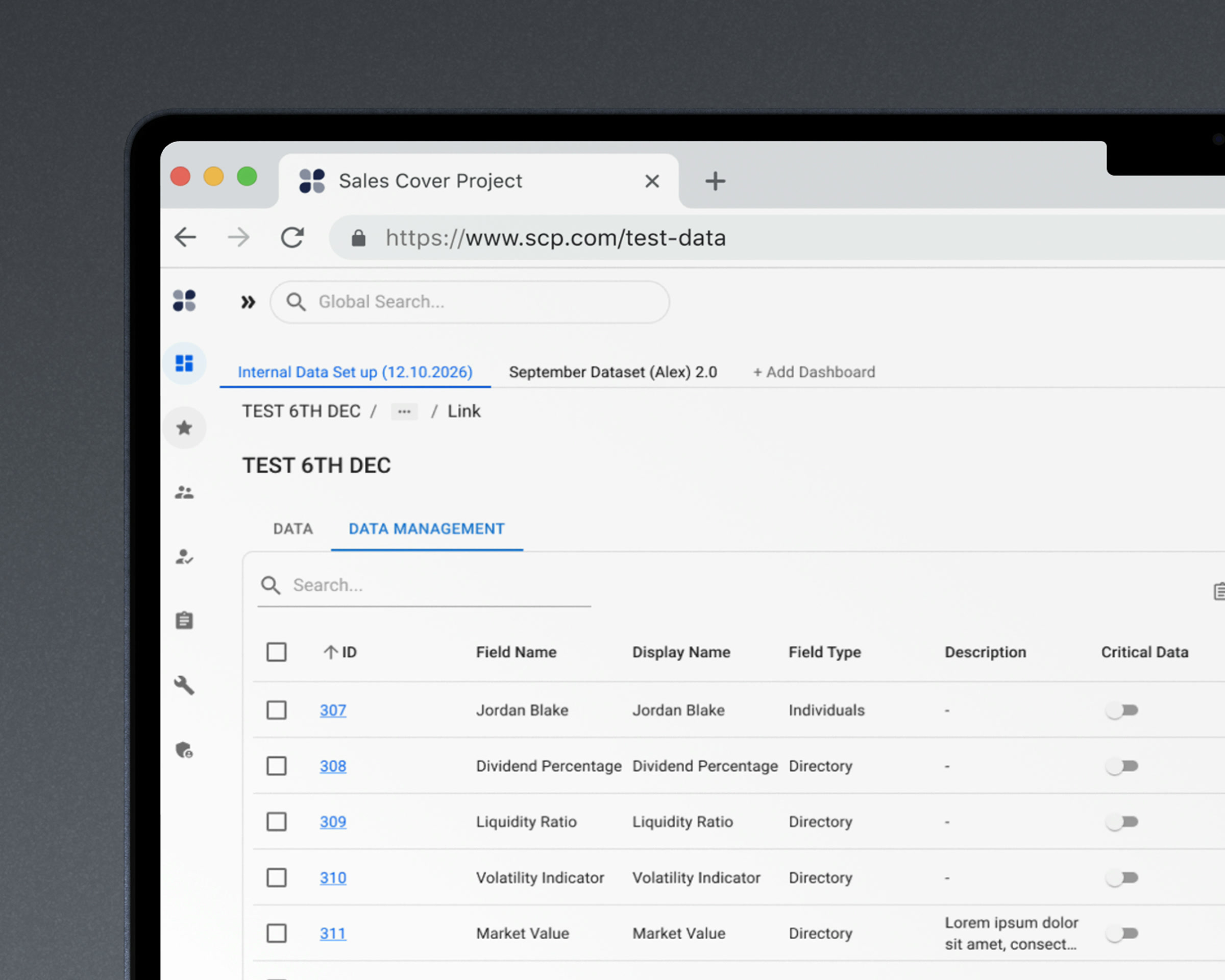
Pages inside the product, opened as tabs above the breadcrumb, each holding a different dataset or report, each renamed by the user. Work in one browser tab instead of a strip of them. The breadcrumb stays underneath: a page you renamed still says where you are inside it.

Users were running the platform across many browser tabs because they needed several tables open at once. Browser tabs are the wrong container for that: they truncate to a favicon and a few characters, they all look identical, and they cannot be named after the thing inside them. Someone running one application across a strip of identical tabs is hunting, not working.

Considered instead

Treating it as solved by the browser — it is a web application, tabs already exist. That answer ignores that the user cannot name a browser tab, and naming is the entire point.

Alternative

Alternative considered: the same work spread across identical browser tabs

Chosen

Chosen: named pages inside the application, sitting above the breadcrumb
Identical browser tabs, or pages inside the product named after what is in them.

03

One panel instead of a dozen modalsRequested by users

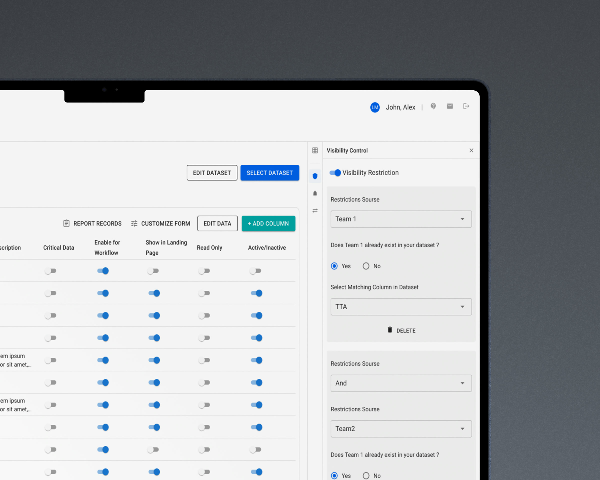
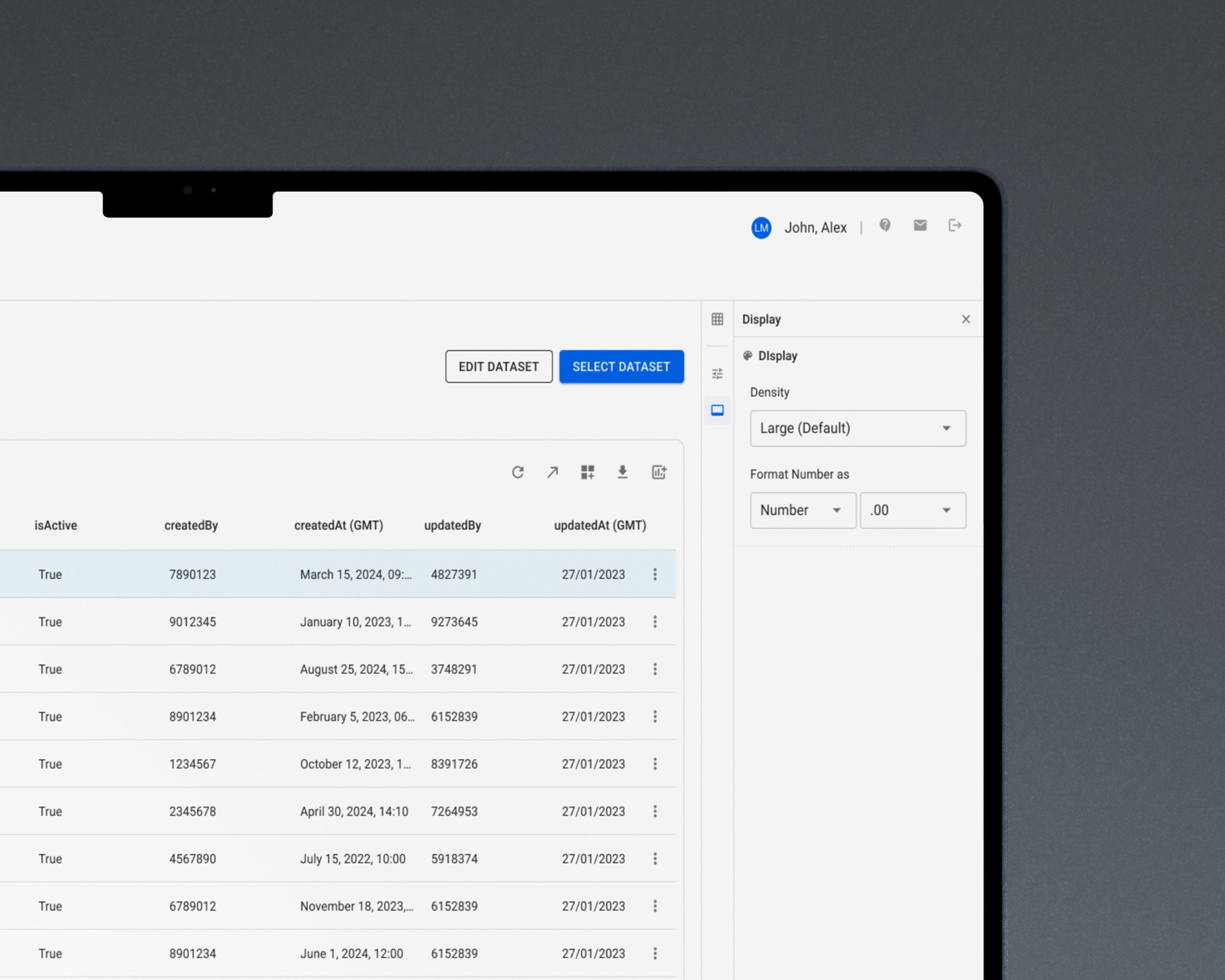
The right-hand panel carries its own vertical rail. Behind it: column selection, display density and number format, query editing, chart configuration, access entitlements, sharing, notification templates, dataset linkage, review scheduling, visibility restrictions. One container, one place to look, one mental model.

Half the rail operates the data. The other half governs it — who sees which rows, who may change them, where the data came from, when it has to be checked again. Both halves are the same container in the same place, because in this product the person doing the second is usually the person who just did the first.

None of these controls were missing before. They were modals and menus attached to different parts of the grid module, and every one of them covered the data it configured while it was open. What people reported was the symptom — the hunt for the right menu, the dialog in the way. Consolidating all of it into one container was the answer to that, and the scope of the consolidation was a design call rather than a request.

The panel also serves two different people on the same screen. The Data and Data Management tabs separate them explicitly: one is reading and analysis, the other is fields, types, data criticality, workflow participation and rights. Two audiences, one product — rather than one product split in half.

Considered instead

Leaving the controls as modals and simply restyling them. Cheaper, and it preserves the two things that made the module hard — the hunt for the right menu, and the dialog sitting on top of the data it configures.

A dense grid with the configuration panel open beside it
The grid never leaves. Only the panel beside it changes.

Alternative

Alternative considered: modals covering the data they configure

Chosen

Chosen: one side panel with an icon rail for every configuration task
The settings were never missing. They were on top of the thing they configured.
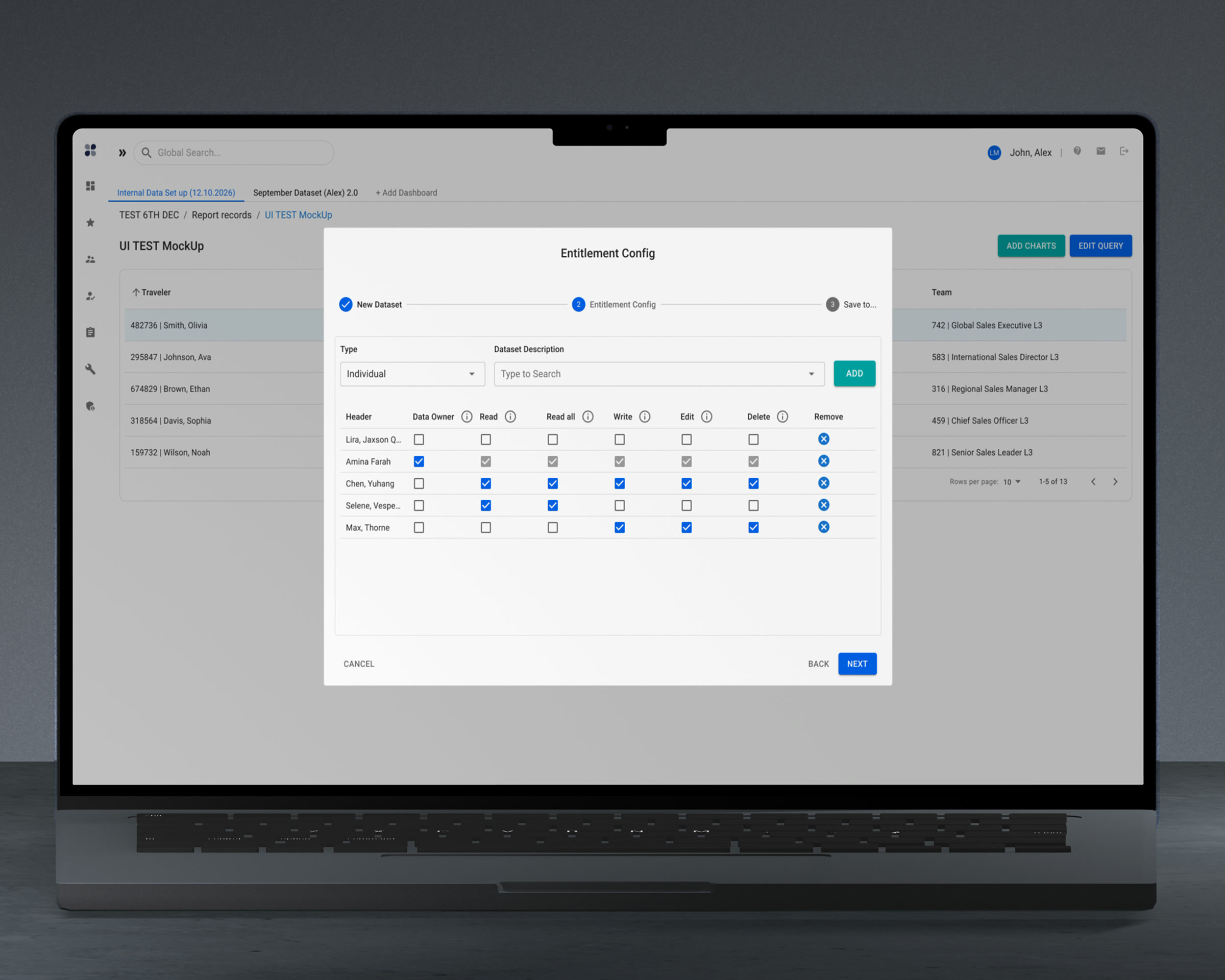
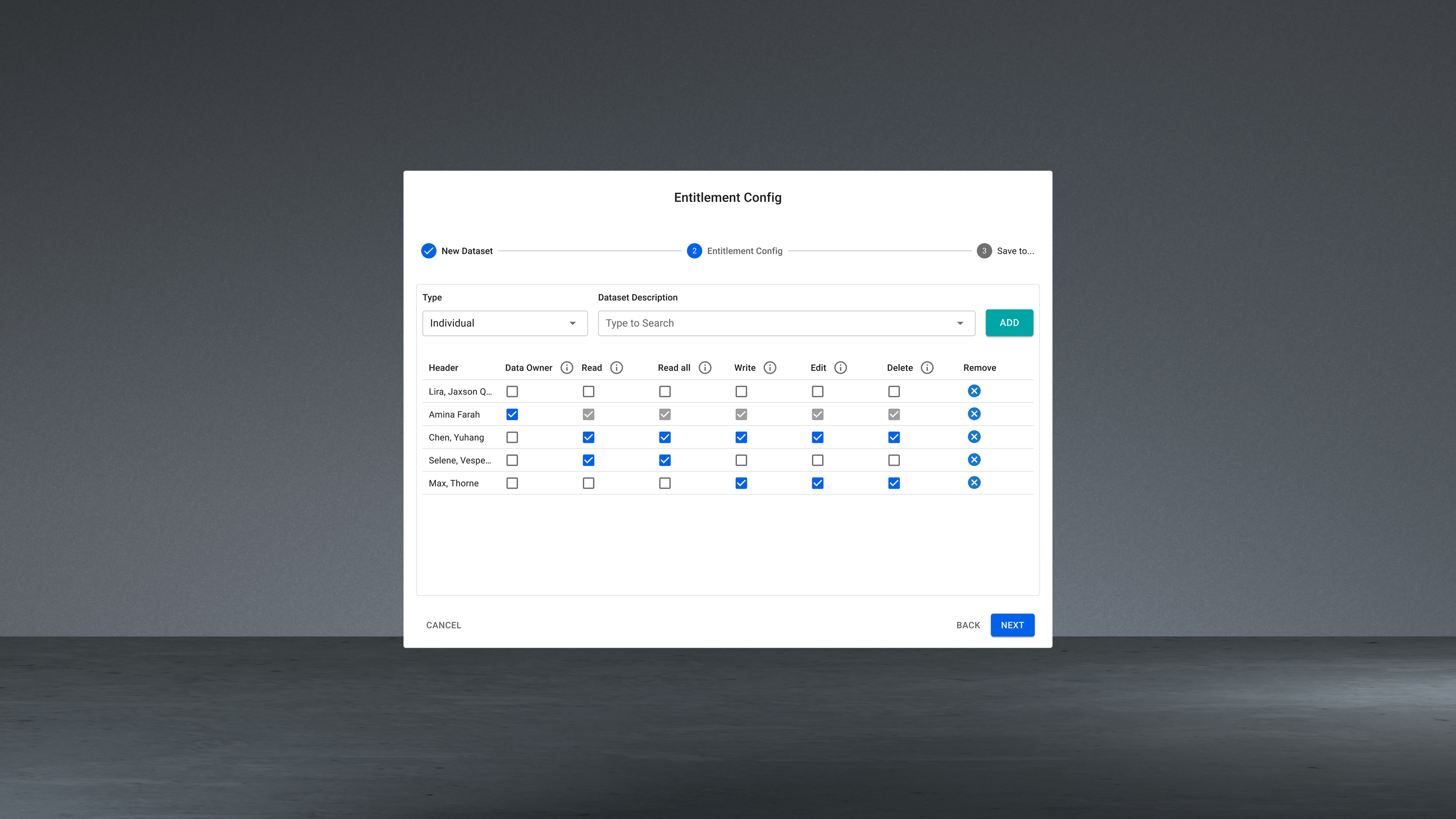
Read, edit and delete rights set while the dataset is being created
Who may read, edit and delete — settled while the dataset is being created, not remembered later.
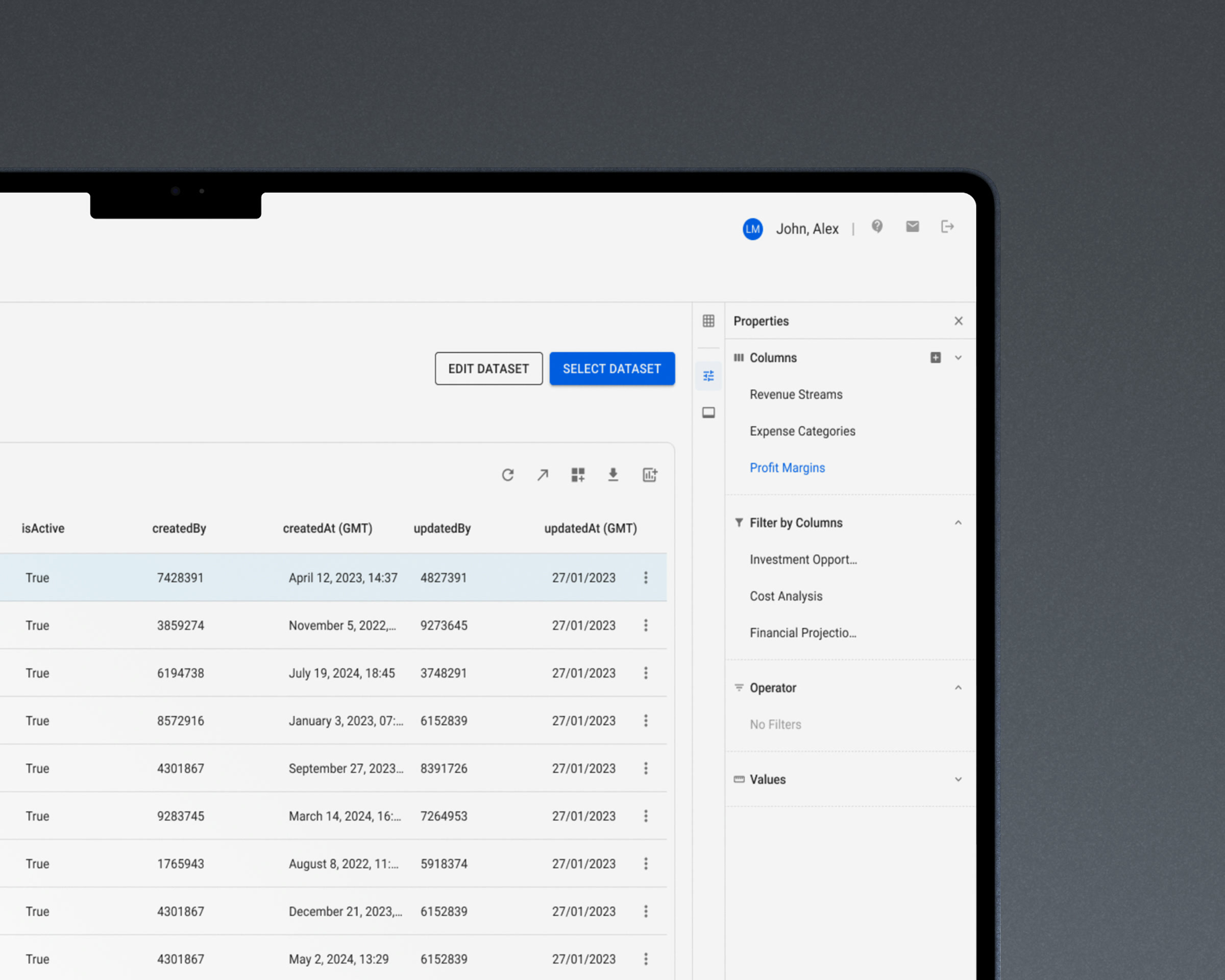
Data tab: records as a person reads them, with their own columns and filters
Data: what a person reads, with the columns and filters they picked for themselves.
Data Management tab: the same records defined rather than read
Data Management: the same records, defined instead of read.
The shared picker pattern: recent, personal, and centrally governed sets
Every «choose a thing» in the panel is the same picker: recent, yours, and the set the bank governs.
Table density and number format set as a personal preference
Table density is a preference, not a decision made once for everyone.

04

Editing a report while the report is on screenRequested by users

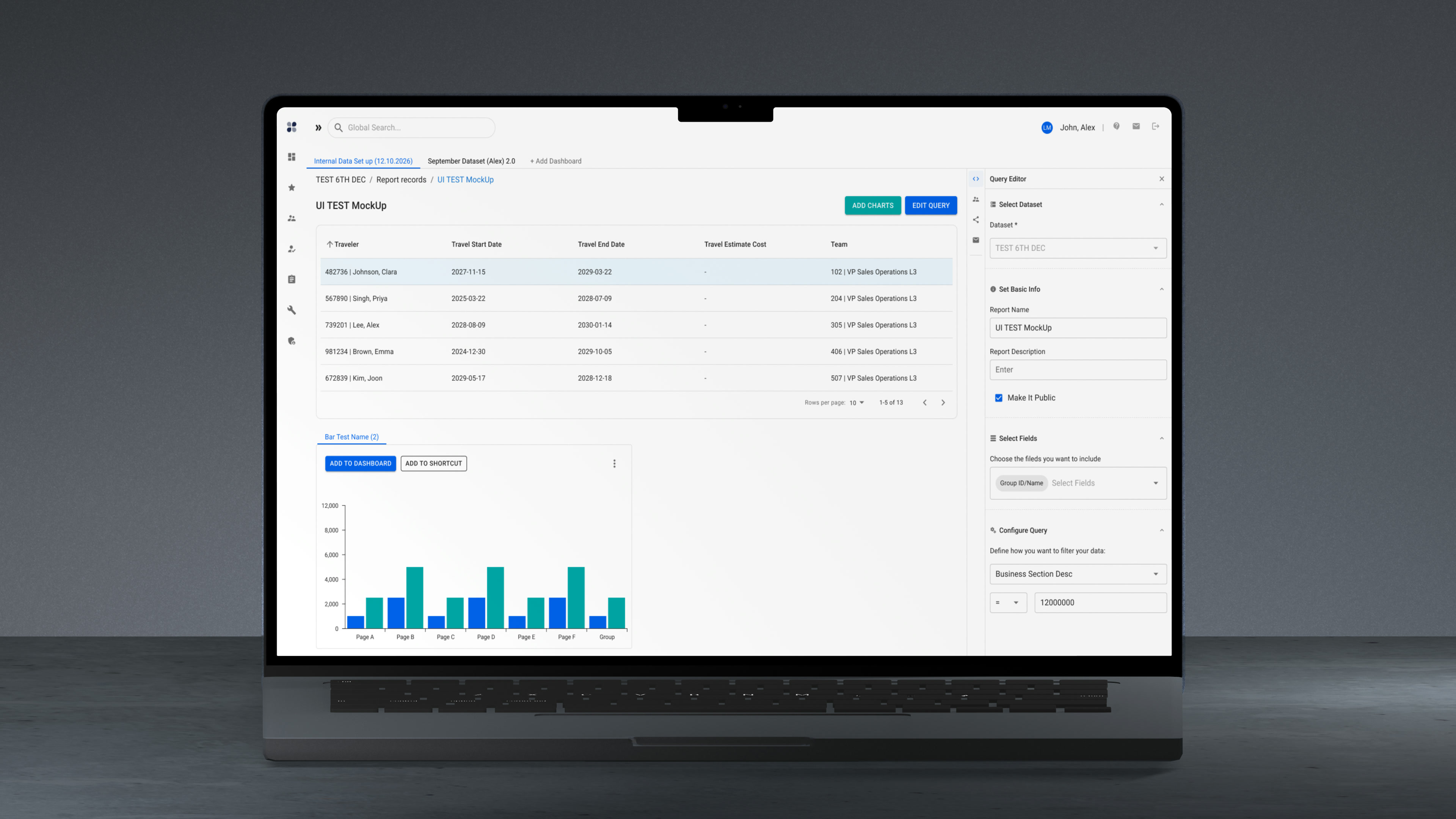
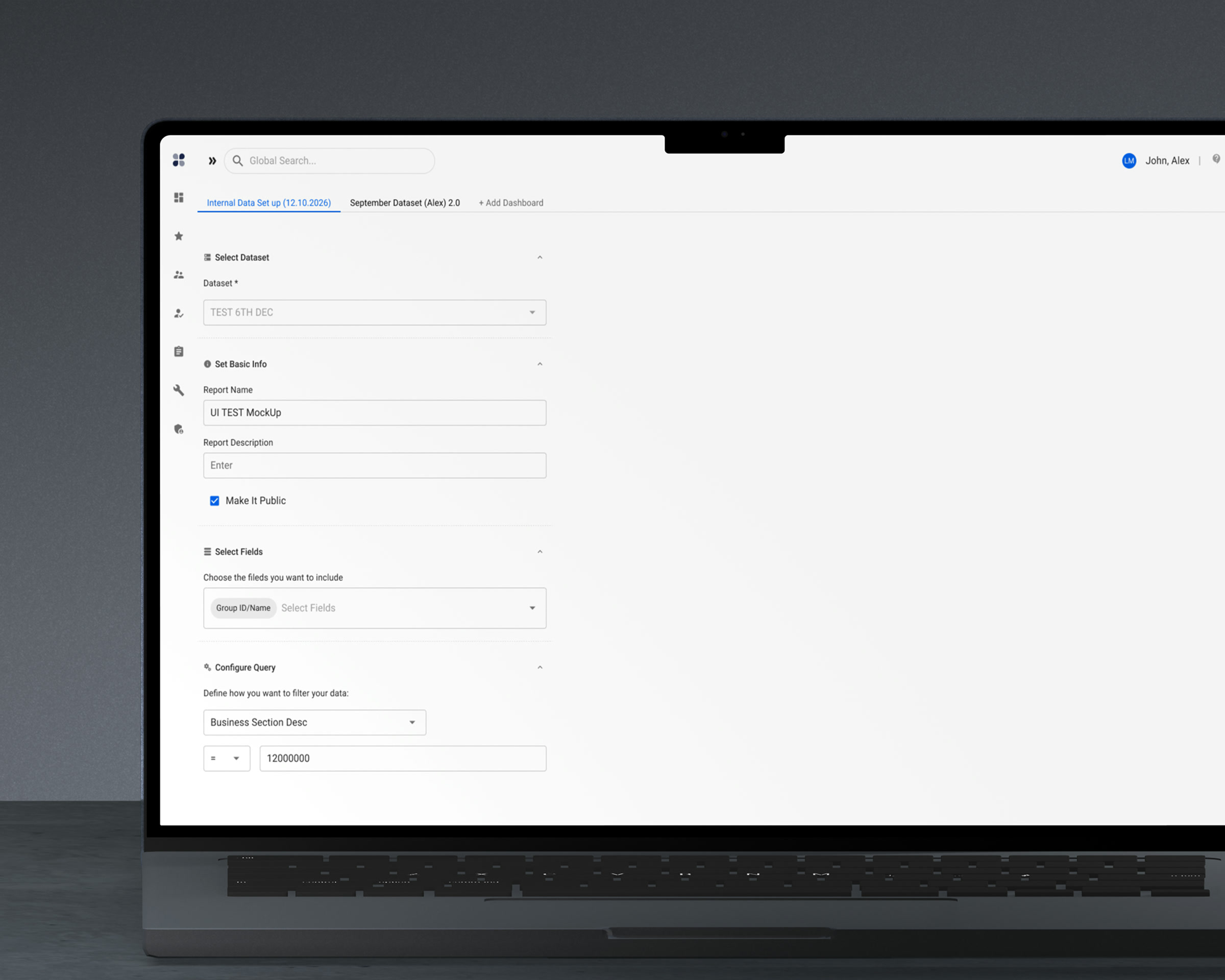
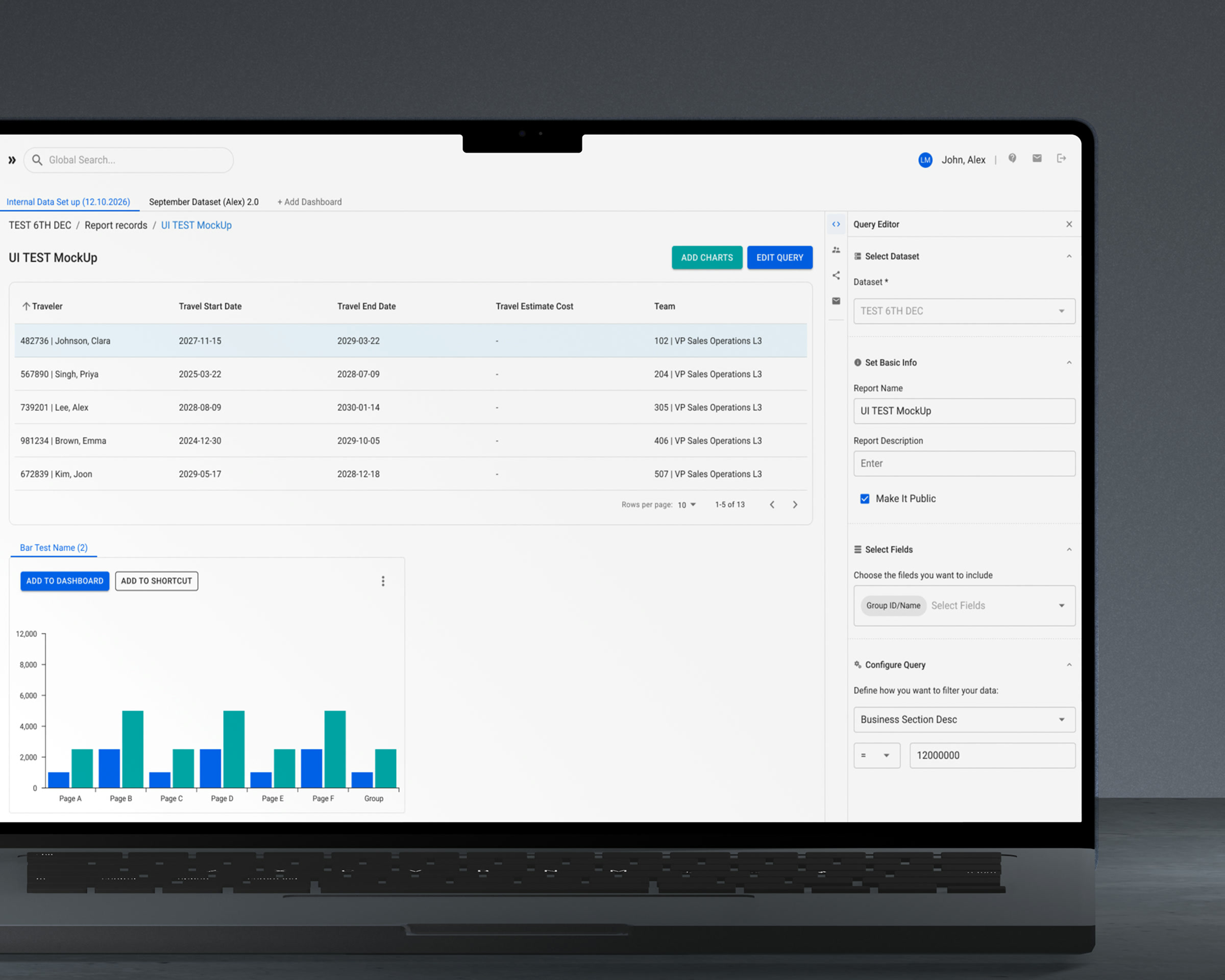
Report configuration moved out of a step-by-step wizard and into the panel beside the report. Dataset, name, fields and query conditions are all editable while the resulting rows stay visible. Change a condition, watch the table answer.

The complaint was specific and repeated: to correct a report name you had to walk back through every earlier step, and while building a query you could not see what it returned. The configuration and its result were never on screen at the same time.

Considered instead

Keeping the wizard and making its steps directly clickable. It removes the walking-back, and it does not put the report in front of the person editing it. The order of the steps was not the problem — the invisibility of the result was.

Report rows and a query editor side by side in one screen.
You can now see the report you are editing. Previously you could not.

Alternative

Alternative considered: a step-by-step wizard that hides the resulting rows

Chosen

Query conditions edited in the panel while the report rows stay on screen
The old flow asked you to build a query blind, one step at a time.

05

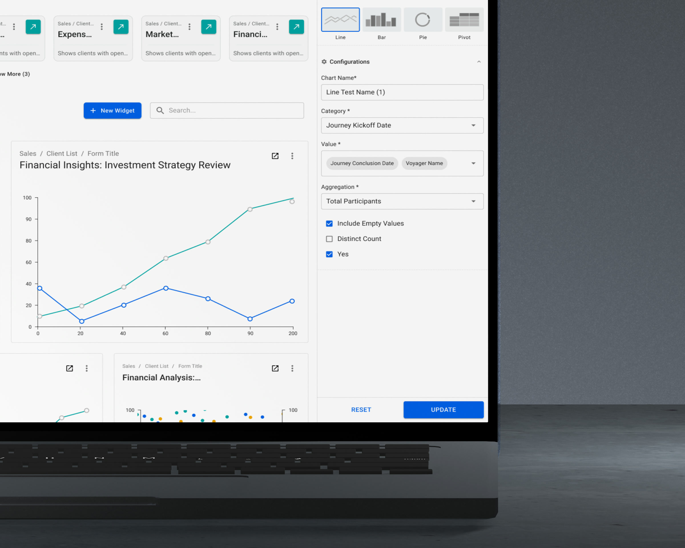
Switching a chart instead of replacing it

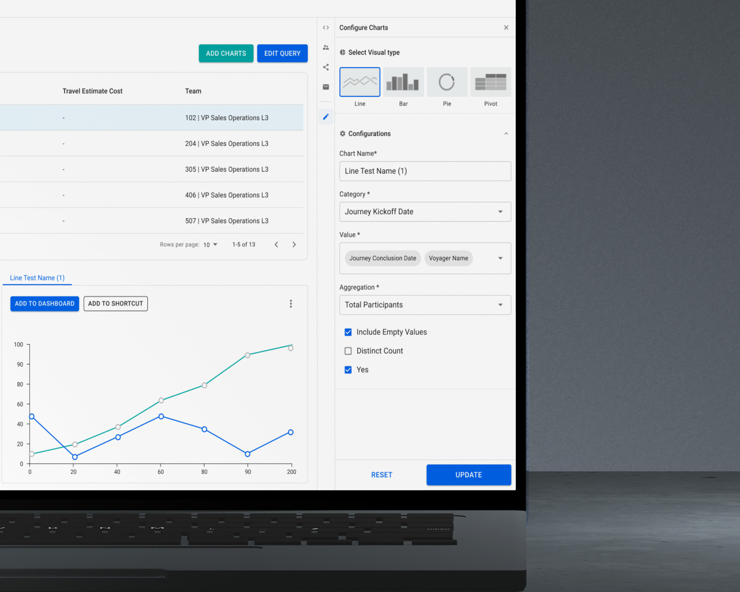
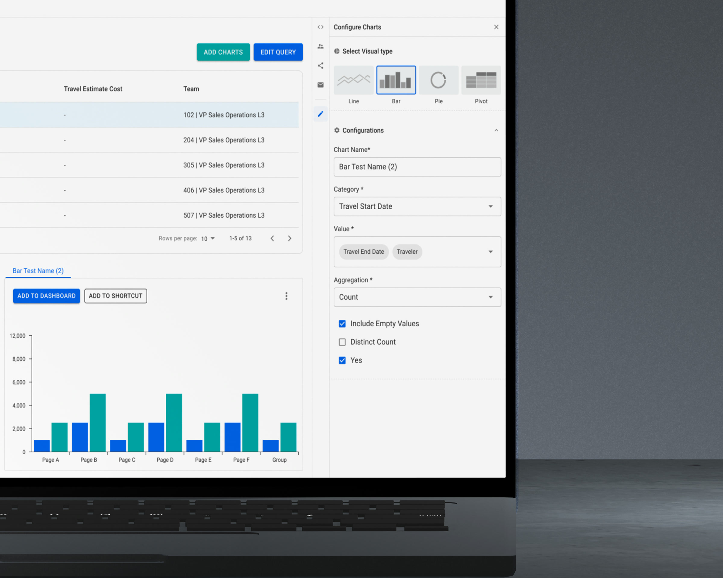
Chart type — line, bar, pie, pivot — switches inside one configured widget. Category, values and aggregation stay filled in; the visual type is a property of the chart, not a different object.

The obvious version of this feature is a chart type picker that saves a click. The real reason is downstream. A chart that someone has added to their dashboard belongs partly to them now. Delete it and publish a replacement, and every dashboard holding it goes blank until each person re-adds it by hand. Editing the existing chart updates what they already have. The same rule governs access: a user with rights to a report can put its chart on their dashboard, and only the owner can change it.

Considered instead

Create-new-and-delete-old, which is how it worked. Fine for the author, and it quietly breaks every dashboard downstream that was already using the chart.

A configured chart widget before its type is switched
The widget after switching to a bar chart, in the same configuration panel
Switch the type, keep the widget. Everyone who saved it keeps it too.

06

Reports that send themselves, and say when they stop

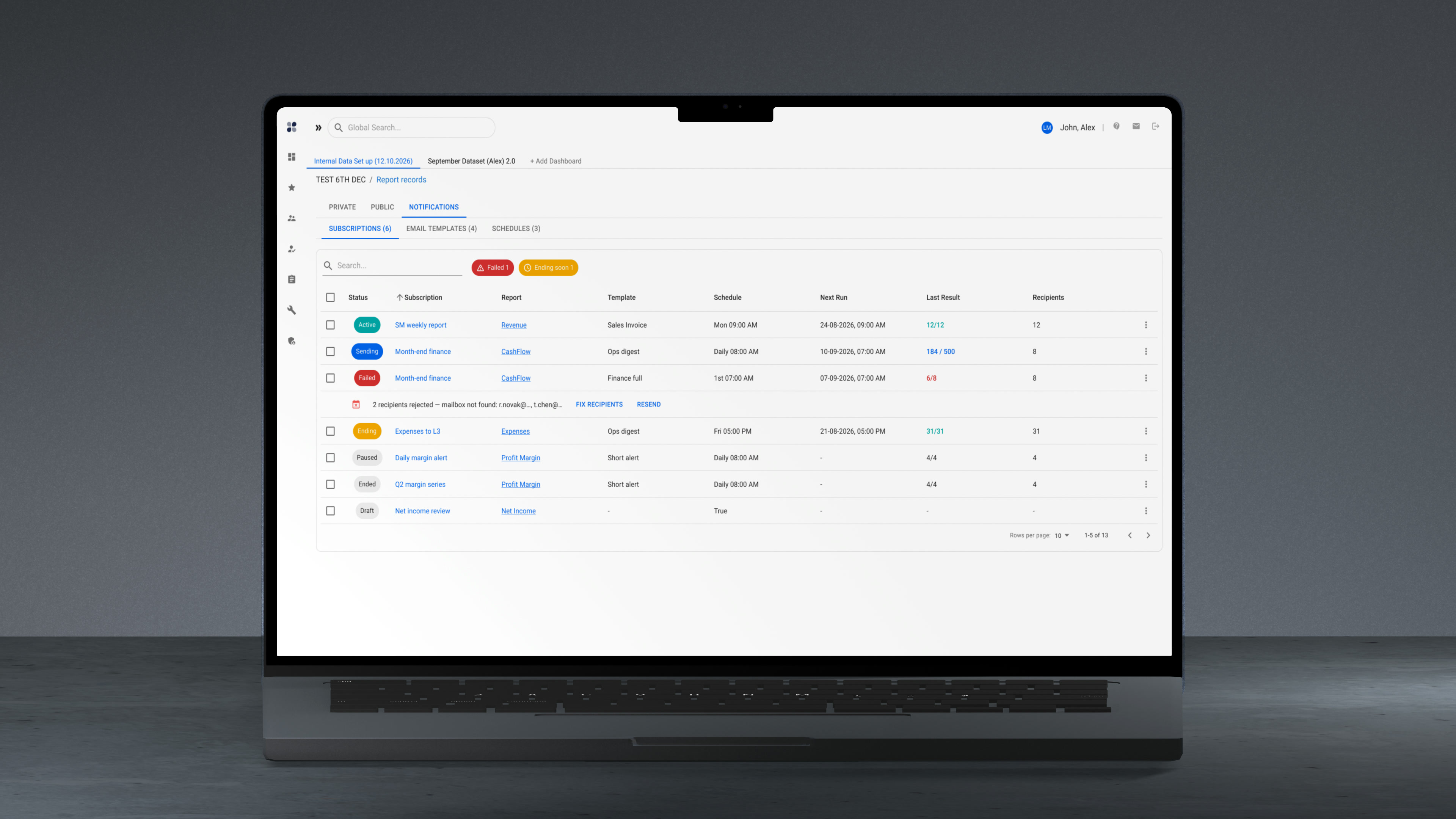
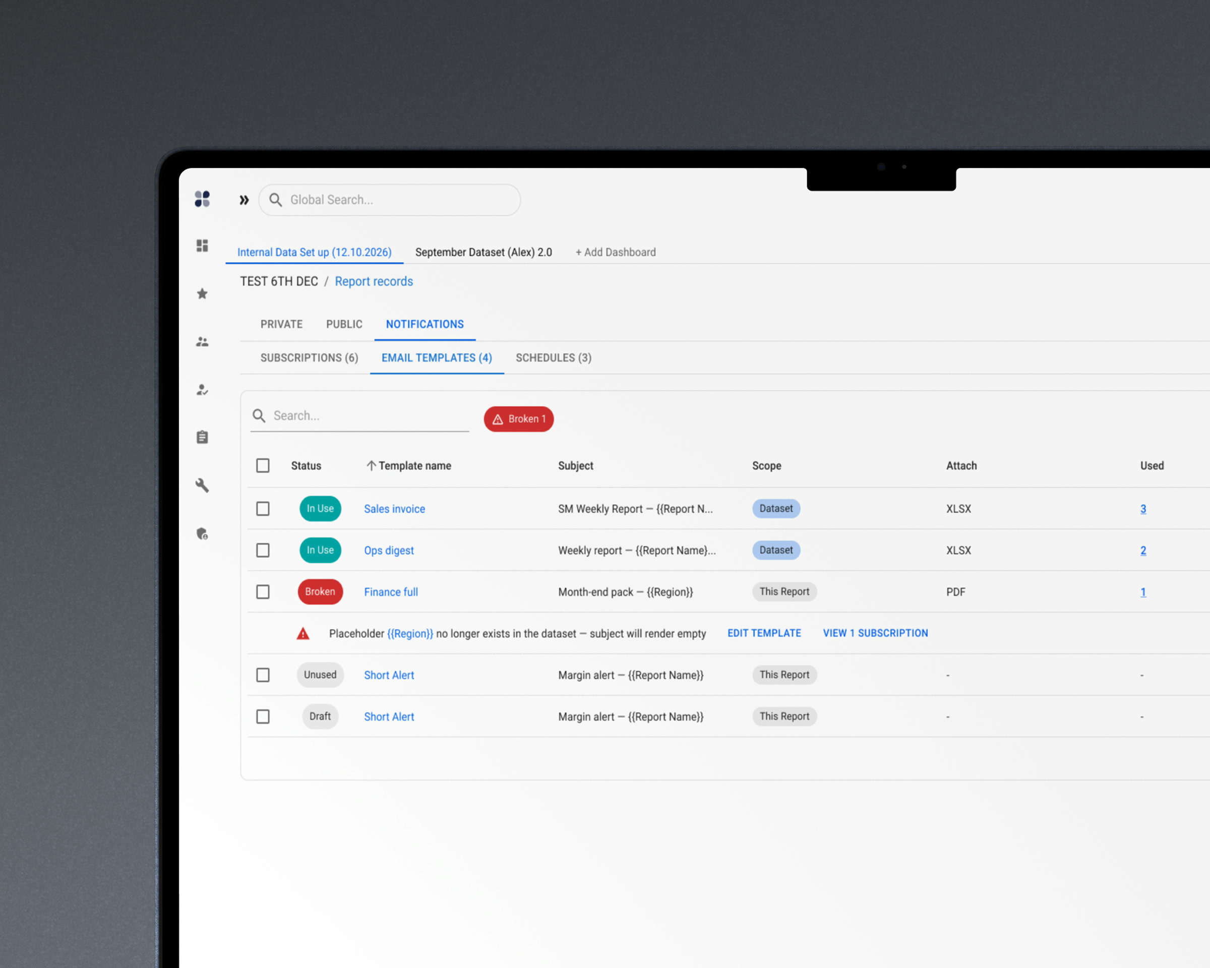
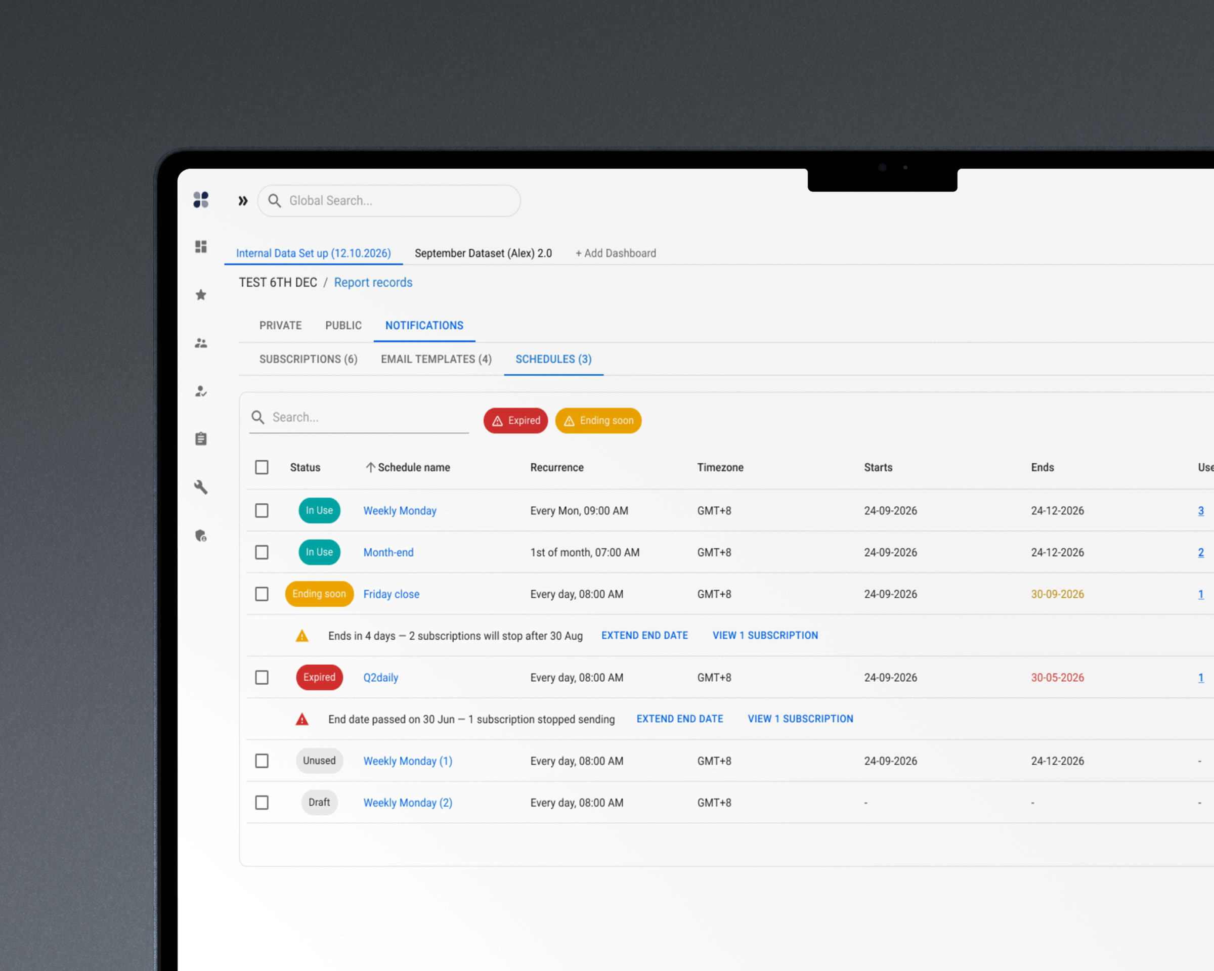
A report can deliver itself: on a schedule, to a list of recipients, through a named template. The subscription list answers one question per row — does it still work. Status, schedule, next run, the result of the last delivery, how many people it reached. A failed delivery opens where it sits, showing the addresses that bounced and the repair beside them.

Scheduled delivery is where internal reporting quietly dies, and it dies in two specific ways. A template loses a placeholder because someone edited the dataset underneath it, and the subject line goes out empty. A schedule reaches its end date and simply stops. Both failures are silent, and both are discovered by the person who did not receive something they were not thinking about.

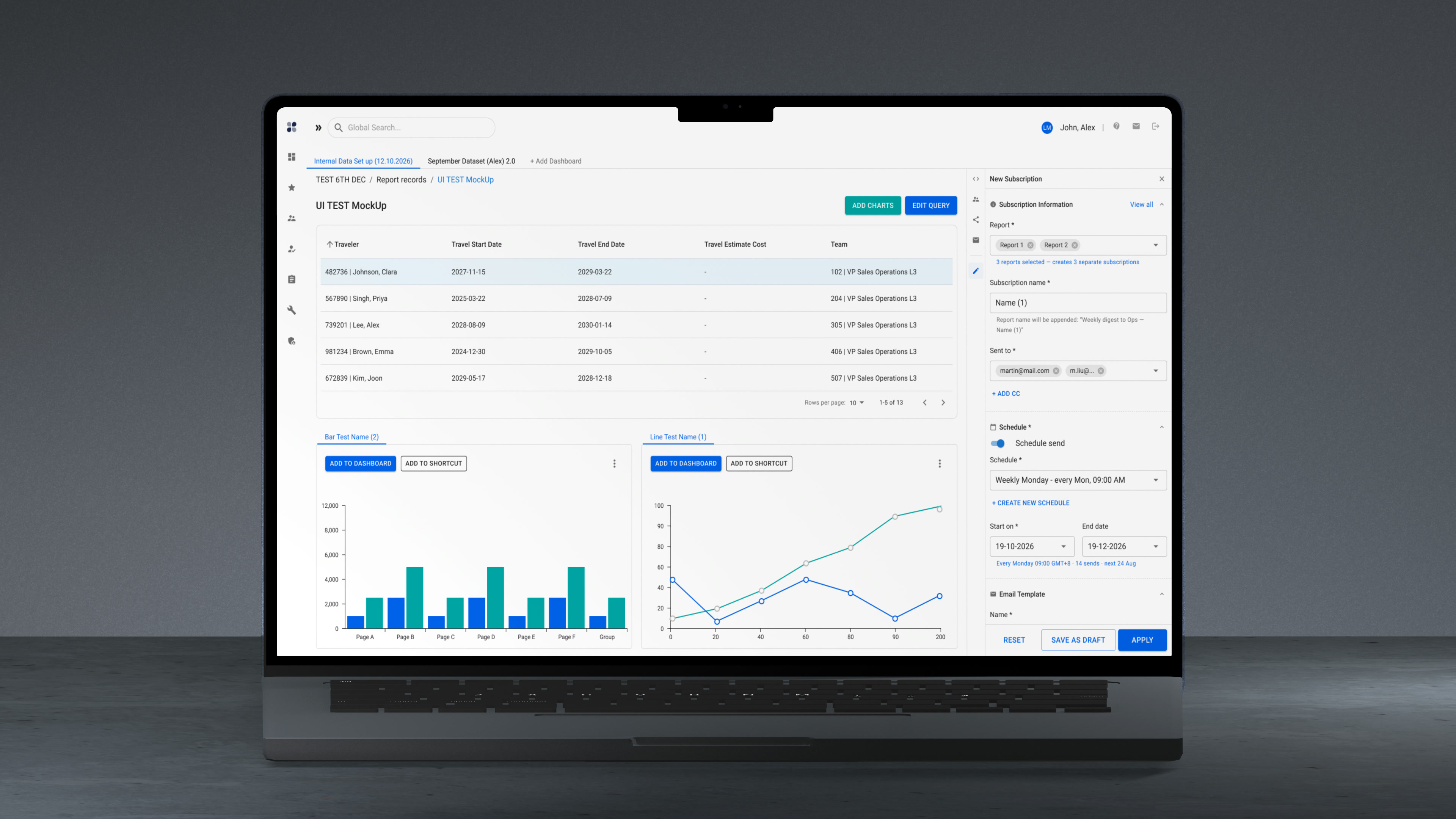
So templates and schedules became objects with their own lists, and each of them says who depends on it: how many subscriptions use this template, which subscription this schedule feeds. A schedule warns days before it expires rather than after it has stopped. Setting a subscription up happens in the panel, beside the report being delivered — and several selected reports produce several separate subscriptions, because each will fail, expire and be renewed on its own.

Considered instead

A single «email me this report» switch on the report itself. It covers the first day and nothing after it: no way to see why Friday's delivery never arrived, and no way to learn that the template it uses has been broken since a field was renamed.

Subscription list: status, schedule, next run and last delivery per row
A report that sends itself. Every row says whether it still does.
A delivery template flagged because a placeholder no longer exists
The placeholder is gone from the dataset. The subject would have gone out empty.
A schedule warning that it reaches its end date in four days
It did not break. It ran out — and said so four days early.
Delivery set up in the panel beside the report being delivered
Set up the delivery beside the thing being delivered.

07

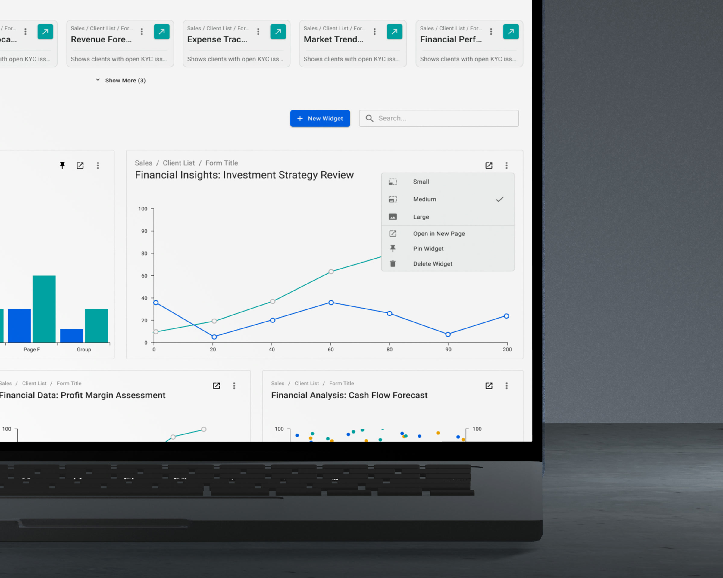
A dashboard of shortcuts and live widgetsRequested by users

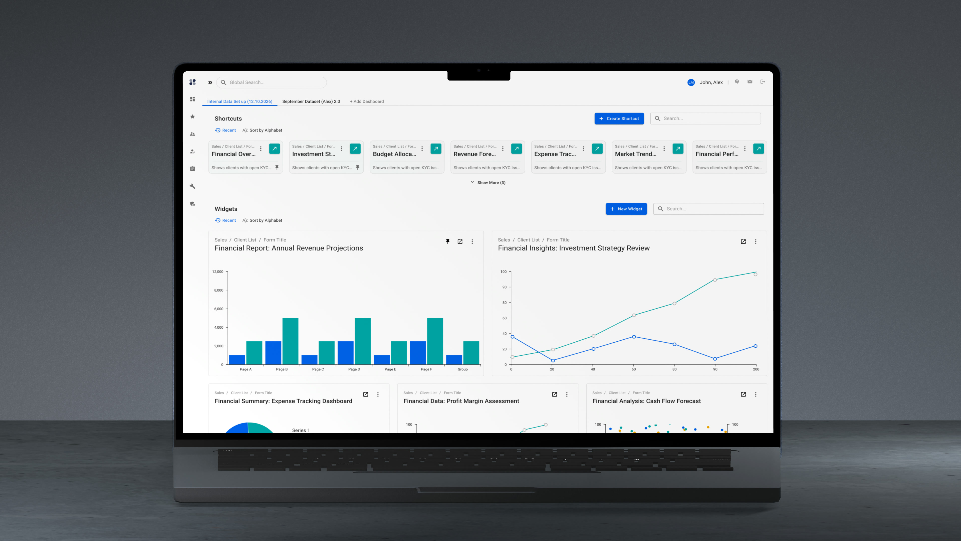
A dashboard page that holds charts pulled from reports across the whole platform, live. The chart on the dashboard reads the same data its report does — when the underlying dataset moves, the dashboard moves with it. Alongside them, saved entry points to any screen in the product.

Two separate requests met in one surface. Users asked to see the charts from their reports in one place instead of opening each report to check it. And feedback sessions surfaced a habit nobody had designed for: people were copying links to screens they used daily and keeping them in email or in local files, because the platform had no place to put them.

Copying a link to any screen, table or dialog already existed in the product. What is new here is the proposal to make the dashboard the place those links live and open from — Proposed a direction for, not built.

Considered instead

A favourites list — bookmark a report, get a list of names. It answers «where was that report» and not «what changed since yesterday», which is the question people were actually opening the reports to ask.

Dashboard of live chart widgets reading the same data as their reports
Live charts from every report. The question is what changed, not where the report was.
Widget size and pinning set from a menu on each dashboard tile
The dashboard is arranged, not issued: size, placement and pinning are set per widget.
A chart widget edited on the dashboard, without reopening its report
Edited where it is looked at — without going back to the report that made it.

08

A new visual language, built on M3

A full rework of the platform's visual identity: a new mark, palette, typography and component language, delivered as a bespoke system built on Material Design 3 rather than applied as a skin over it. Several visual directions were presented; one was chosen and taken through the product.

The brief here was the opposite of the market risk platform, where the instruction was to change as little as possible. This product looked its age, and the visual work was part of the ask.

What the page shows is the system, not the identity: the component sets as they exist in the working file, the surfaces and the type scale, and how all of it behaves on dense tables. The mark itself is client property and not shown.

Considered instead

Theming stock Material components to the new palette. It arrives faster and it fails at exactly the place this product lives — dense tables, where stock spacing, elevation and status colour all have to be re-derived anyway.

The systems layer

Material Design 3 as the foundation, with a bespoke component library built on top of it — not a theme applied to stock components. Tokens cover surfaces, elevation, density and status colour.

The panel is one component with a swappable body, which is why ten different configuration tasks can live in it without ten different layouts. The same picker — recent, favourites, official — appears everywhere something has to be chosen. Patterns were aligned with the adjacent internal CRM and API products so the family reads as one system. Handover runs to React and Storybook.

What I'd validate next

  • Whether the three navigation modes actually split the population, or whether one of them turns out to carry ninety per cent of users. If it is the latter, two of them are maintenance cost.
  • Whether named pages get renamed at all, or whether people keep the default label and lose the only thing that made them better than browser tabs.
  • Whether dashboards get built once and left alone, or curated. Those imply different defaults.
  • Whether saved entry points get shared between colleagues or stay private. Sharing is where the environment question gets serious.
  • Whether anyone acts on an expiring schedule when warned, or whether the warning is read the same way as the failure it was meant to prevent.
  • Whether the panel earns its width on the modules where the table is widest, or gets collapsed by reflex and never reopened.
  • Which of these reach production unchanged. Several are directions, not shipped features, and I would rather say so than imply otherwise.