Uladzimir Kavalenka
Senior Product Designer (UX/UI) — Financial Platforms & Fintech
- 2017 Internal banking procurement portal BelWeb Bank, IBA Group
- 2018 B2B logistics optimisation, Germany Hapag-Lloyd, IBA Group
- 2020 Government document platform, Switzerland Mühlemann & Popp Online Media
- 2021 Home-management platform, London Livlet, Andersen
- 2022 Seven regulated health products NozomiHealth, design lead
- 2023 Own products and independent work Finance, habits and supplements, then Quify
- 2024 Internal Market Risk Platform Tier-1 international bank
- 2025 Internal Sales & Coverage Platform Tier-1 international bank
- Senior product designer with nine years in digital product design, specialising in complex, data-dense interfaces for finance.
- Since May 2024, the UX designer on two internal platforms at a Tier-1 international bank, engaged through Luxoft: an internal Market Risk Platform and an internal Sales & Coverage Platform, used by fifteen expert teams of five to ten people each.
- Works in spreadsheet-grade table ergonomics on AG Grid, filter provenance and state ownership, WCAG-aware status colour, and hybrid enterprise design systems built on Material Design 3, AG Grid and custom bank component libraries.
- Degree in economic analytics.
- Runs an AI-assisted design workflow to put testable prototypes in front of users faster.
Polish residence card issued 2025, valid 10 years — no sponsorship required to work in Poland.
Design across two mature internal banking platforms used by risk analysts, business analysts, sales and coverage teams and administrators — fifteen expert teams of five to ten people each. Brief on both: evolutionary modernisation that improves usability without breaking established expert workflows. One rule carried across both: configuration sits beside the data, never on top of it.
- Every filter declares its origin — applied locally, inherited through a subscription chain, or carried by a preset — with explicit conflict resolution instead of silent merging.
- Reusable analytical state at two scales: saved filter sets, and pre-wired layout templates that open with widgets, connections and filters already in place.
- Designed the sharing and ownership model for shared dashboards and templates: reader, co-owner and owner roles, folder-inherited permissions, and change requests held in separate unresolved and resolved queues.
- Designed a three-rung filtering model — list, filter builder, query editor — so common cases live in the interface while the query layer stays available to power users.
- Three colour modes, one built for colour-vision deficiency — status colour moved from cell fills to chips beside the number, because in risk the colour carries the sign of a value.
- Multi-level drill-in through saved filter paths: a drill sequence that can be named, repeated and handed to a colleague.
- Publishing and subscribing given separate semantics, with indirectly inherited filters surfaced rather than hidden.
- Two-level history proposed instead of a global undo stack — session-level state transitions you inspect before returning to one, plus widget-scoped Ctrl+Z.
- A grid that stays dense: pivot and tabular modes, drill-through, progress states for expensive queries, compact day-over-day badges with an inspect affordance.
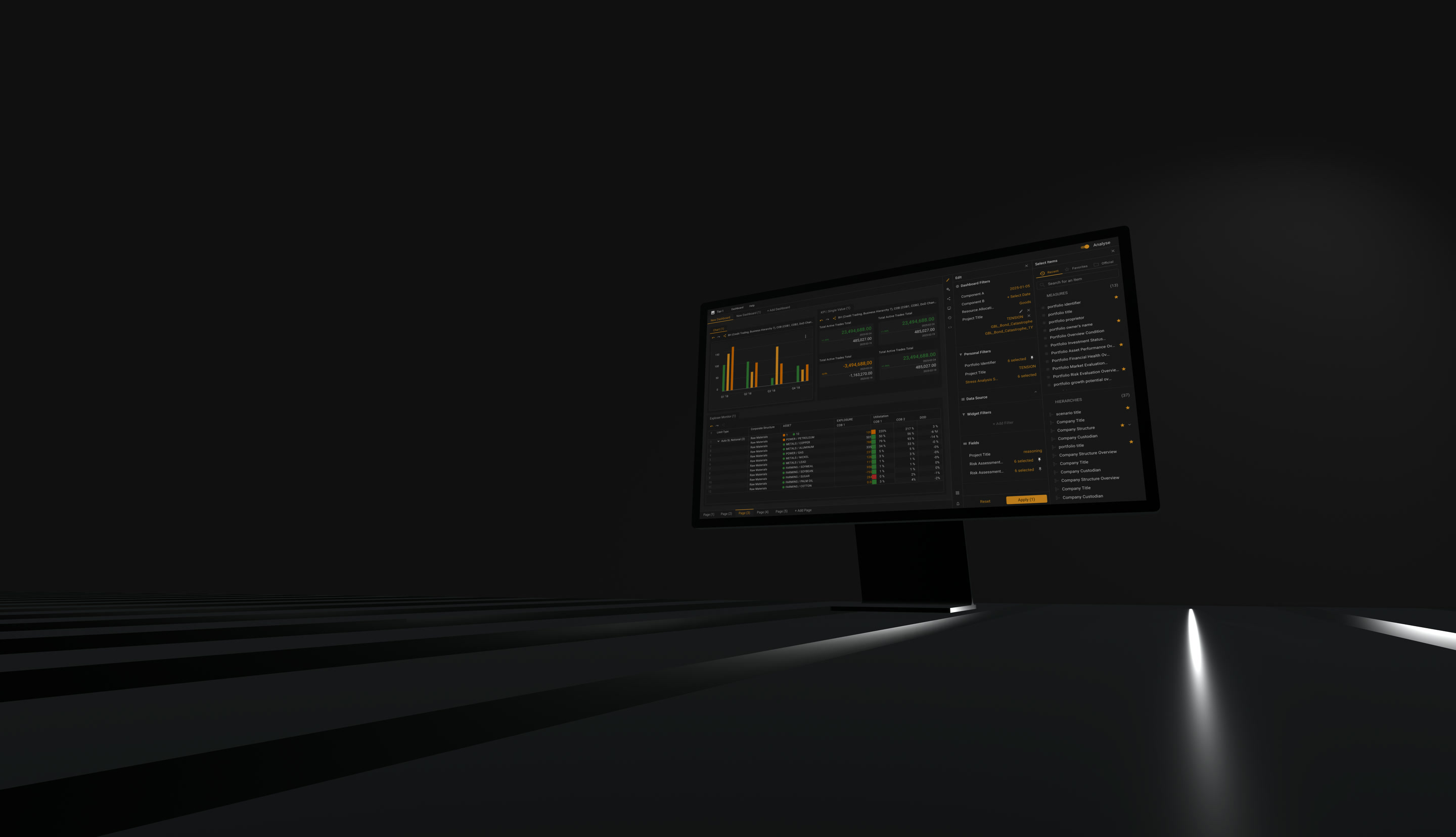
- Report configuration moved out of a step-by-step wizard into a panel beside the live report: change a condition, watch the table answer.
- One right-hand panel with its own icon rail — query, columns, display, charts — plus the governance half: access entitlements, visibility control, dataset linkage and review scheduling.
- Automated report delivery as three reusable objects — template, schedule, subscription — where every object carries a state and every broken state carries its repair in the same row.
- A dashboard of live widgets reading the same data as the reports that made them, so the daily question is what changed rather than which report to open.
- Chart type as a property of an existing widget rather than a new object, so switching type keeps every dashboard downstream that already holds the chart.
- Named pages inside the application, renamed by the user, instead of a strip of identical browser tabs.
- Three navigation modes chosen by the user, over a flat 20-item list regrouped into collapsible groups with pinning.
- A new visual language built on Material Design 3 — a bespoke component library, not a theme over stock components.

Client identity, system names and screens are covered by NDA. Anonymised case studies available on request.
Design lead on seven regulated consumer health products across mobile and web, in cross-functional teams of 6–11, for clients in Stockholm, Zurich and Chicago. Several shipped to the App Store. Success criteria here were engagement and brand recognition, measured by usability testing before and after each redesign — a different metric set from enterprise finance, and worth naming as such.
- Community care platform for coordinating help for elderly relatives — the people doing the caring are family, not clinicians, and the flows had to survive that. Released and live in the App Store.
- Rebuilt navigation and onboarding from usability testing: after redesign 81% of users had no navigation problems.
- Brand-colour recall landed at 63% — the weakest in the portfolio, and traceable to partner-mandated extra colours that diluted the identity. Named here because the constraint, not the method, produced the number.
- Sports nutrition and wellbeing tracking; the largest engagement in the portfolio at 11 people, rebuilt from an existing web MVP into native iOS and Android rather than wrapped.
- After redesign: 93% brand-colour recall, 73% of users with no navigation problems.
- Children’s sleep tracking across web and mobile, released on the App Store.
- The strongest test numbers of the portfolio: 92% of users had no navigation problems and 95% recalled the brand colours.
- Allbry — mental-health telemedicine for young people. Navigation problems fell 42 percentage points and task failure 32 points after redesign.
- ProgressMe — health tracking for people with eating disorders. Navigation problems fell 54 points, task failure 65 points, brand recognition rose 47 points.
- These two are the only products in the portfolio with genuine before/after deltas measured on the same test set, which is why the deltas are quoted rather than the absolutes.
- Breathing and calm app built on parasympathetic technique: 90% of users had no navigation problems after redesign.
- Brand-colour recall stopped at 72% — a cast of characters in different colours makes a single brand colour harder to name, a cost the gamification was worth anyway.
- Built the design systems and component libraries that held consistency across parallel teams working on different products at once.
- Same method every time: read the existing analytics and user pains, build a custom test to locate the flow breaks, redesign UX and UI against the grid, three-colour and three-click rules, rebuild onboarding, test the prototype and iterate on what came back.
- Analytics-led rebuild of the landing page and onboarding for a home-management web platform: 4x on-page retention, 2x click-through into the application, 35% more completed onboardings.
- Built a design system on the existing brand — roughly 30% faster layout production — and restructured core flows, cutting time to key user goals threefold to an average of 6 seconds and 5 clicks.
- EDI communication service: designed the UX architecture of a new module inside an established design system for a government-document submission platform, working from two years of analytics and heatmaps alongside existing user feedback.
- Prototyped and tested with target users, iterated on the findings and delivered UI frames within the existing system; 10 people in the responsible sector, 40+ across the programme.
- BelWeb Bank internal procurement portal: interface design for budget-controlled purchasing workflows from department request through to contract — first internal banking tooling and regulated approval chains.
- Hapag-Lloyd internal B2B shipping module: UX for an optimisation tool combining ships, ports, weather, fuel costs and cargo data; part of a 50+ person programme.
Quify — own product, iOS and Android, live on the App Store. Designed through 2024 under the name Purly and shipped as Quify. Research, UX, UI, prototyping and design system across 24 sprints: a 25+ screen onboarding system, an adaptive habit tracker, an AI feed and chat, and a reward ladder bounded at two years. Prototype testing: 91% brand recognition, 79% of users with no navigation problems, 85% completed all tasks.
Obsify (expenses and subscriptions), Suppfy (supplement tracking) and HEROX (activity tracking) — own iOS products in TestFlight or in development, taken from concept to shipped interface alongside full-time client work. The finance tracker sits directly on the same niche as the client work.
Own design studio, 2020 — 2021: outsourcing work alongside two in-house startups, EasyWallet (a crypto wallet simplifying transfer flows for non-technical users) and Travy. Both taken to prototype and user testing; neither reached release.
Market risk (VaR and stress-test reporting, day-over-day attribution), sales coverage and client onboarding workflows, internal enterprise banking platforms, fintech web and mobile, regulated healthtech.
High-density tables on AG Grid, pivot and tabular models, drill-through, column and filter management, multi-select states, reusable presets and preference persistence, progress states for expensive data operations, dashboards and widgets, deep links and macros.
Information architecture for large module sets, publisher/subscriber context propagation, inherited versus local filter provenance, MDX-style include/exclude filtering, session history and reversible state, breadcrumbs, wizard and stepper flows.
Material Design/M3 plus AG Grid plus custom bank component libraries; Figma components, variants, variables and modes; design tokens and theming including dark and elevated surfaces; WCAG-aware status colour; documentation and handover to React and Storybook.
Stakeholder and expert interviews, synthesis of user feedback and product analytics, usability testing (Maze), competitor benchmarking, prototype-based validation with real users.
Figma Make, Figma Weave, Figma AI agents, Cursor, Claude Code, Claude Cowork, OpenAI Codex, ChatGPT, Midjourney — used for rapid prototype generation ahead of user feedback rounds, research synthesis, visual exploration and design-to-code handover.
HTML, CSS/SASS, JavaScript basics, React component model, Storybook, coded component libraries, design tokens, Webflow, GSAP.
Agile and Scrum, Jira, Confluence, distributed cross-functional teams, NDA and restricted-data environments.
Financial and market analysis foundation behind the current specialisation in risk and trading interfaces.
UX/UI design course instructor, BelHard, 2020. Front-end development courses, 2017.
English — B2, full working proficiency; all client and project work conducted in English. Russian — native. Polish — A1.
Operating through a Polish sole proprietorship registered in 2023: available for remote B2B contracts across the EU and UK, with no umbrella company or employer of record required.