Enterprise UX · Market risk · 2024 — present

Spreadsheet speed, without losing track of where the state came from

Internal Market Risk Platform (MRP) at a Tier-1 international bank. A mature system used by fifteen expert teams of five to ten people — risk analysts, business analysts, admins — where the brief was evolutionary modernisation, not a rebuild.

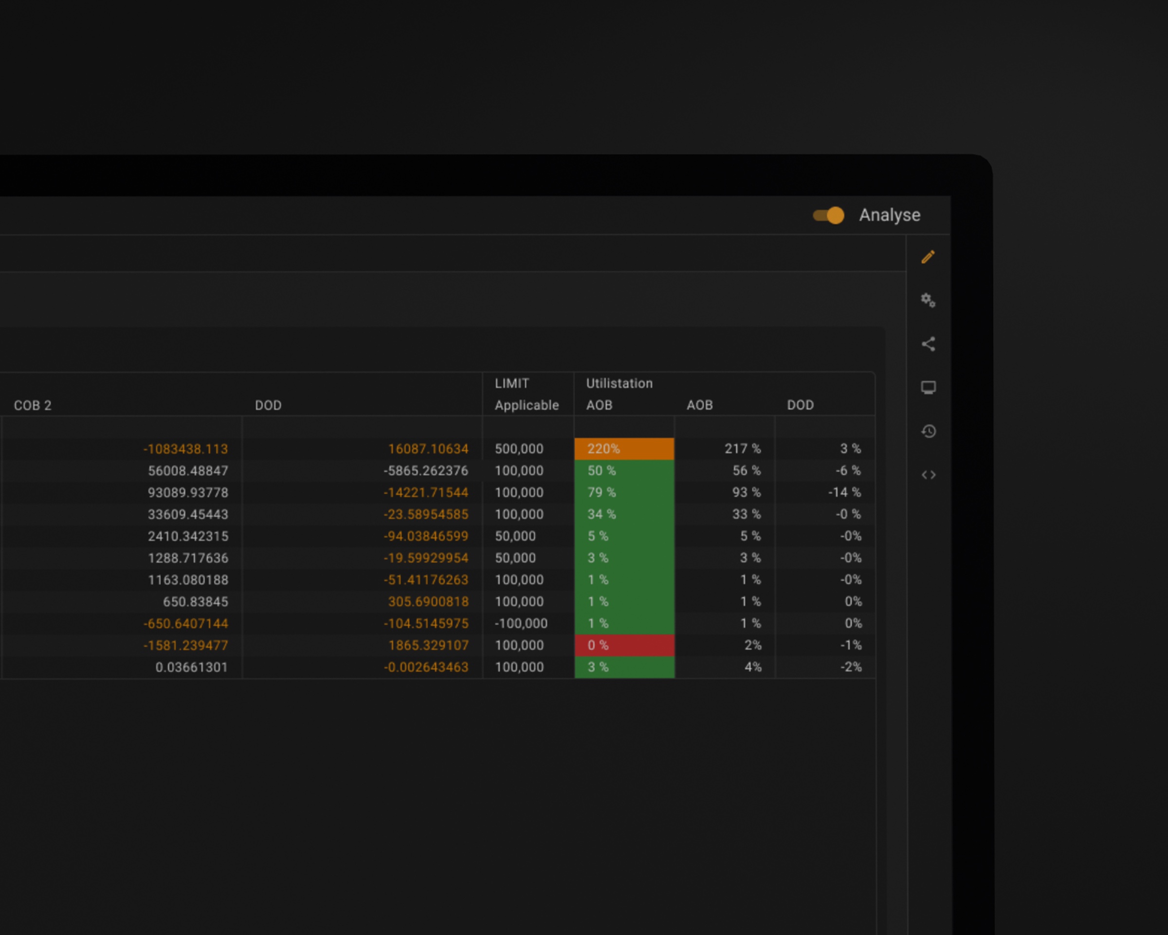
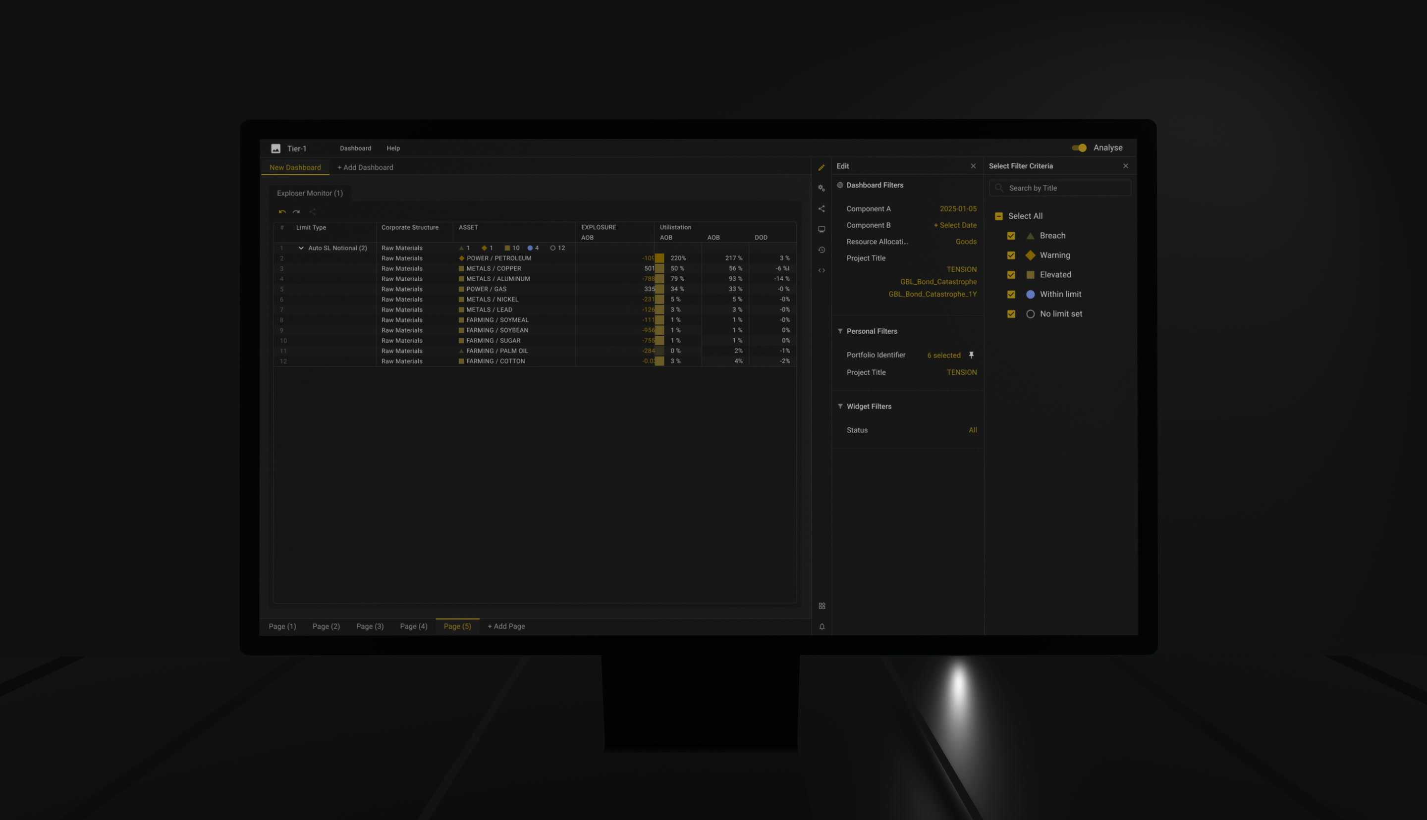
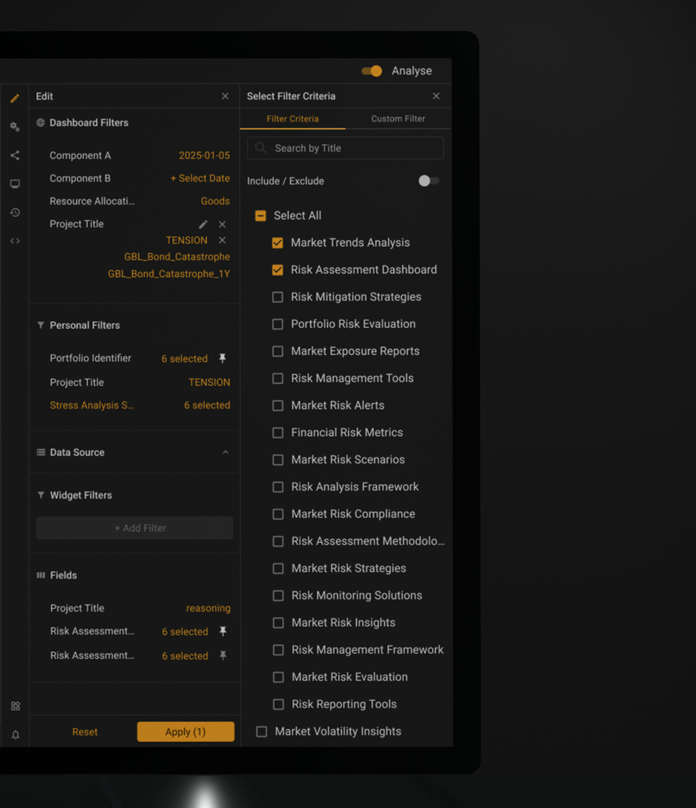
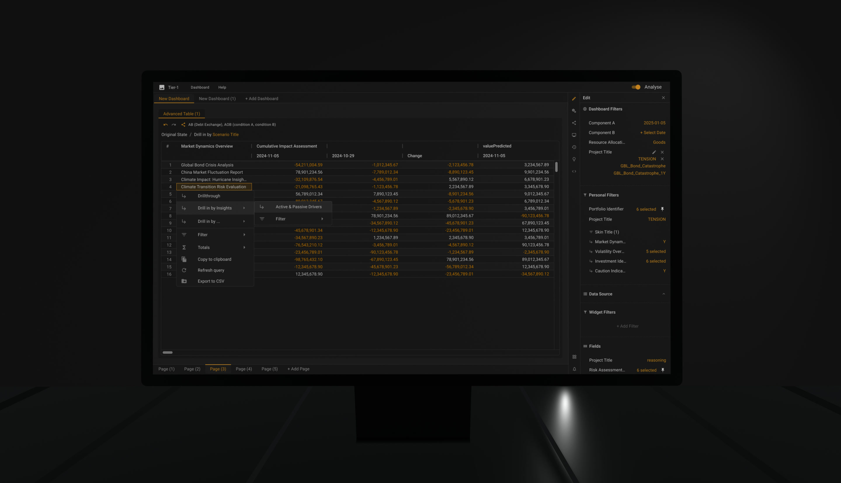
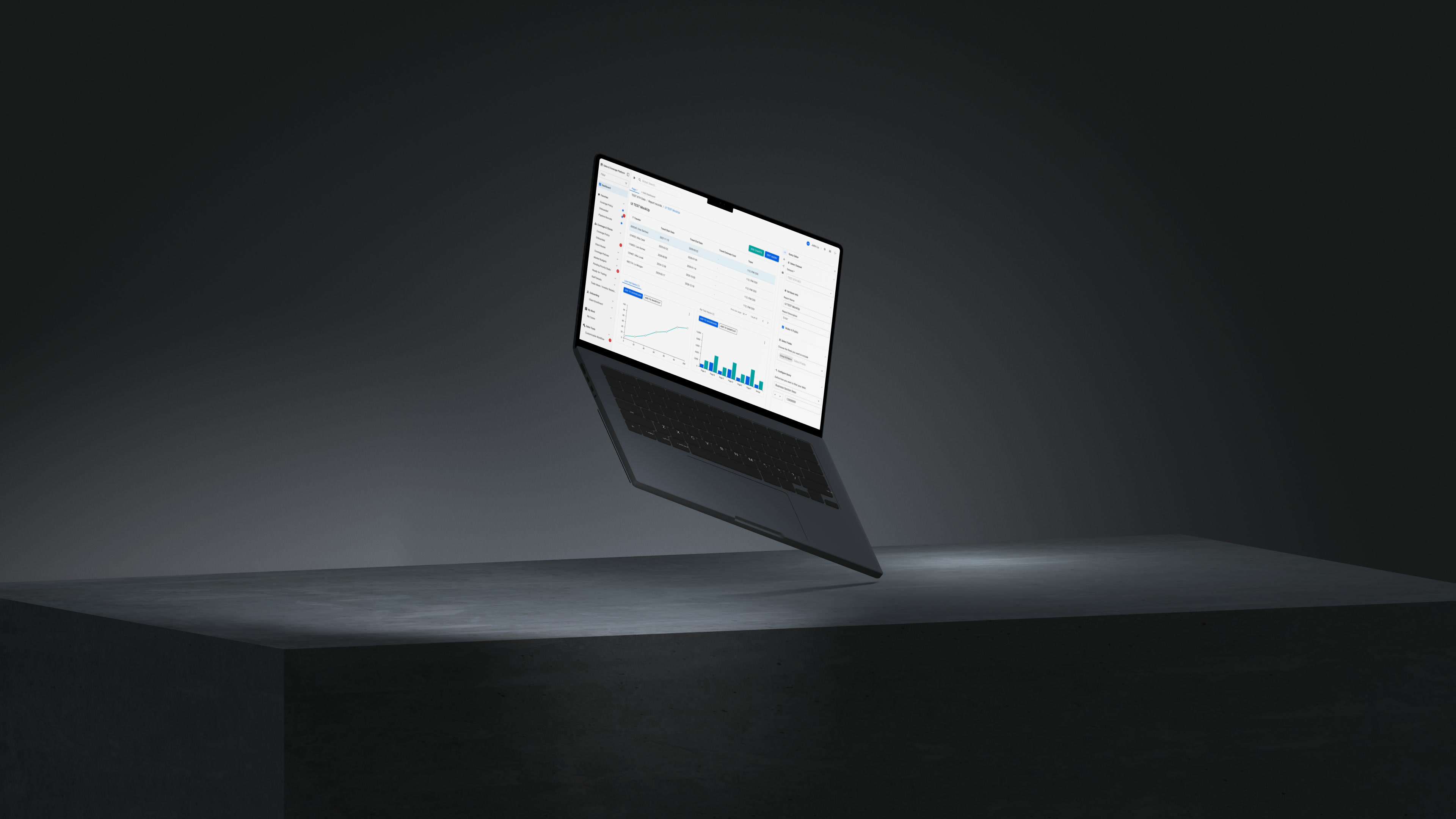
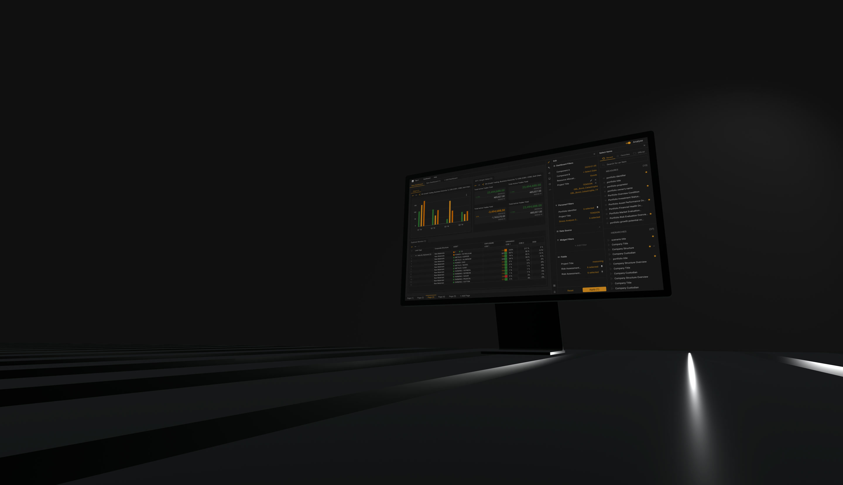
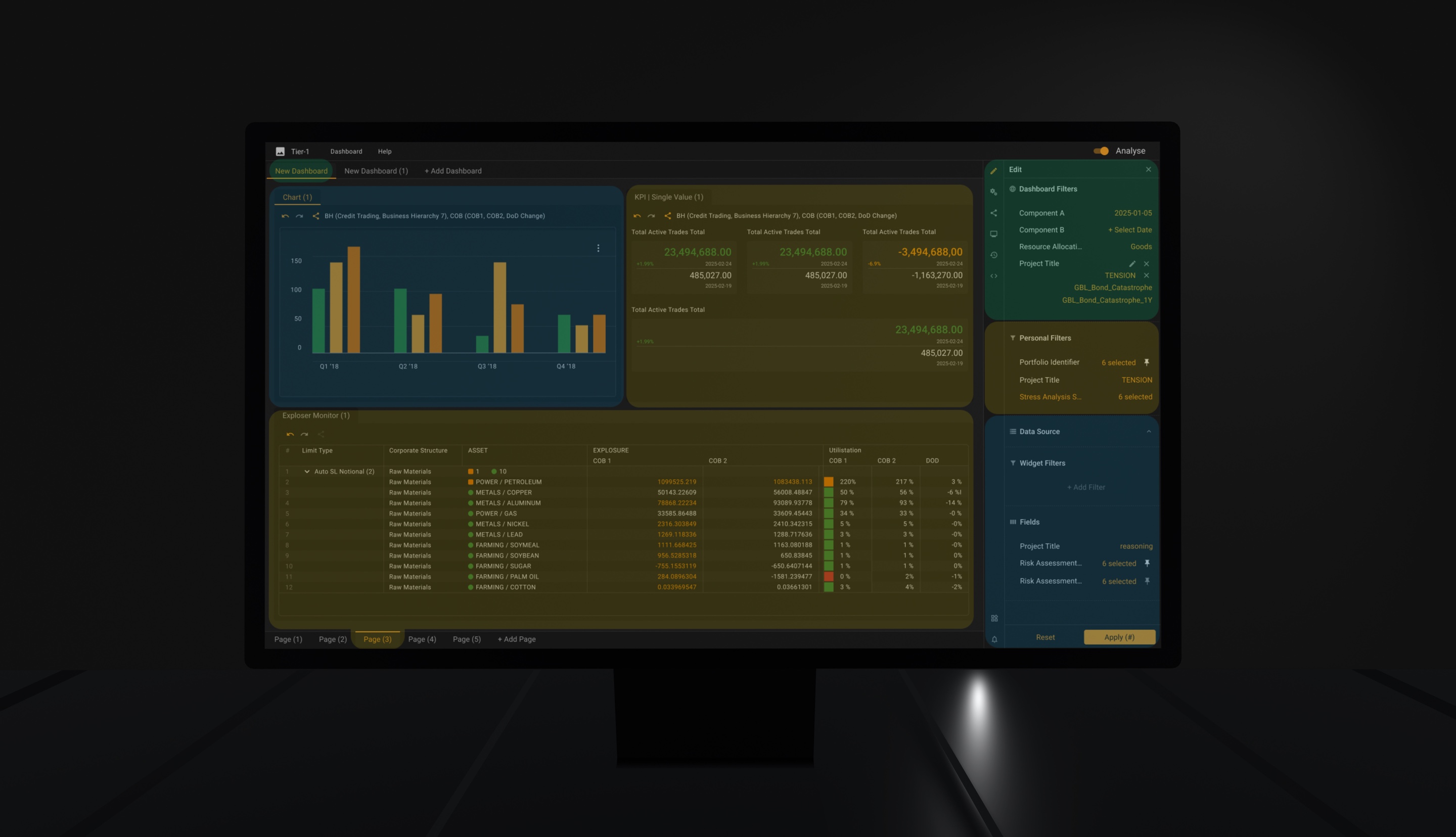
A market risk platform on screen, dense analytical grid with its filter panel open.
A mature market risk platform. Fifteen expert teams, and a system nobody can afford to have rebuilt.
Role
UX Designer (via Luxoft)
Period
2024 — present
Domain
Market risk — VaR and stress-test reporting, day-over-day attribution
Foundation
Material / M3 + AG Grid + custom bank components
Confidentiality
Client and system names under NDA. All visuals rebuilt on synthetic data.

(Expert teams)

15

(People per team)

5–10

(Foundations to reconcile)

3

(Decisions)

08

Users need spreadsheet-level speed. The mechanisms that give them that speed — layered filters, subscriptions between widgets, reusable presets — are the same mechanisms that make the current state impossible to reason about. You cannot remove the power. You have to make it legible.

Rule 1

The data never leaves the screen

Configuration never covers the data it configures. Filters, subscriptions, presets and column setup live in the right panel, so the grid stays visible while you change what it shows. You see the effect of a subscription as you connect it, not after you close a dialog and re-orient. Full-screen modals are reserved for actions where the data is genuinely irrelevant — saving, admin, destructive confirmation.

Considered instead

Modal-first configuration. Easier to build, and it costs the user the one thing they opened the screen for.

Trade-off

The panel takes horizontal space from a grid that never has enough. It collapses, and on narrow viewports it overlays rather than pushes. Decided in favour of the grid.

The grid never leaves. Only the right panel changes — the effect appears while the panel is still open.

Rule 2

State is an object, not a mood

Anything a user configures — a filter set, a drill path, an entire working layout — can be named, saved, pinned and reopened. Expert users were rebuilding the same workspace every morning; the platform was stateless between sessions and the work was not.

Research Method

How this was researched

Fifteen teams. Five to ten people in each. All of them on the previous version every day, all of them knowing the domain better than a designer will. Nobody could be recruited and nobody could be replaced, so the constraint was access, not sample size.

(Asked Teams)

15

(People in each team)

5–10

(Sessions per day, for months)

3–5

(Gates before a user saw a screen)

3

  1. 01

    Before anything was designed

    Weeks with the business analysts and the project managers, learning what the system is actually for. Market risk has a vocabulary, and a designer who cannot use it correctly will spend every session being corrected instead of listening.

  2. 02

    The brief that set the method

    Stakeholders asked for the platform to be more user-friendly. Vague as a requirement, precise as a mandate: the redesign was to be led by what the people using it said, not by what the people owning it assumed. Everything below follows from that sentence being taken literally.

  3. 03

    Sessions with the people who use it

    Daily, across all fifteen teams. Each opened with the obvious question — what is wrong, what would you change. Often the answer was nothing, and that is where the useful part started: the team was asked to simply work, and the screen was recorded with their consent.

    Expert users rarely name what is slow. They routed around it years ago and stopped noticing the detour. Watching finds what asking does not.

    The recordings became flows, journey maps and mind maps, and a list of pains attached to named teams rather than to invented personas.

From there, nothing reached a user until it had survived two other rooms. Every proposal passed the same three gates, always in this order.

  1. 01 Application owners, themselves users Is the concept right? Sketch
  2. 02 Engineering, then PM and owners Can it be built, and is it worth the capacity? UX frames
  3. 03 The teams Does it work in the hands of the people who asked? Clickable prototype, video session

The second gate is the one that matters. Estimating before validating means a proposal either survives its own cost or does not, and no user is ever shown something that cannot be built. It also protects the one resource that cannot be replaced here — the willingness of busy experts to keep showing up.

A revision does not go back to the person who raised it. It re-enters at gate one — owners, then engineering, then the teams. Slower, and the only way the answer stays the same answer for everyone.

Considered instead

Validating with users first and pricing later. It produces enthusiastic sessions about things that never get built, and it spends the only access anyone has to fifteen expert teams.

What cleared all three gates went into development, and the components it needed went into the design system. That is the loop the eight decisions below came out of.

The first rule is about what you can see. The second is about what you can keep. Everything below is one of the two applied to a specific mechanism.

01

Filter provenance and state ownership

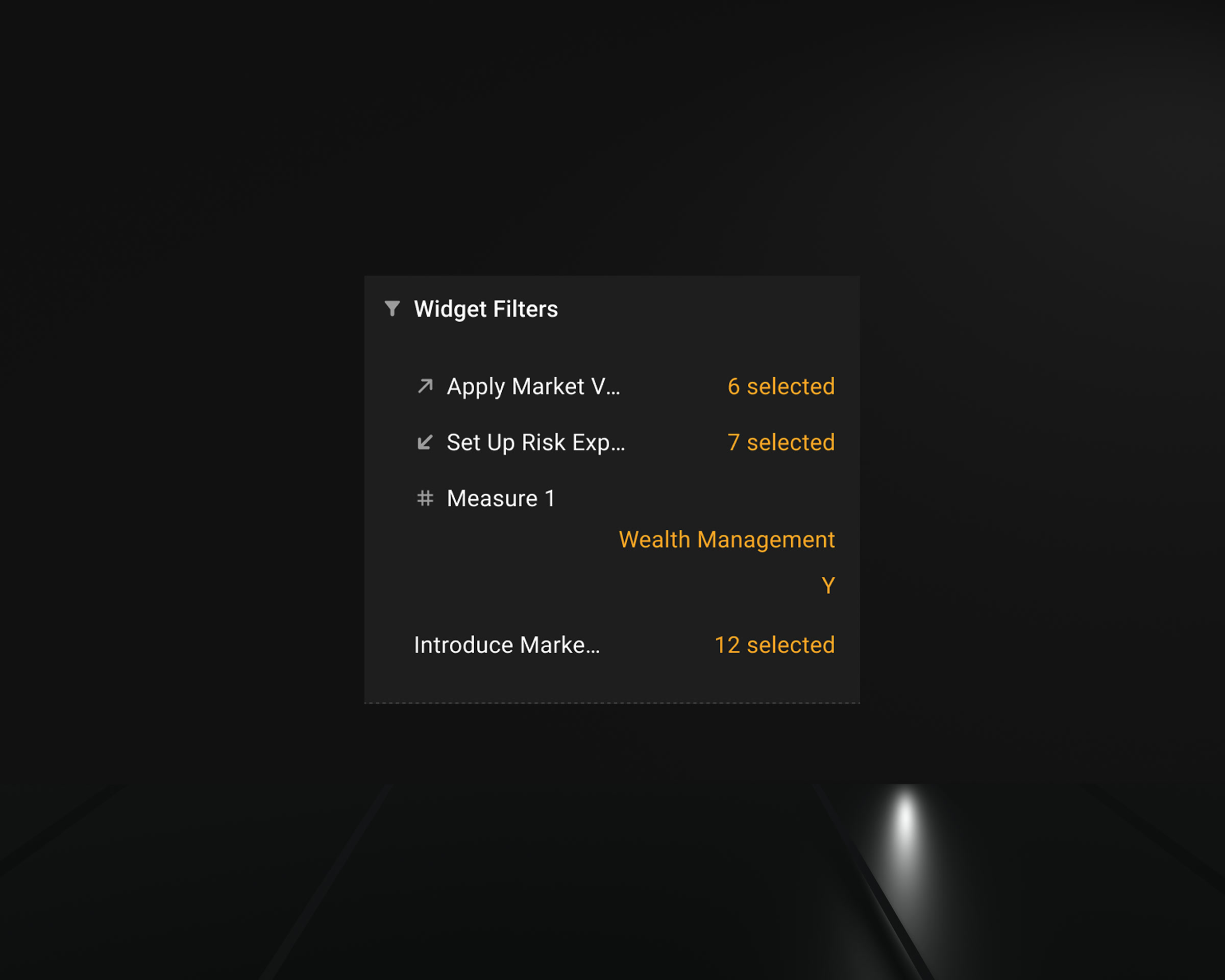
Filters live in the layer they came from: the dashboard, the person, or the single widget. Nothing is labelled for that — the section is the label.

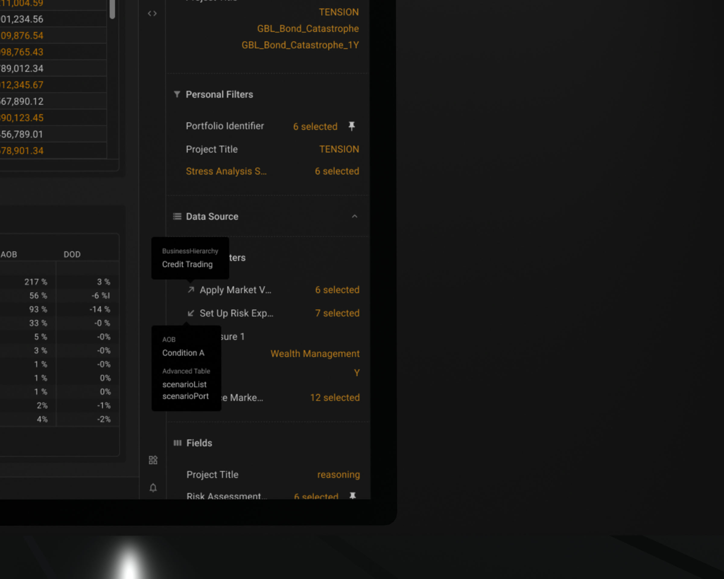
Two of them carry a marker. An arrow leaving means the filter is published and something else is reading it. An arrow arriving means it came from a subscription. Hovering either one names the widget on the other end and the fields that travel with it. Everything else sits unmarked, because a filter that stays where you put it holds no surprise.

The complaint was «too many filters». The real problem was that the same value could arrive from three places and the screen looked identical in all three. Once state became reusable, origin stopped being a nicety: you are working inside other people's decisions.

Considered instead

Marking every filter with its origin. It looks more rigorous and it costs the marker its meaning — when everything is labelled, the two that actually travel stop standing out.

Widget filter list where two filters carry direction markers and the rest carry none.
Two arrows and a blank. Only the filters that travel get marked.
Filter panel with subscription markers expanded, naming the widget on the other end.
Hover the arrow and it names the widget on the other end.

Publishing and subscribing were given separate semantics and separate visual treatment, and a filter inherited through a chain of subscriptions is surfaced rather than hidden. When widget C subscribes to B and B subscribes to A, C shows that its state originates at A.

Considered instead

Putting every subscription and publication onto the widget itself. It showed the whole model at once and became unreadable just as fast: a dense grid with a stack of state chips over it is noise, not provenance. Letting each user pin what they need on the surface, and keeping the rest one hover away, carried the same information without the cost — that is the version that was built.

A single generic share icon. It explains neither direction nor automation, and it is why the model was unreadable to begin with.
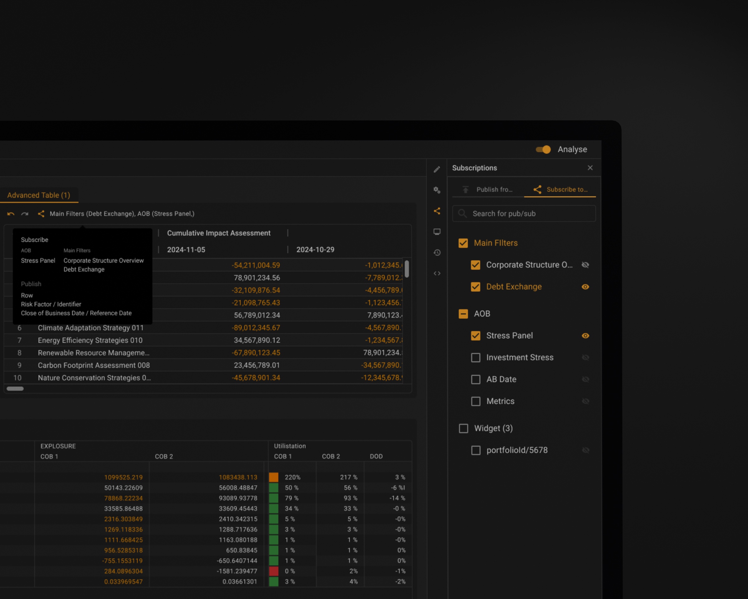
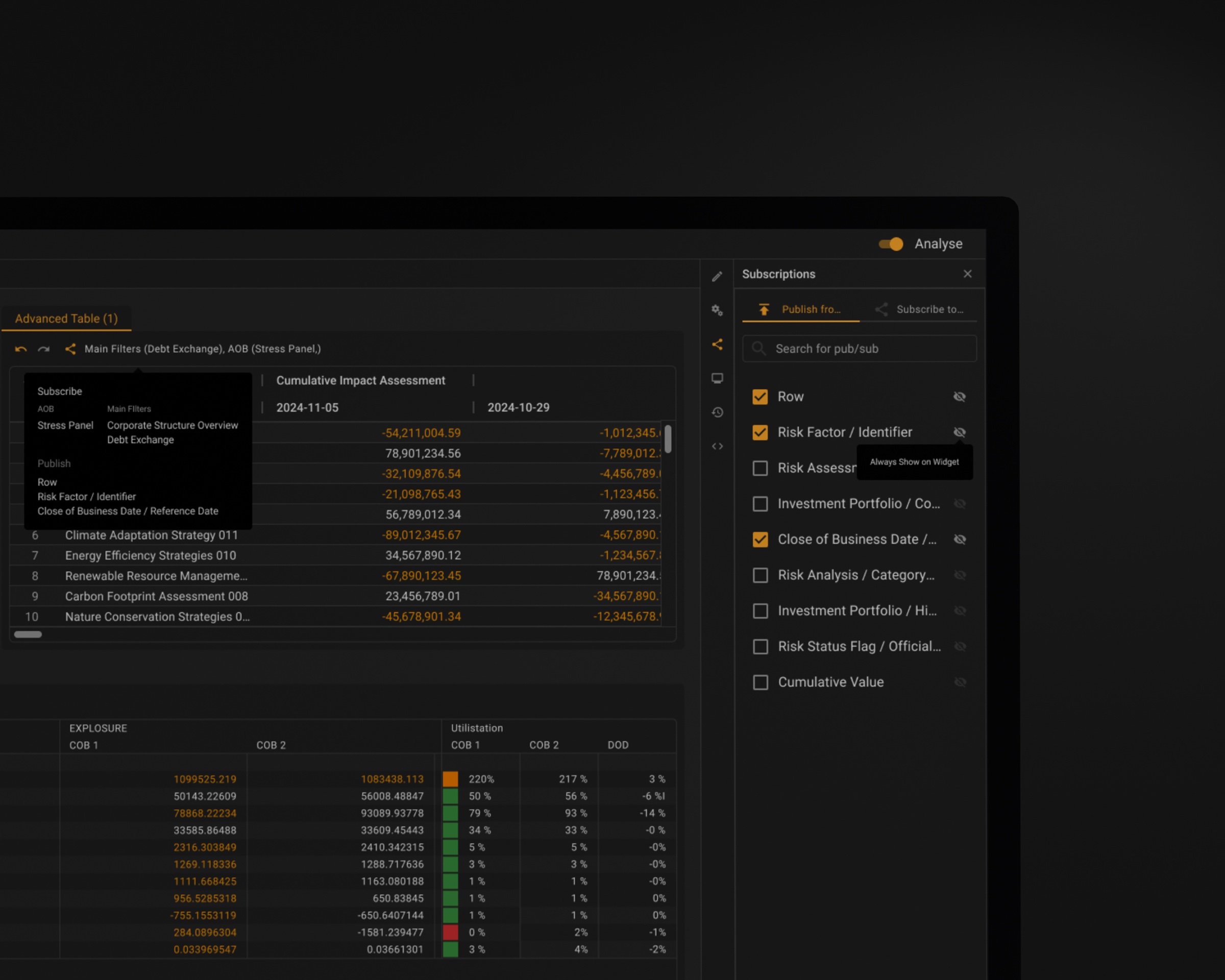
Panel listing the filters a widget subscribes to from other widgets
Each widget shows the subscriptions you pinned to it. The full list is one hover away.
Panel listing what a widget publishes to other widgets
The same control for what a widget publishes — a separate surface, because it is a separate commitment.

A date filter behaves the same way. T-1 to T-5 replace a calendar for the choices people actually make, a period can have days taken out of it, and the label on the dashboard states what survived: two dates, a range with its length, or a custom selection with the number of days it contains. Two dates and a fortnight used to look identical on the dashboard, and the difference was left for the reader to work out.

Considered instead

Showing the selected dates as they are. Honest to the letter and useless in practice — the reader still counts the weekends in their head.
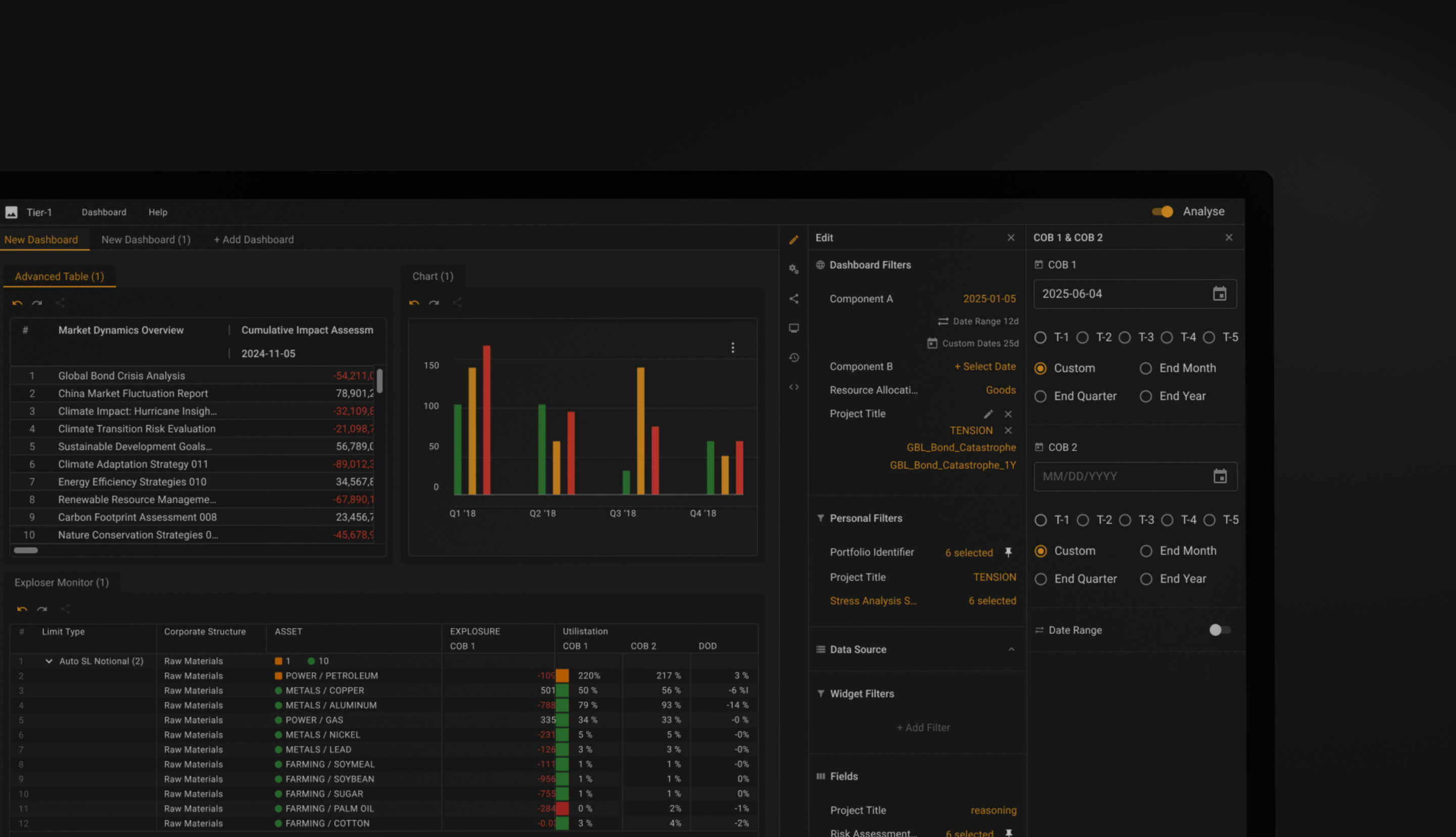
Date control with T-1 to T-5 shortcuts and a labelled custom range
T-1 to T-5 instead of a calendar, because that is what people pick. Two dates, a range, or a range with days taken out — the label says which, and how many days survived.

02

SKINS and IDEAS: reusable state at two scalesRequested by users

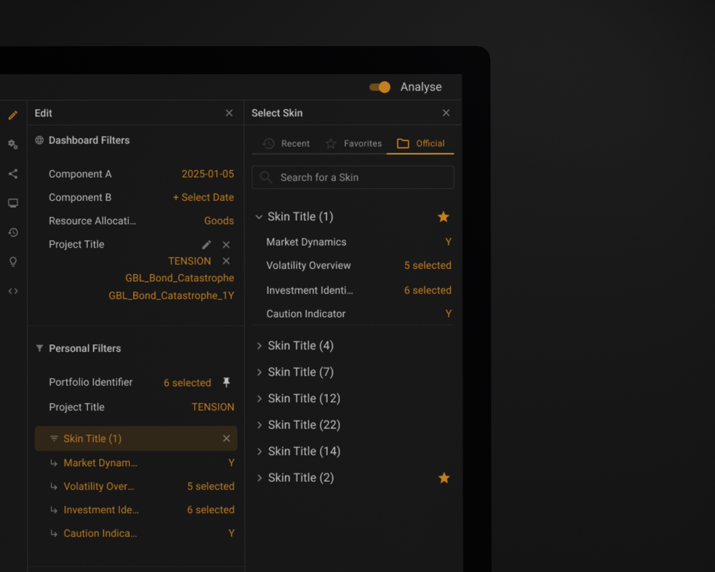
SKINS — saved filter sets. Open a new widget and apply a saved filter set instead of rebuilding it. Frequently used SKINS pin to the top and the widget reopens with them next session.

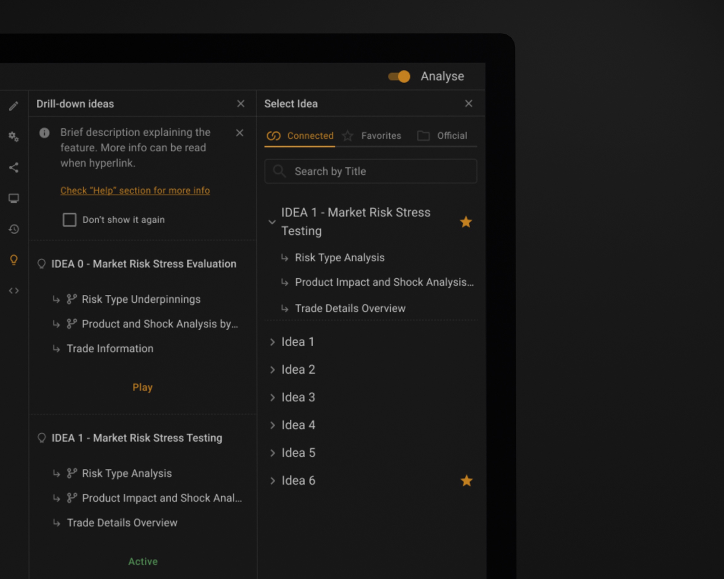
IDEAS — pre-wired widget templates. A step up in scale: whole layouts where the widgets, the connections between them and their filters are already wired. Open one instead of assembling five widgets and connecting them by hand.

Both came from the same request, made repeatedly: stop making me rebuild my morning. The reasoning inside a workspace was being thrown away every session while the layout survived.

Considered instead

Personal dashboards as the only reuse mechanism. A dashboard saves an arrangement of widgets. It does not save the analytical intent inside them, which is the expensive part.

Library of saved filter sets, favourites marked with a star
Saved filter sets, pinned. Nobody rebuilds their morning.
List of pre-wired templates, each showing its drill-down steps and a play control
A template that already knows which widgets talk to each other.
Opening a template instead of assembling five widgets by hand.

03

Shared state has an ownerRequested by users

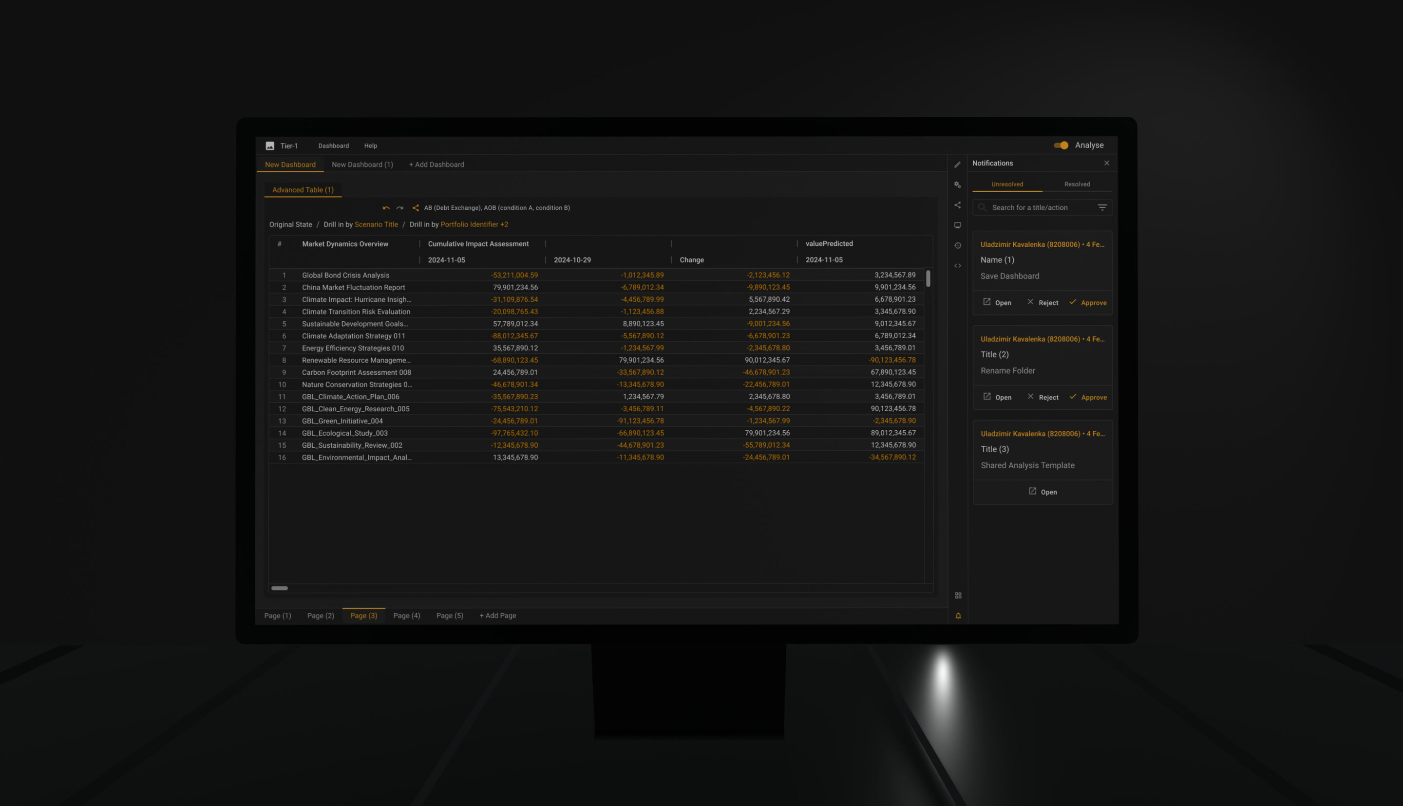
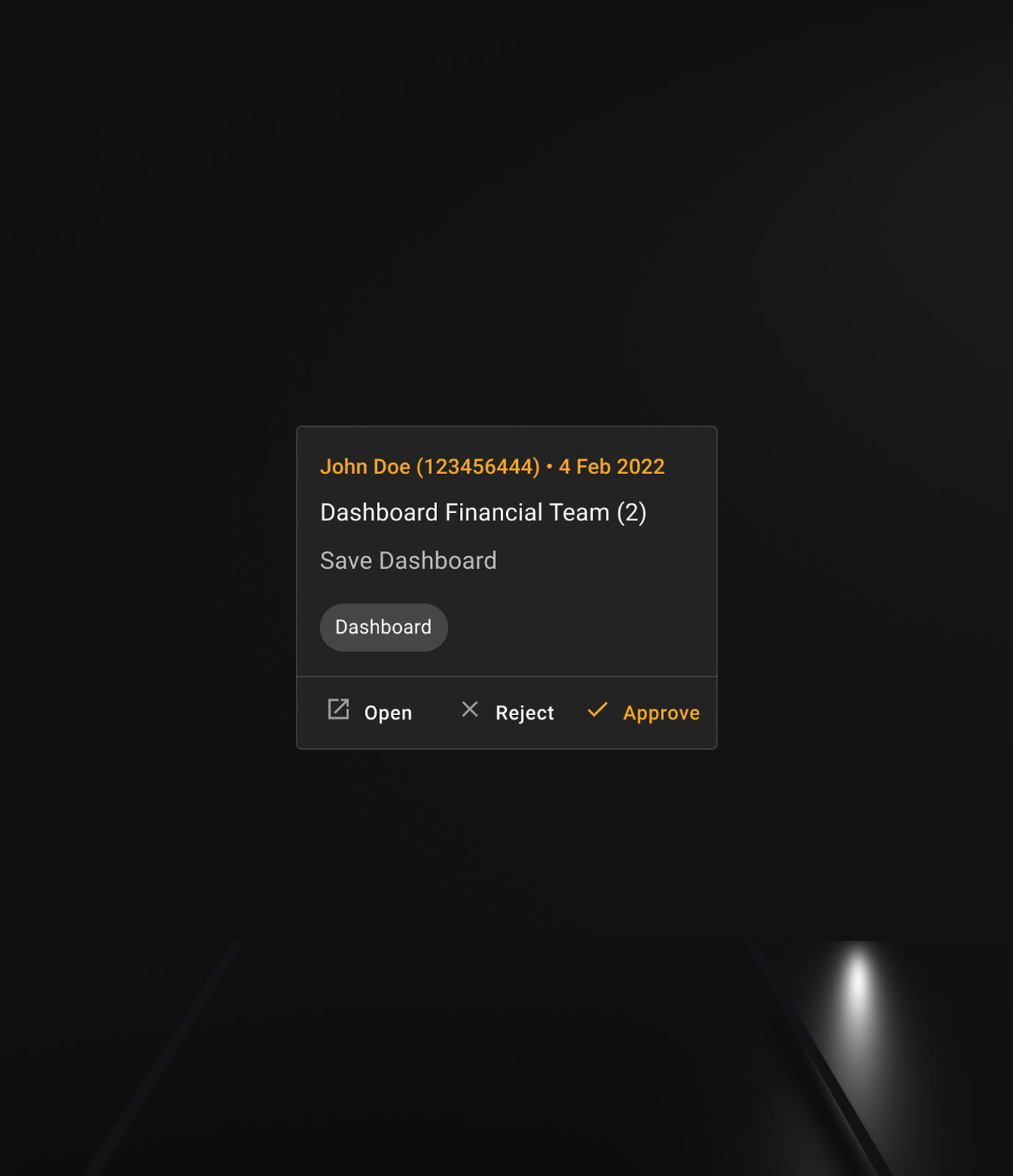
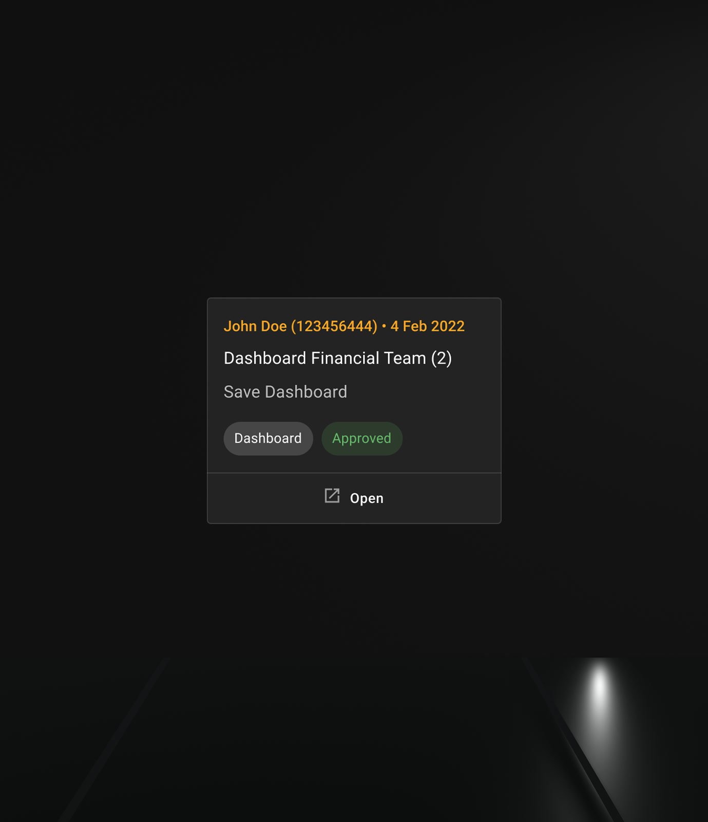
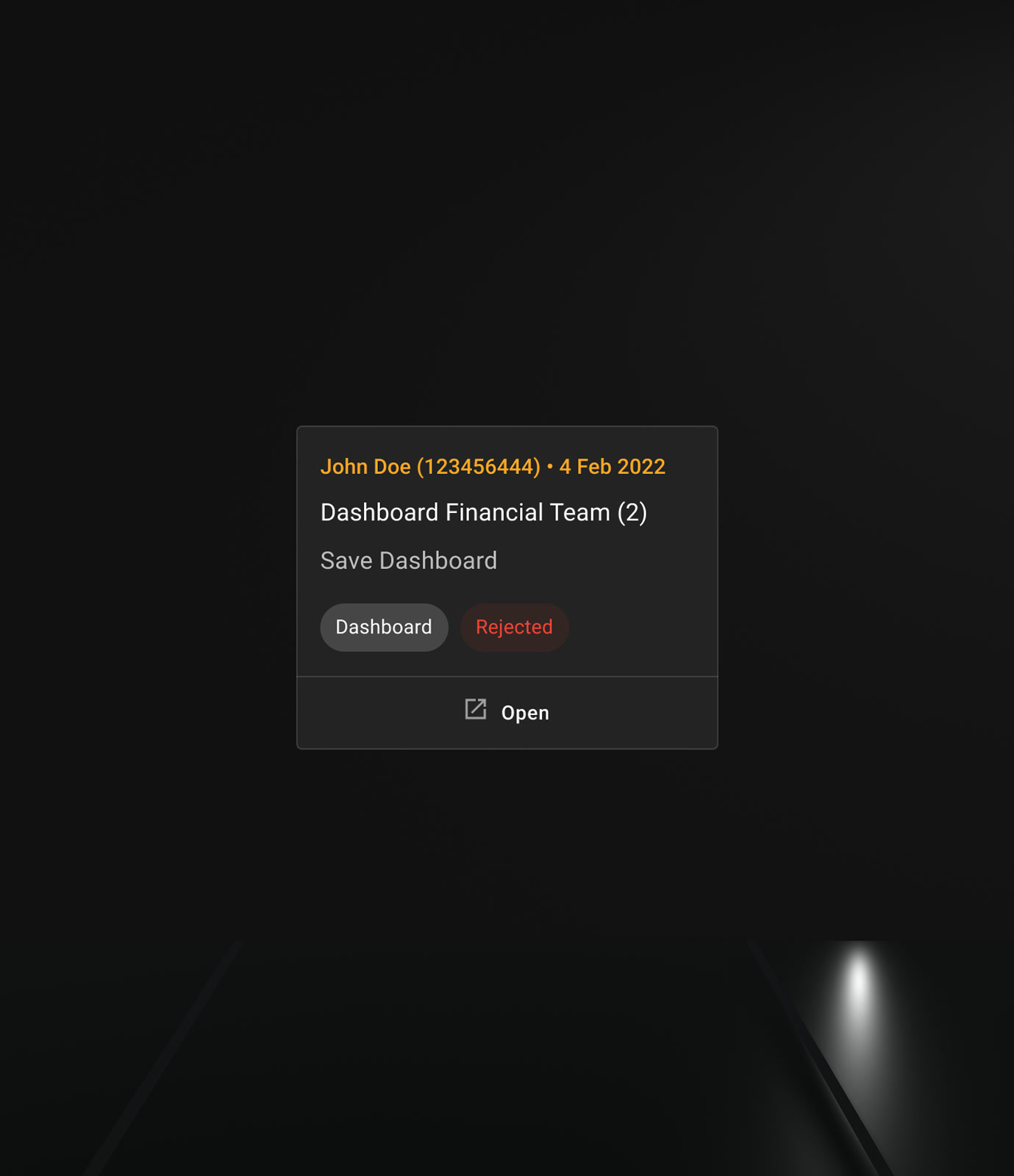
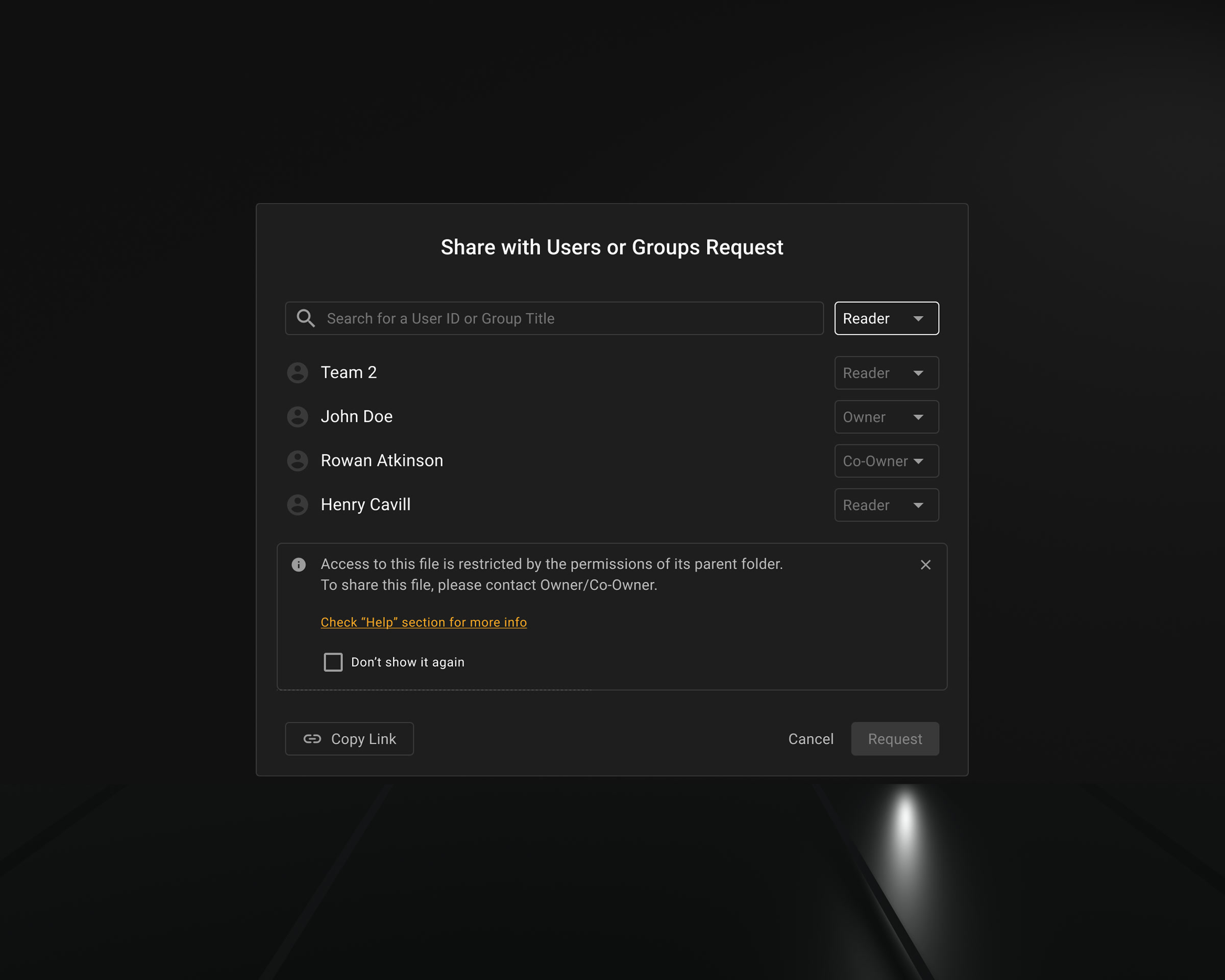
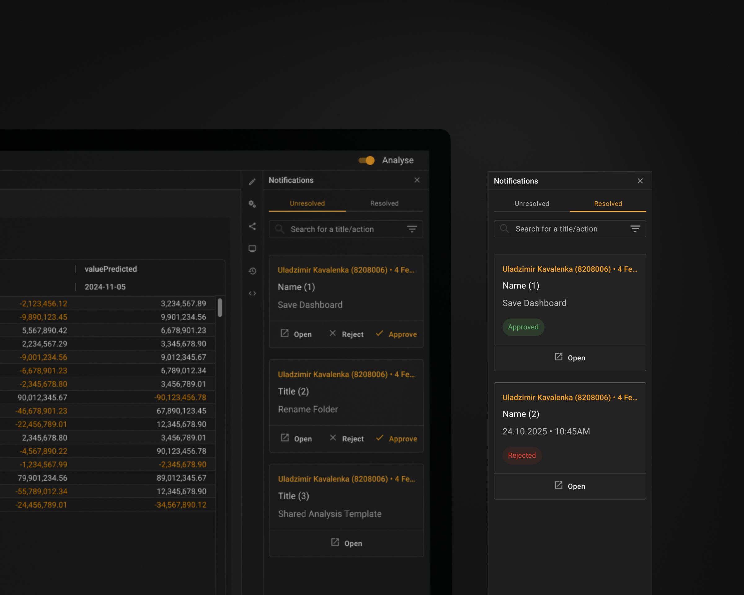
Dashboards and analysis templates can be shared, and shared objects have owners. When someone wants to change one they do not own, the change goes out as a request: the owner sees what is being asked, by whom, on which object, and approves or rejects it. Access itself is layered — Reader, Co-Owner, Owner — and a file inherits the permissions of the folder it lives in.

The moment saved state became reusable, it stopped being personal. A dashboard three teams read every morning cannot be edited by whoever opens it first, and it cannot be locked either — the person who spots the error is rarely the person who owns the object.

Unresolved and resolved are separate lists. A request stays in the first one until somebody acts on it, then moves to the second carrying the decision with it, so nobody has to ask whether they were rejected or simply forgotten.

Considered instead

Open editing with an activity log. Cheaper to build, and it puts the correction after the damage: by the time the log is read, everyone downstream has already acted on the changed number.

Change request to a shared dashboard shown in the panel beside it
A request to change a shared dashboard arrives beside the dashboard, not instead of it.
Incoming change request with open, approve and decline actions
Open, reject, approve — the owner decides without leaving the screen.
Change request in its approved state
Approved. The change reaches everyone who reads the object.
Change request in its declined state, with the decision recorded
Rejected. The person who asked is told, not left waiting.
Access roles — reader, co-owner, owner — with folder-inherited permissions
Reader, co-owner, owner — and a file inherits the permissions of the folder above it.
Change requests split into unresolved and resolved lists
Unresolved and resolved are separate lists. Nothing still waiting on a decision is buried under what has already been decided.

04

History at two levelsRequested by users

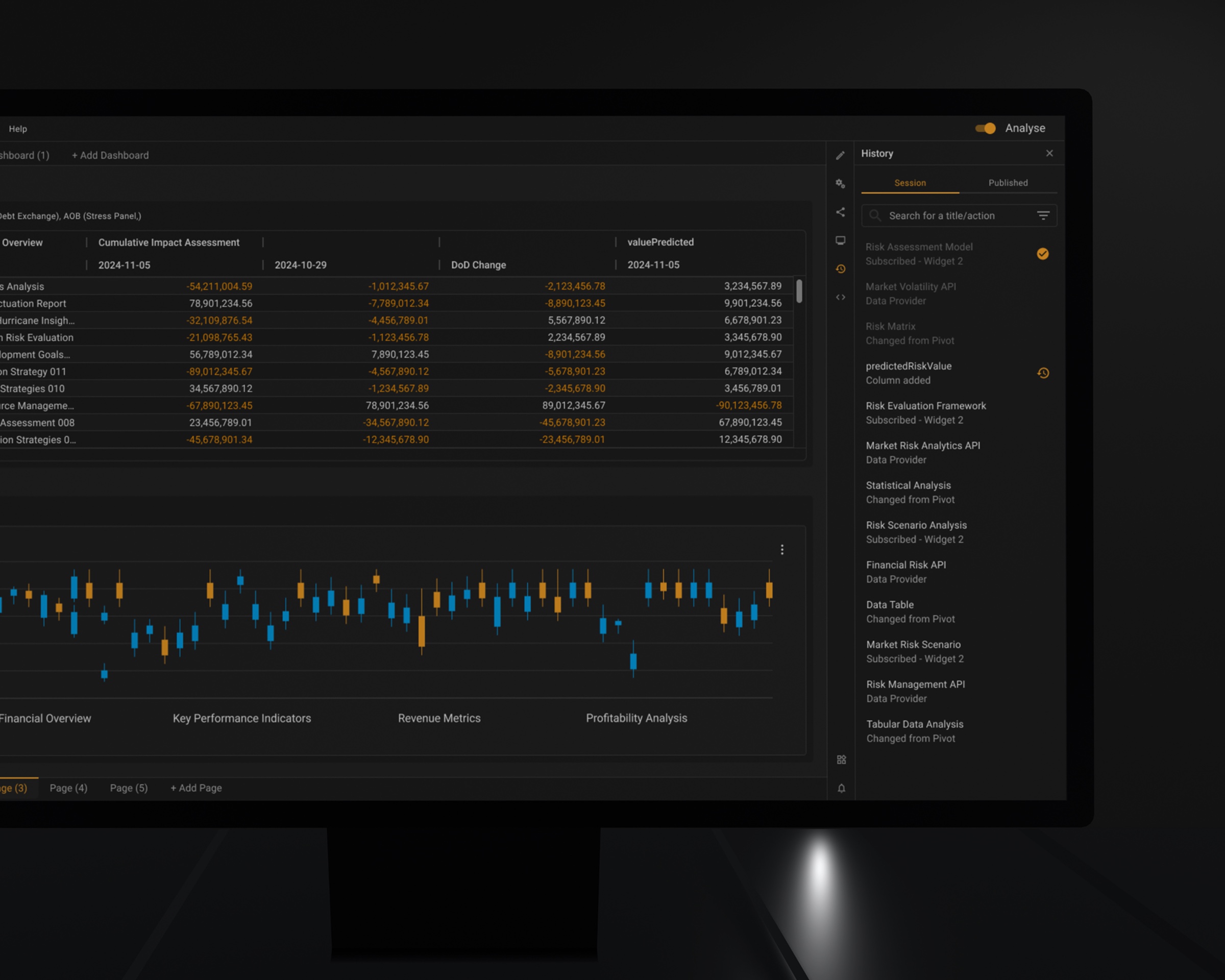
Session History records what you changed on top of a shared dashboard: applied presets, excluded desks, completed drills. The list is yours alone — you inspect a state before returning to it, and nobody else sees it. Ctrl+Z lives at this level and is scoped to the widget you are working in, so a familiar shortcut keeps a small, honest meaning instead of a global one.

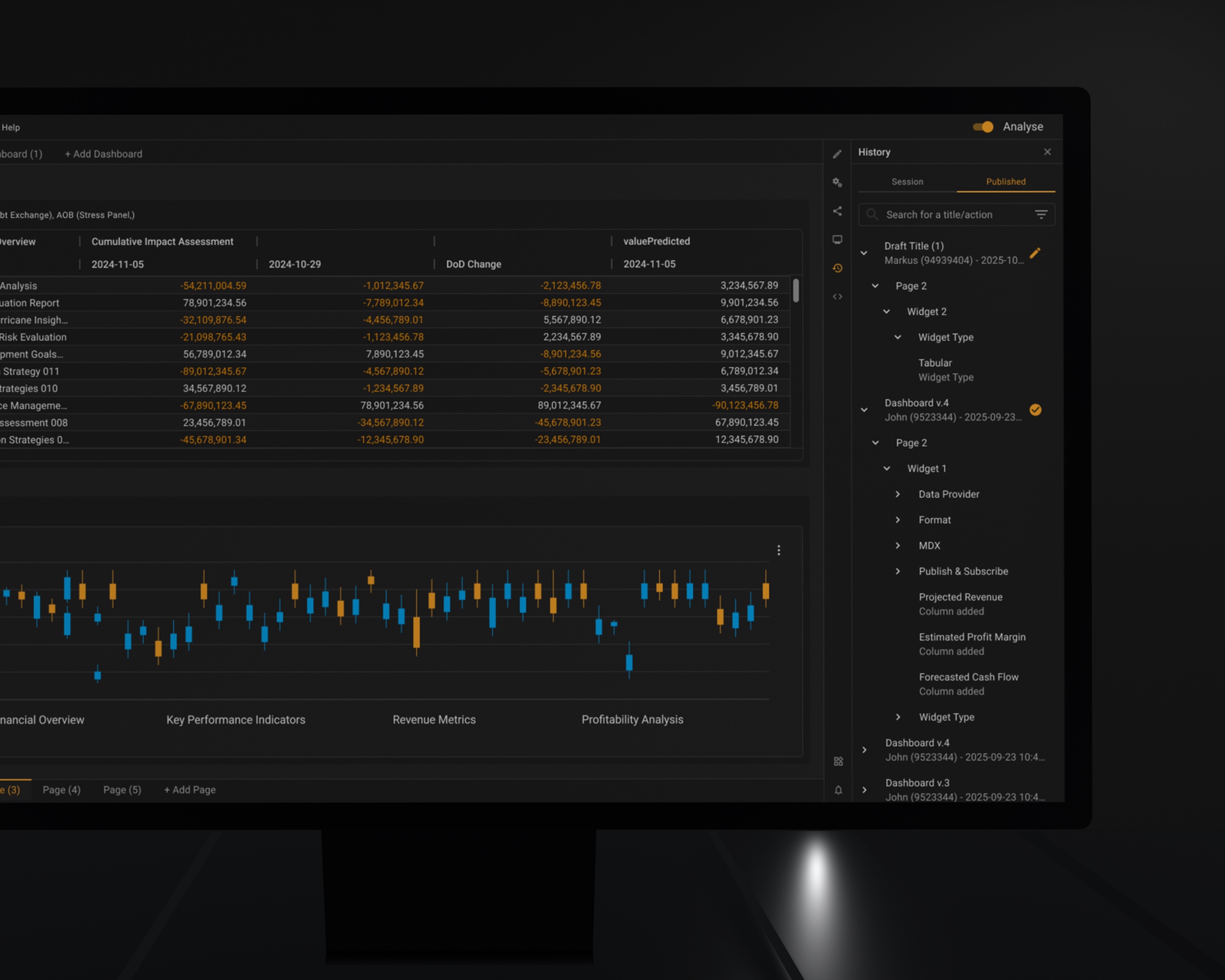
Published versions are the second level, and undo never reaches them. Publishing to a shared dashboard is a separate right; what arrives for everyone else is a named version with an author and a date, not somebody’s working session. The two levels never touch, which is the point: no shortcut can quietly rewrite what a room full of people is reading.

Considered instead

A single global undo stack. When a visible state depends on several filters, a subscription chain and a completed data operation, «one step back» has no single honest meaning — and a wrong guess silently changes numbers someone is about to send on.

Session history listing state transitions made on a shared dashboard
Your own changes to a shared dashboard stay in your session — a history nobody else sees.
A published dashboard version carrying its author and date
Publishing is a separate right. What reaches everyone else is a named version, with an author and a date.

05

Three colour modes, one of them accessibleRequested by users

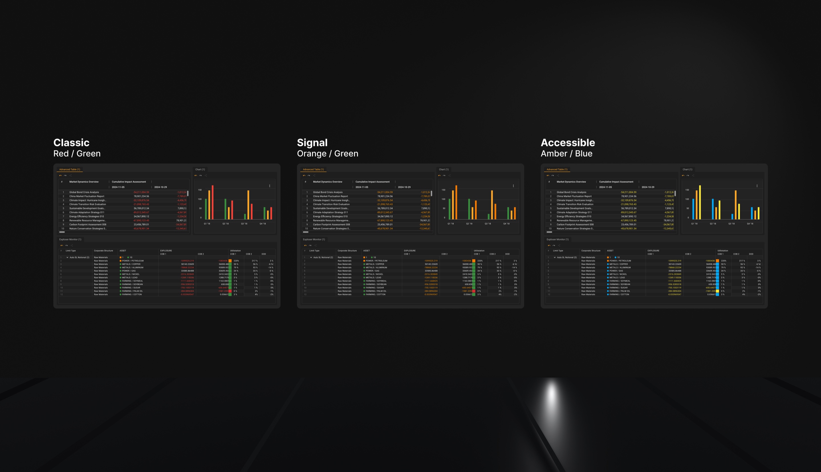
Three status palettes, switchable per user: Classic red/green, Signal orange/green, and Accessible amber/blue. The colour is not decoration here — in market risk it is the sign of the movement. An analyst who cannot separate red from green cannot read the direction of a delta across forty rows, and the number stops carrying its most important attribute.

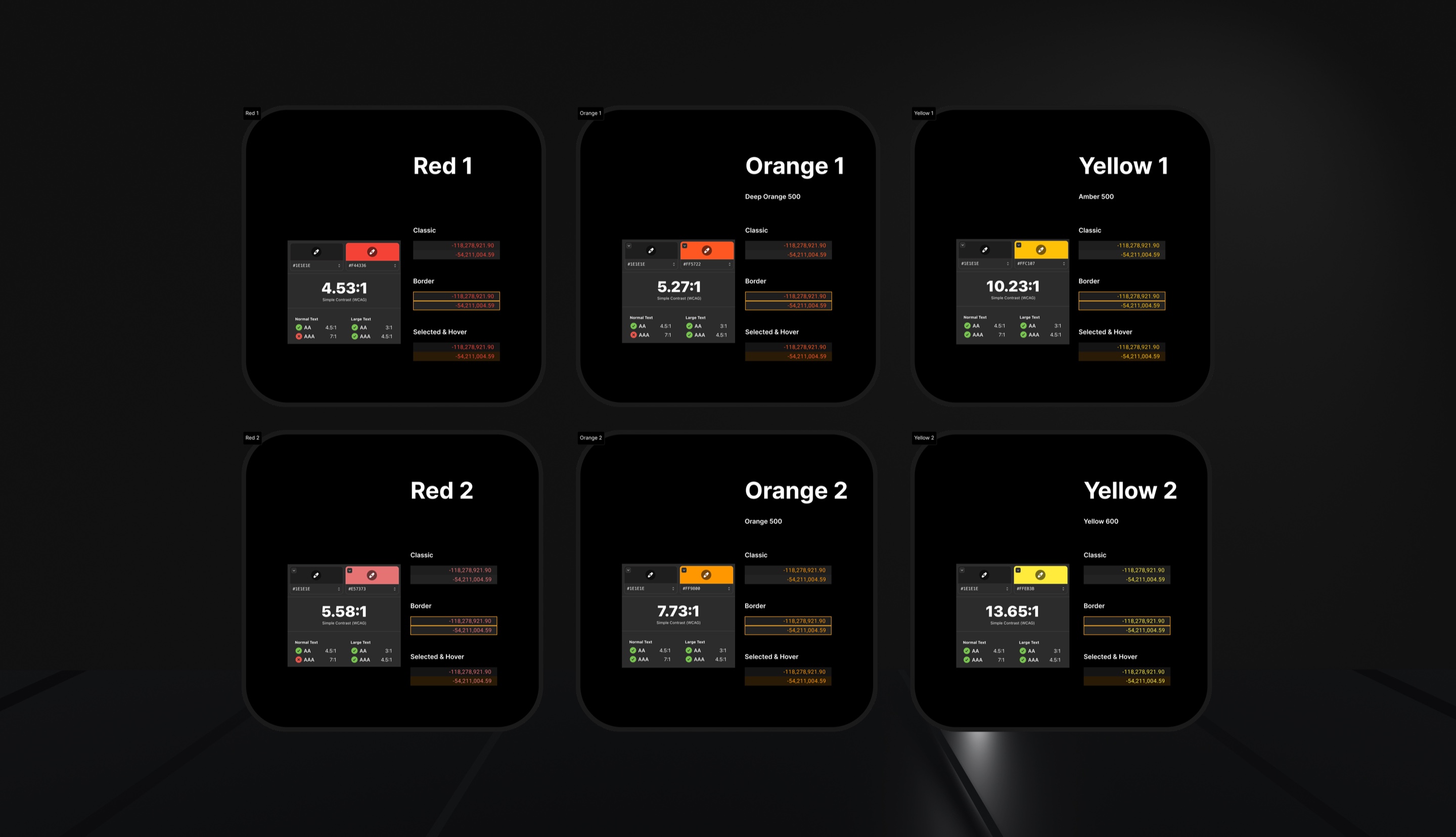
The orange mode came first, and it came from users: red on dark and elevated surfaces was reported as hard to read, and pure red gives 4:1 against white — below the 4.5:1 that WCAG 2.2 AA requires for normal text. Fixing that exposed the larger problem. Red-green is the one pair that fails for the most common forms of colour vision deficiency, and the platform had no alternative to it. Amber against blue survives those forms, and it is the convention professional market terminals already use — so the mode is unfamiliar to the eye but not to the domain.

Classic

Red / Green

The convention people arrive with.

Signal

Orange / Green

The platform's own accent, already adopted after red proved hard to see on dark surfaces.

Accessible

Amber / Blue

Blue against amber survives the common forms of colour vision deficiency, following the convention used in professional market terminals.

Colour is never the only carrier. In Accessible mode direction is also encoded as shape — an upward and a downward glyph — and the sign stays on the number. That is the actual requirement: information must not depend on colour alone. Designed against contrast and non-colour-dependence requirements; no formal audit was run, so no compliance is claimed.

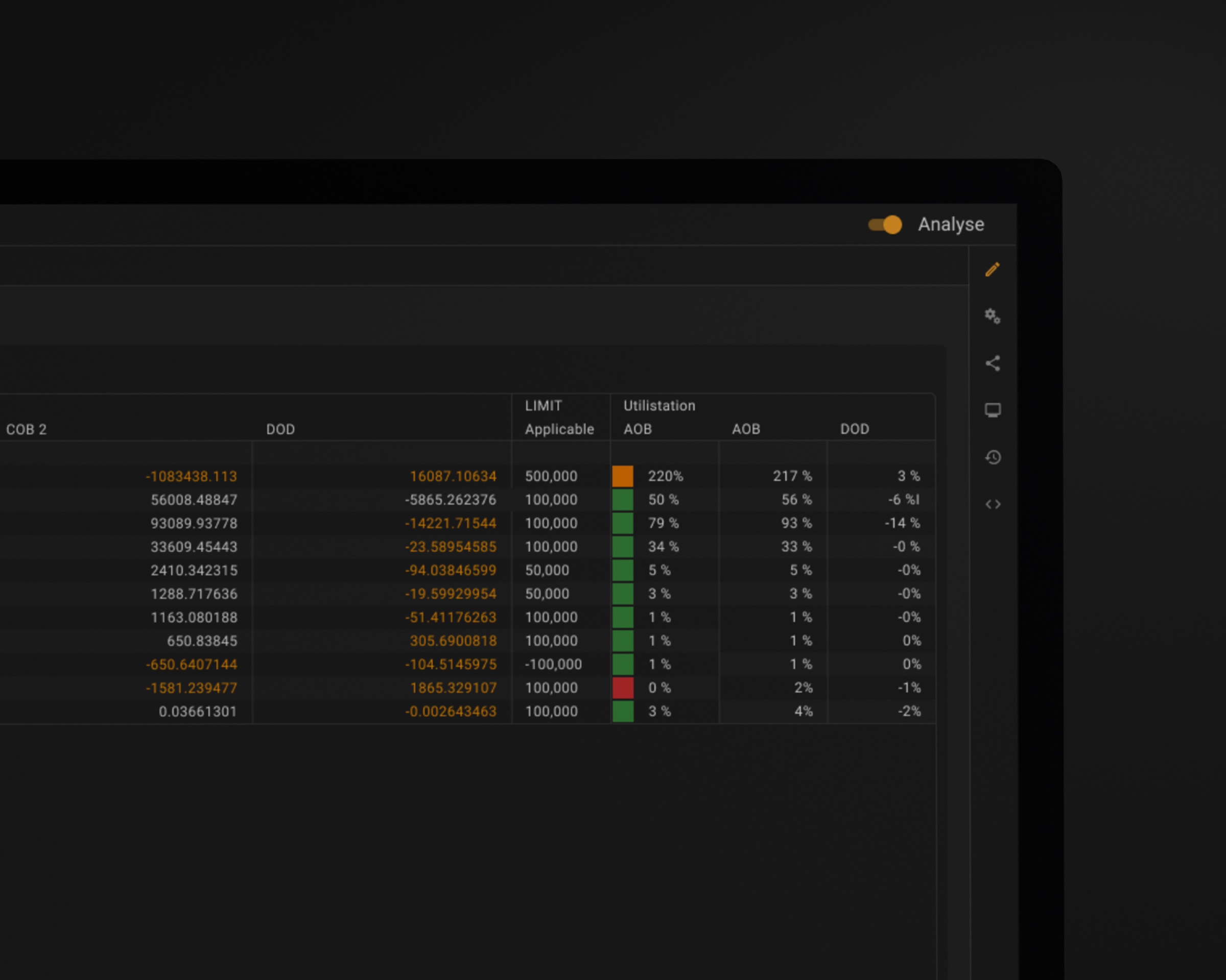
A second decision, inside the grid: the colour indicator moved out of the cell. Colouring the cell background put text on top of a saturated fill, where contrast collapses at exactly the moment the number matters most. The value now sits on the normal surface and the status colour becomes a chip immediately to its left — same scanability down a column, no text-on-colour anywhere.

Conditional formatting lets a user set a cell background of their own, and some of those pairings fail contrast regardless of which mode is active. What the product should do about a colour the user chose is an open question, not a solved one.

Considered instead

A single corrected palette. It would have satisfied the contrast audit and left the red-green pair intact — the audit is not what makes the number unreadable.

The same analytical grid shown in three status colour modes
The same grid three times. Red and green carry no information for some of the people reading it.

Considered instead

Alternative considered: status colour as a saturated fill under the number

Chosen

Chosen: status colour as a chip beside the number, on a normal surface
Colour next to the number, never under it.
Six candidate status colours, each with contrast ratio, pass marks and sample cells
Contrast measured before the palette was chosen: every candidate red, orange and amber against the surfaces it has to sit on.

Checked against

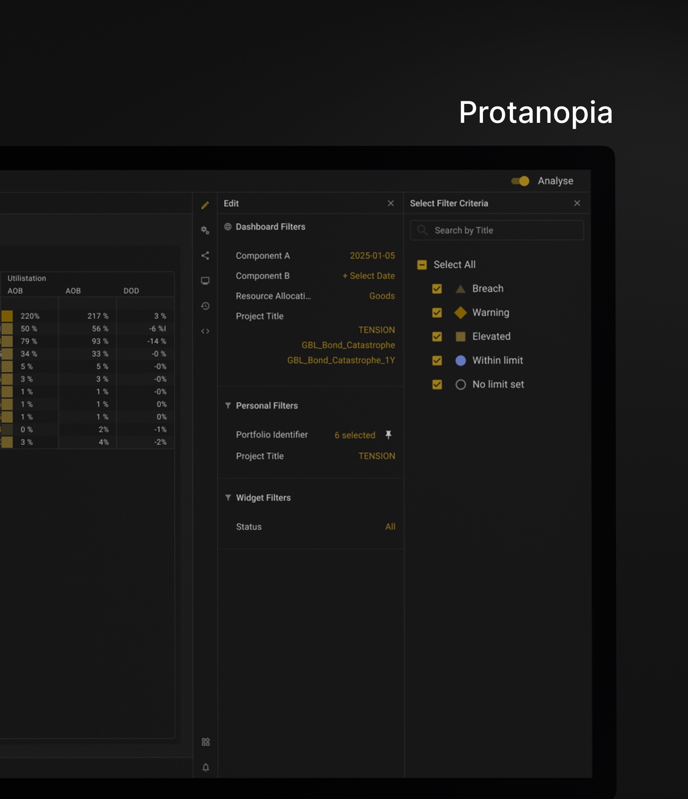
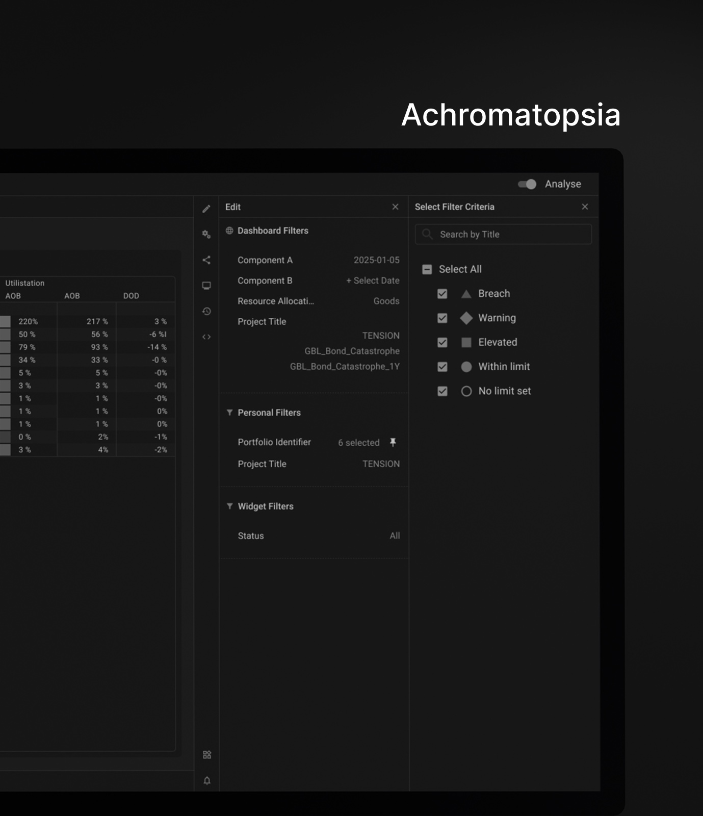
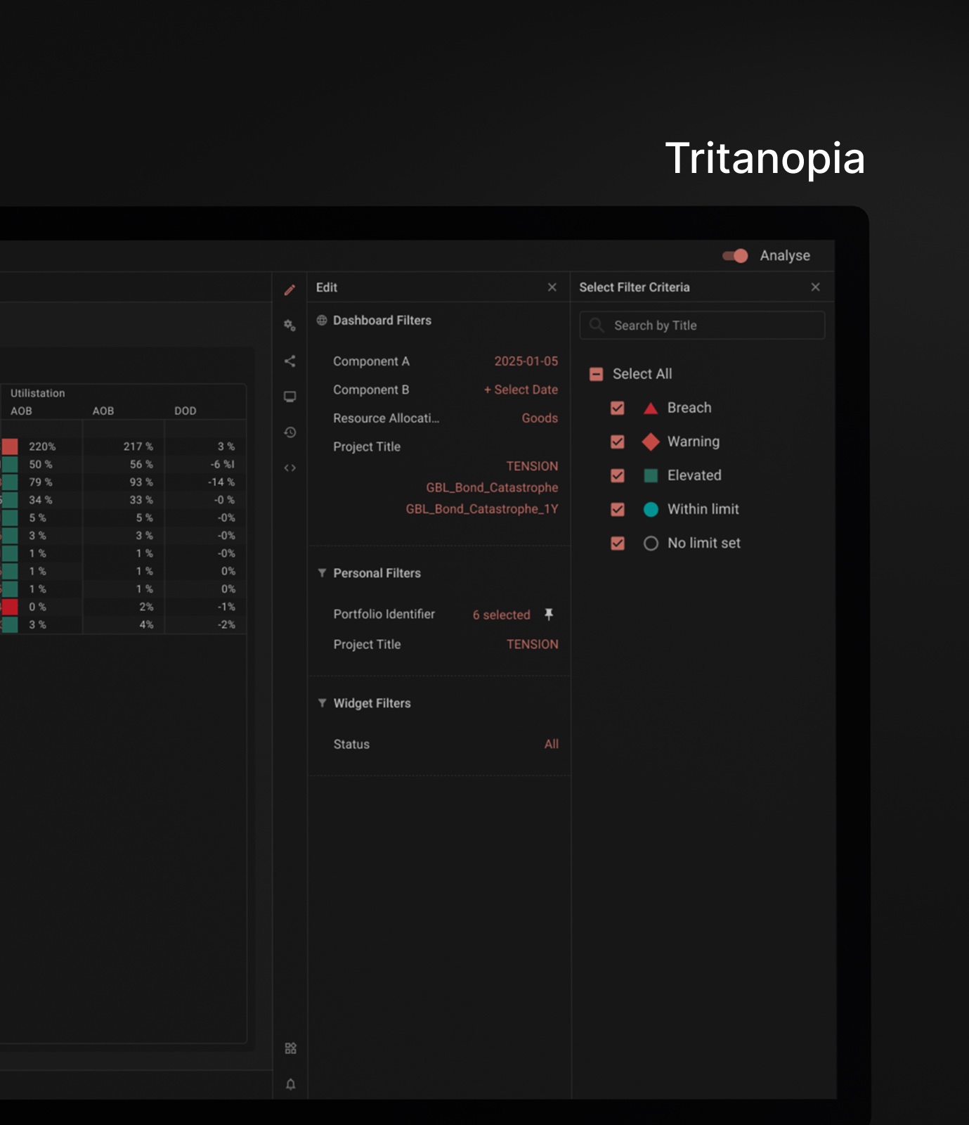
Every mode was rendered through simulations of colour vision deficiency. Three of these are audiences; the fourth is a stress test rather than a group of people.

Deuteranopia

The most common form

Removes exactly the red-green difference the grid was relying on.

Protanopia

The other red-green form

Red loses brightness as well as hue and sinks into a dark surface.

Tritanopia

The rarest of the three

The one form amber / blue does not solve — blue is what suffers.

Achromatopsia

About 1 in 30,000 · a test, not an audience

No colour at all. If status survives here, it survives everywhere.

Simulated, not audited

These are renderings, not a certification. No formal audit was run — but a palette that fails here fails for real.

The grid rendered through a deuteranopia simulation
Deuteranopia — the most common form of red-green deficiency. It removes exactly the difference the grid was relying on.
The grid rendered through a protanopia simulation
Protanopia. Red loses brightness as well as hue and sinks into a dark surface.
The grid rendered without colour as an achromatopsia stress test
Achromatopsia — the extreme case, used as a test, not as an audience. If status survives here, it survives everywhere.
The grid rendered through a tritanopia simulation
Tritanopia. Blue is the one that suffers, and amber/blue is not immune — which is why there are three modes and not one.

06

The interface covers the common cases, not the code

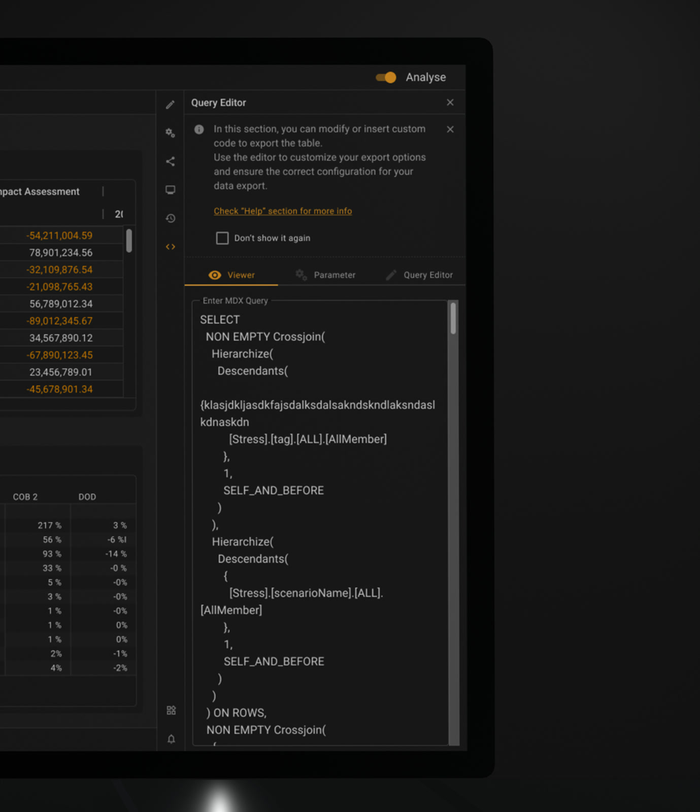
Everything in the platform — widgets, dashboards, filters — is a query underneath. It used to be written by hand, by admins and a small number of power users. The redesign moved the frequent combinations into the interface and left the query editor in place for everything else, one tab away rather than in another tool.

Between them sits a filter builder: when the value you need is not in the list, you compose the condition yourself without dropping to the query. Three rungs, and the interface never pretends the third one is unnecessary.

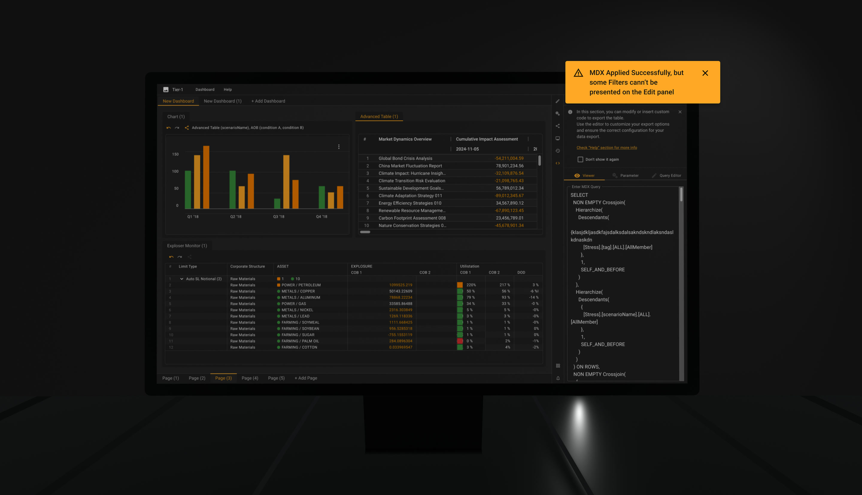
Where a hand-written query expresses something the panel cannot render, the interface says so — applied, but some filters cannot be presented on the edit panel — instead of silently showing an incomplete picture. A panel that quietly omits what it cannot draw is worse than no panel.

Considered instead

Hiding the query layer entirely. It would have made the product look finished and taken the ceiling off the people who use it hardest.

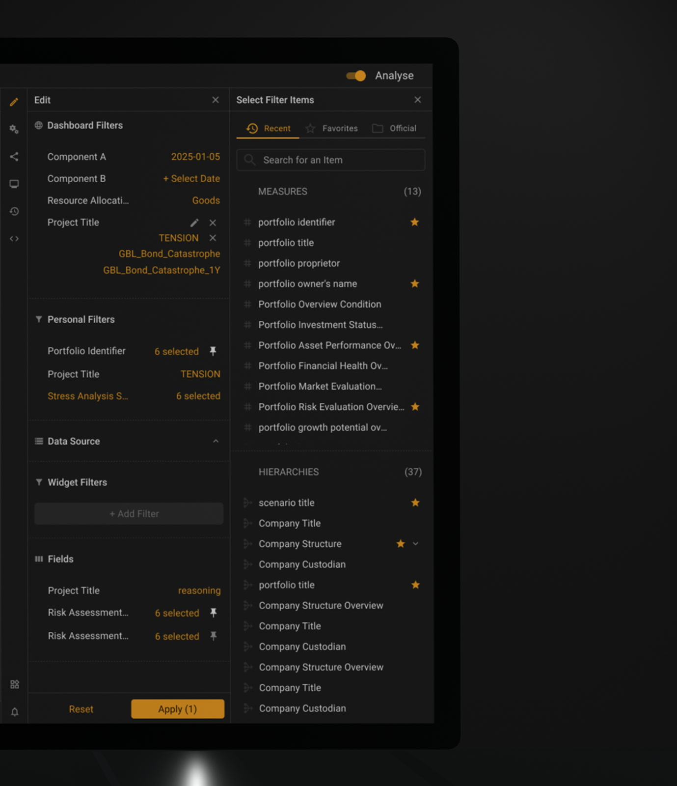
Searchable filter picker with frequently used filters kept to hand
First you pick the filter itself. Searchable, with the ones you reach for every morning kept to hand.
Filter builder picking criteria from a list, with an invert-selection control
Then its criteria — pick them from the list, invert the selection, or write the condition yourself. All of it without leaving the panel.
Query editor open in a tab beside the table it rewrites
And when even that is not enough, the query is one tab away, not another tool.
Notice that some applied filters cannot be shown on the edit panel
Where the panel cannot draw what the query says, it says so instead of showing half a picture.

07

Multi-level drill-in through saved filter pathsRequested by users

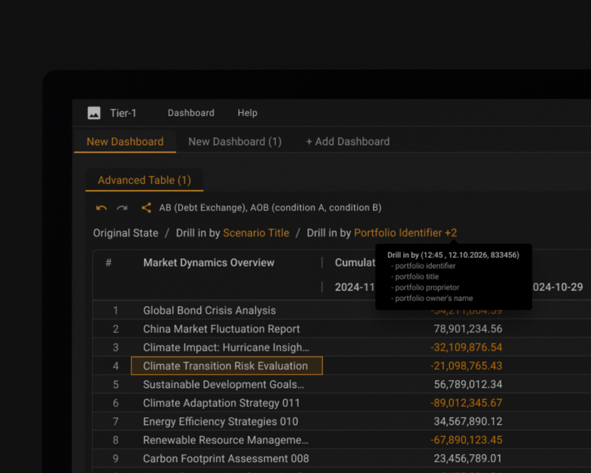
Users bookmark filter combinations, then drill through them: each saved filter becomes a step in the path. A drill-in stops being something you reconstruct by hand and becomes something you can name, repeat and hand to a colleague.

Considered instead

Free-form drill only. Fast the first time, unrepeatable the fifth, and impossible to compare across days.

Drill path assembled from drill-ins by field, each step a breadcrumb
A drill-in you can name, repeat and hand to a colleague.
Each step is a bookmark, so the path can be walked in both directions.

08

A grid that stays dense, and explains itself

The Advanced Table is where the work actually happens. Pivot and tabular modes, drill in by any dimension, dense rows sized so a full book fits on one screen, and explicit progress states for queries that take real time to come back — a risk analyst should never wonder whether the screen is thinking or broken.

Drilling in rewrites the table, so every drill leaves a breadcrumb: Original State / Drill in by Scenario Title. One click back, always.

The part that mattered most sits in the right-click menu. «Why did this number move since yesterday» is asked constantly, and the honest answer used to live in a different report. Now Drill in by Insights → Active & Passive Drivers splits the change into what the desk did and what the market did — one click from the cell, without losing the table you were reading.

Considered instead

A separate attribution report. Cleaner to build, and it moves the answer one navigation away from the question — which is exactly how the old workflow lost people.

Cell context menu offering a drill-in by active and passive drivers
Why the number moved since yesterday — one click from the number, not one report away.

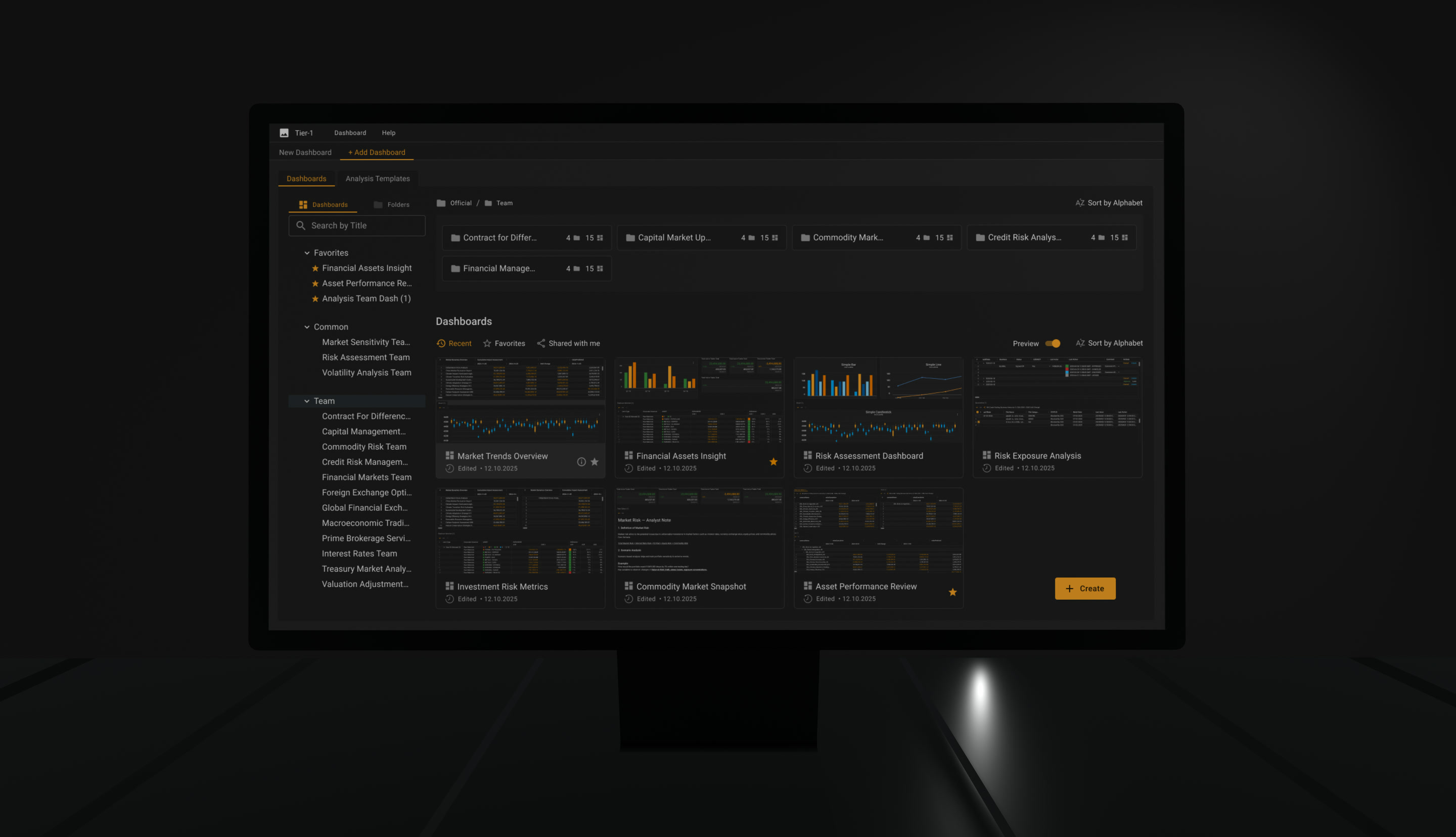
Landing Page

Four smaller decisions that share one screen: what the home page is for, what a card tells you before you open it, how search identifies a destination, and what happens when the thing you found is not yours.

Landing page built from folder and dashboard cards, beside a folder tree
The landing page in full. The three frames below take it apart.
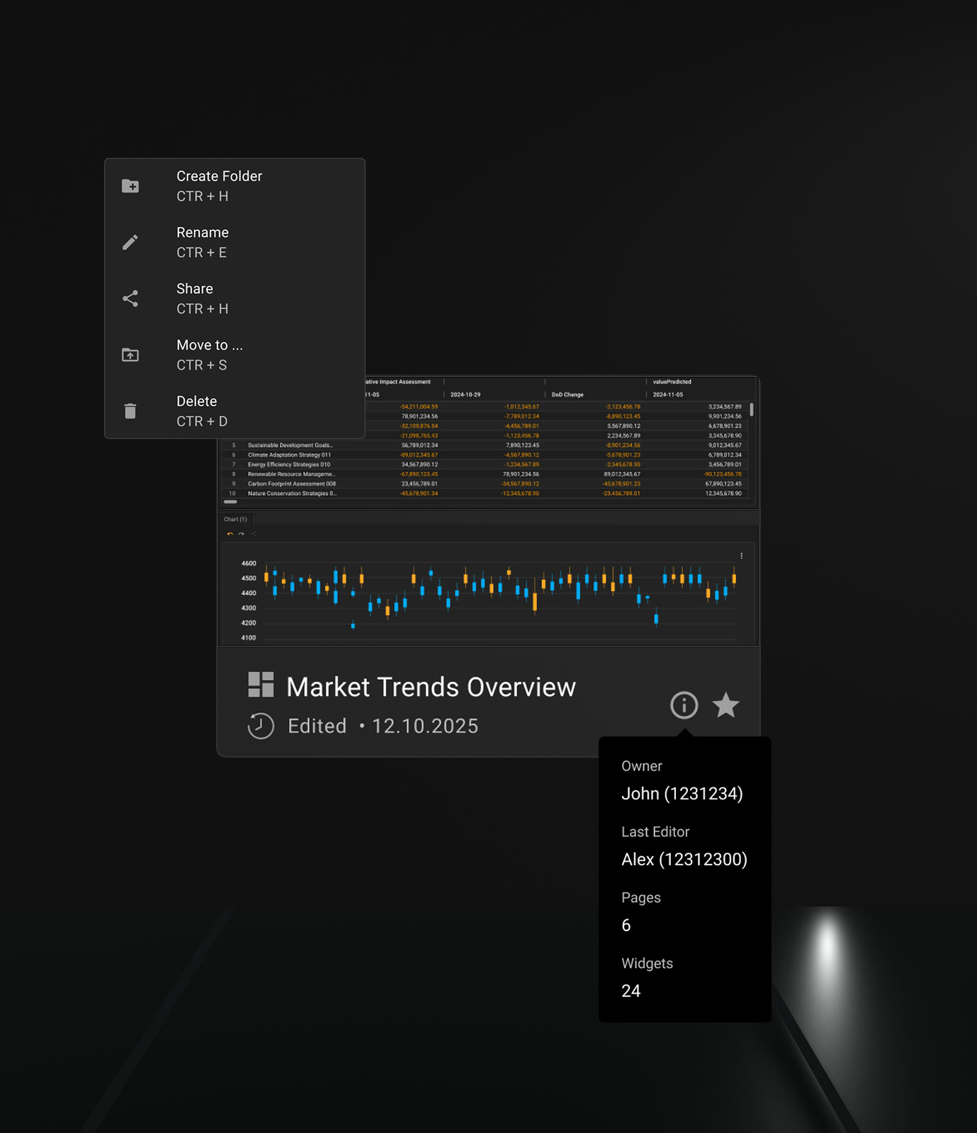
Dashboard card showing owner, last edit and size before it is opened
A card says who owns it, who edited it last and how big it is — before anyone opens it.
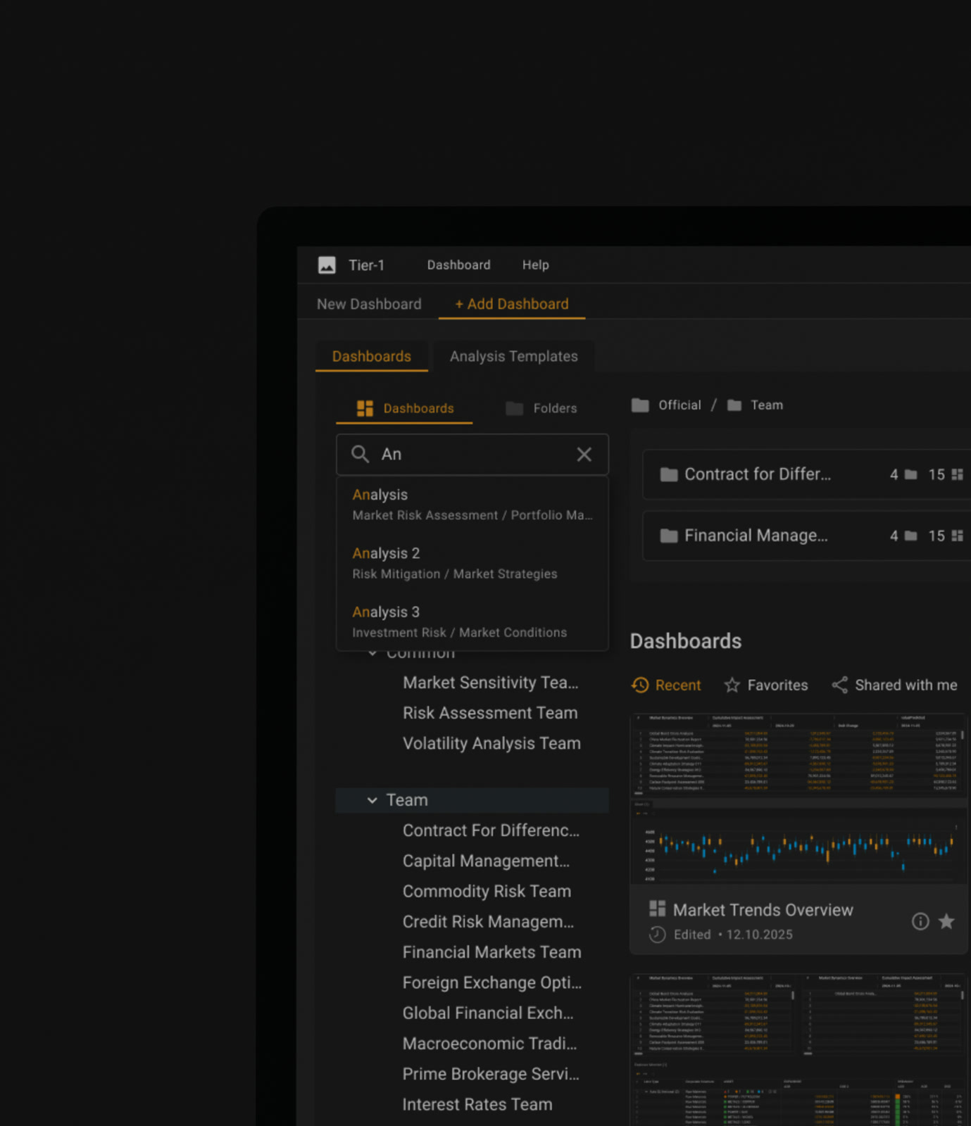
Search results carrying the full path to each destination
Search returns the path, not just the name. Ten dashboards share a name and nothing else.
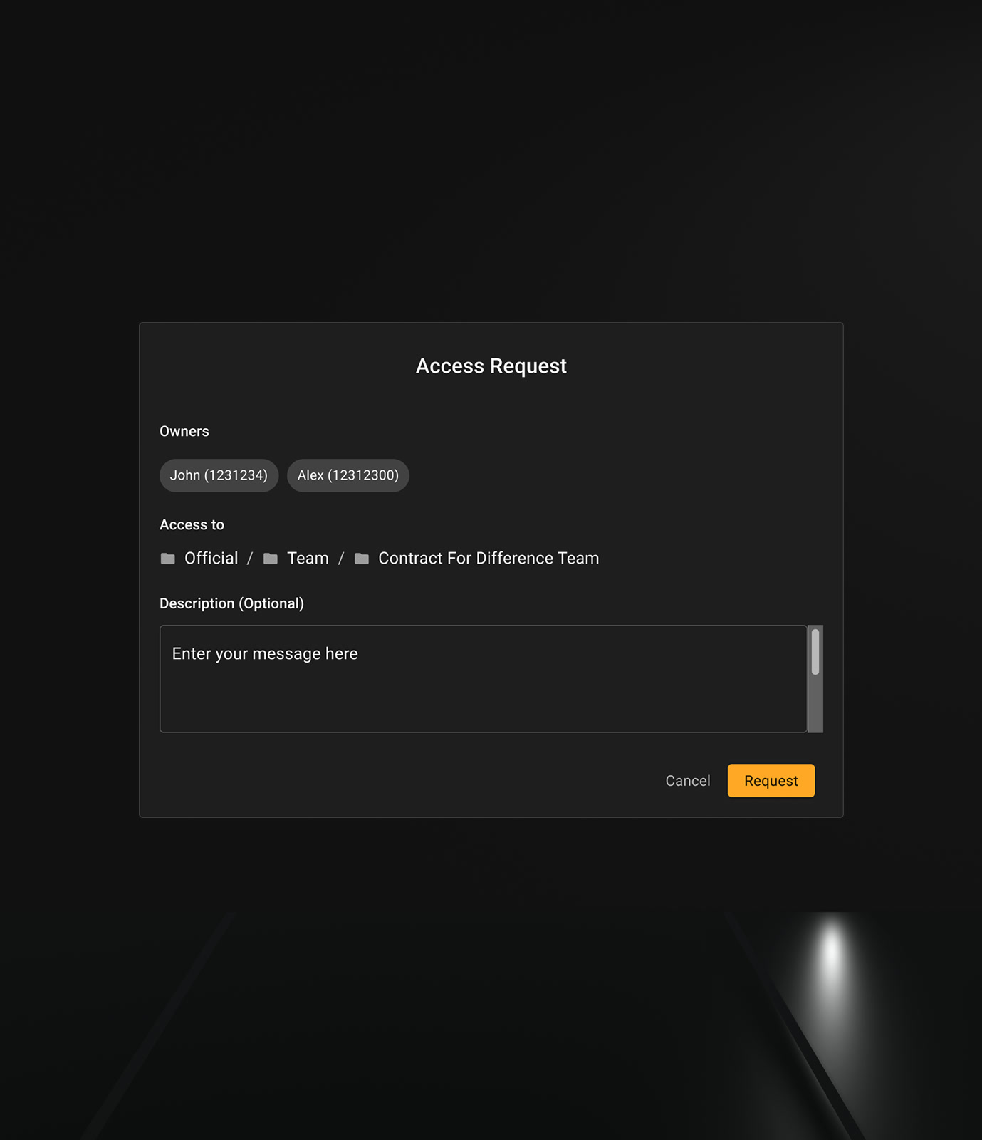
Request for access to an object owned by someone else, addressed by name
The thing you found is not always yours. The request goes to the people who own it, by name.

The systems layer

Three foundations live at once: Material 3, AG Grid, and the bank's own library. Not a stack — three peers with overlapping opinions about the same control.

The governing requirement was to stay as close to Material as the product allowed and deviate only where the deviation could be defended: a density the default could not hold, a state the default had no concept for, a meaning the palette had no slot for. Preference was not a reason. That constraint is harder than it sounds, because the instinct in this job is to design something, and here the correct answer was usually to use what already existed and write down why.

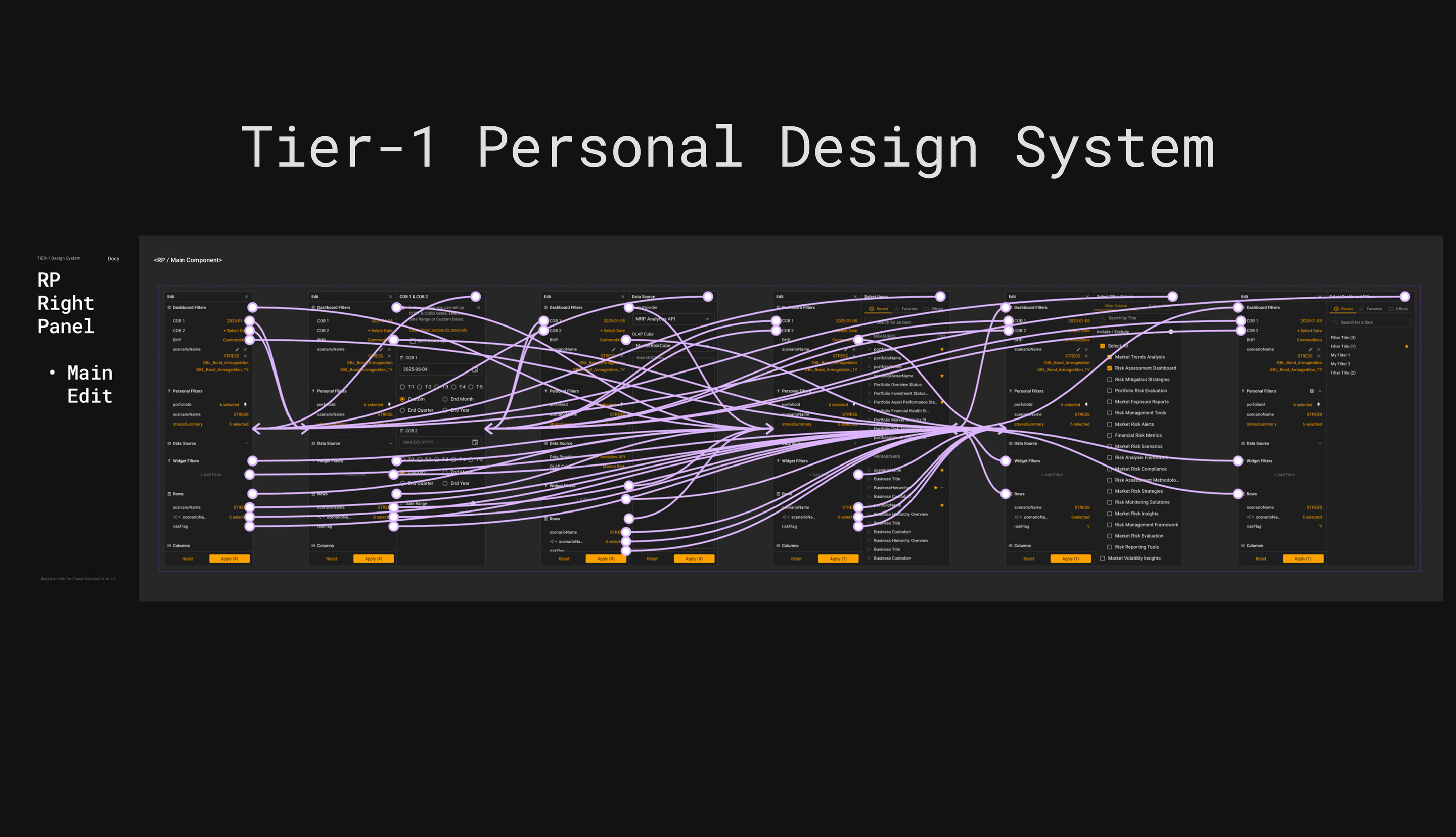
What is left is a library where Material supplies the grammar, AG Grid supplies the behaviour of the table, and the bank's own components exist only where those two leave a gap. The largest of those gaps is the right panel: Material has components, and this product needed an assembly — one object holding filters, subscriptions, presets, date logic and column setup, with its own rules about what may be open at once.

Considered instead

Normalising everything to one system. Tidy library, and a table that fights its own engine.

Component sheet: the side panel in every state and the routes between them
One component, every state it can be in, and every route between them. The right panel is where Material stops having an answer.
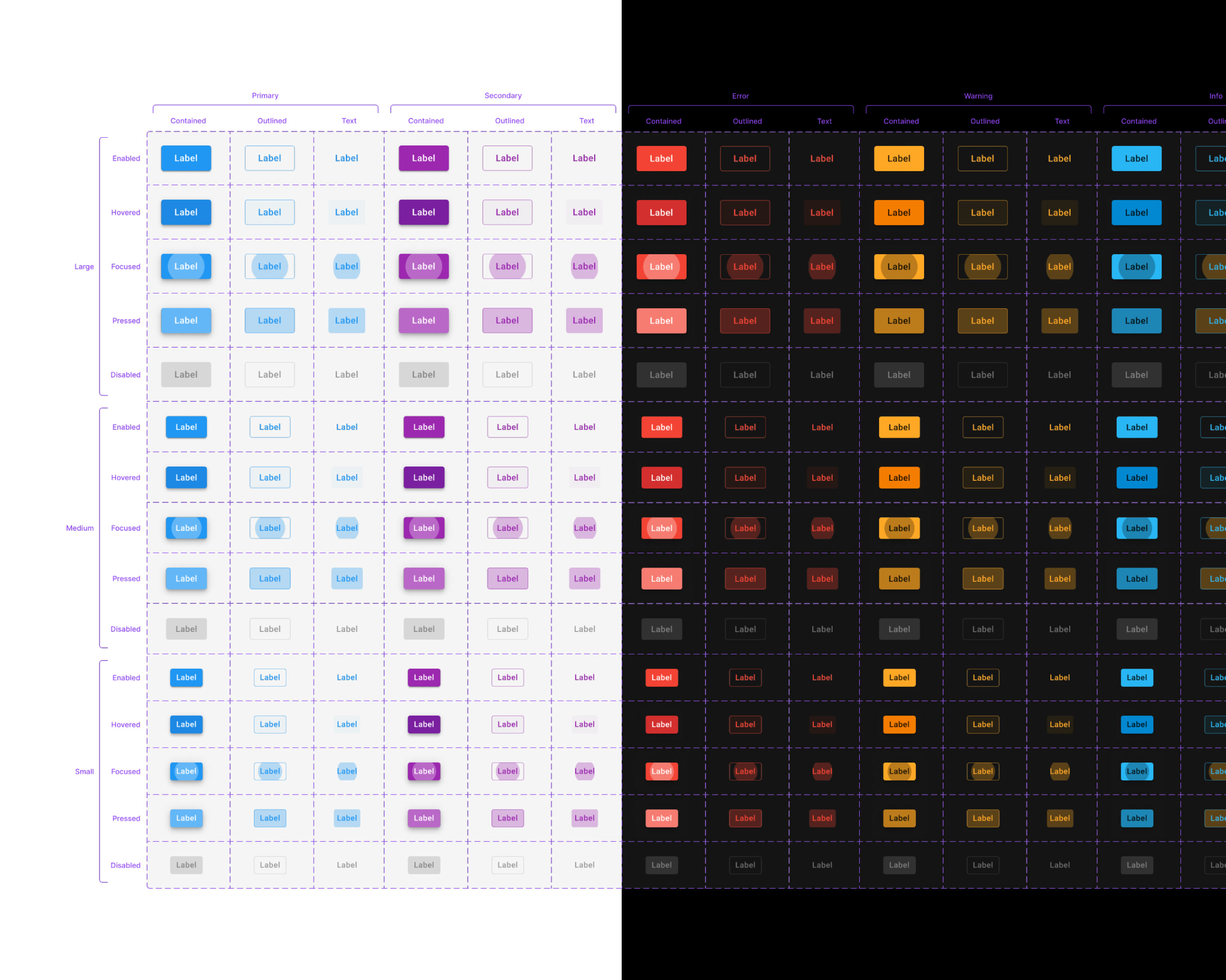
Button matrix inherited from Material: families, emphases and states
Material inherited whole: the families, the emphases, the states. Nothing here was redesigned because nothing here needed to be.
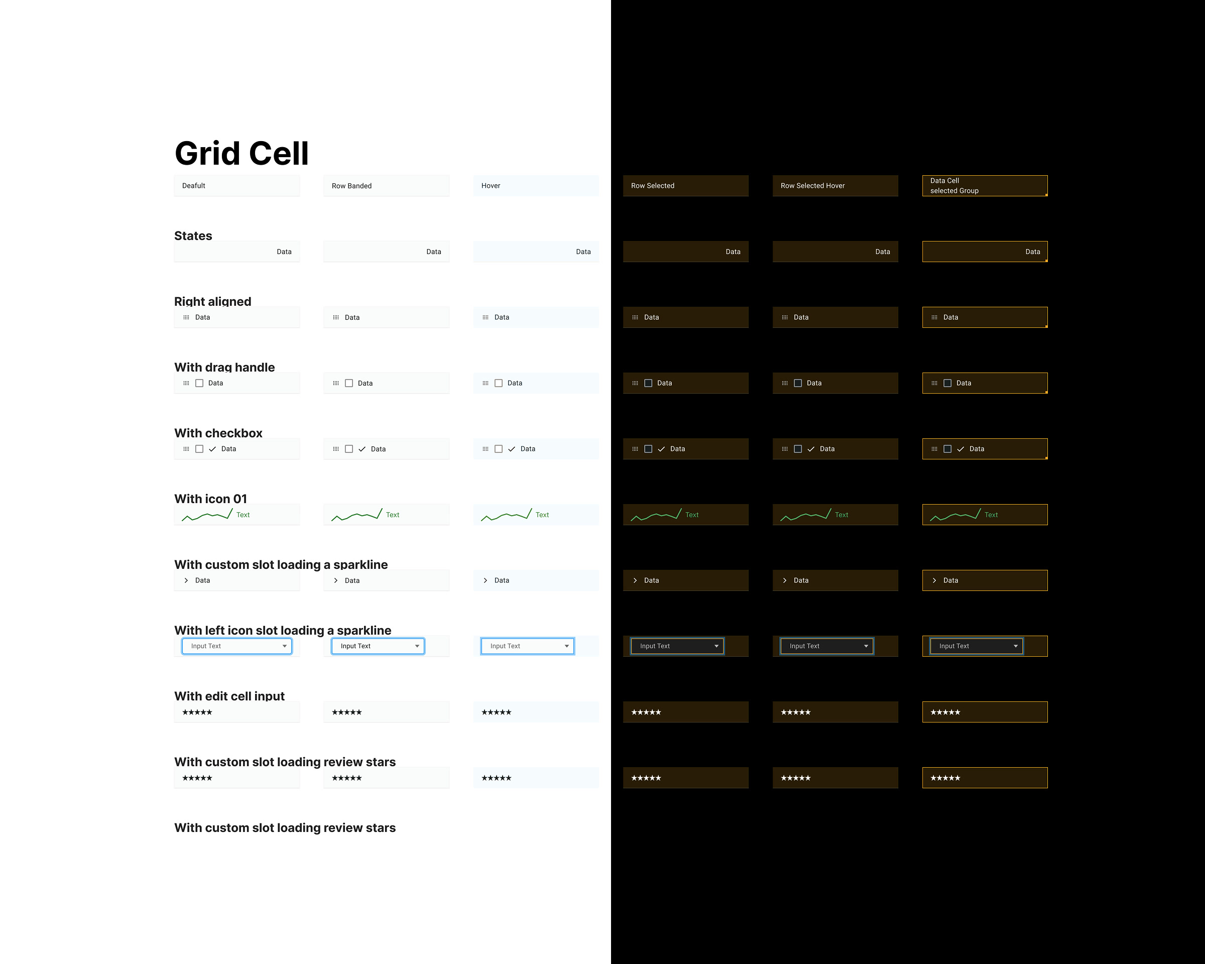
Grid cell matrix: every content type across six row states, split between themes
The cell is where AG Grid wins. Every content type still has to hold six row states, in both themes.

What I'd validate next

  • Whether user-defined cell colours should be constrained, warned about, or left alone. Constraining them protects readability and takes away something people use.
  • Which colour mode people actually keep. If Accessible is chosen by users without a colour vision deficiency simply because amber and blue are easier to read on a dark screen, it is not an accessibility mode — it is the better default, and the ordering of the three should change.
  • Whether users keep the right panel open or collapse it by reflex. If they collapse it, the trade that keeps data on screen was decided in the wrong direction, and the panel needs to earn its width differently.
  • Whether provenance labels survive contact with users who have twenty filters active, not five.
  • Whether IDEAS get created by users or only consumed from a central set — that is the difference between a template feature and a knowledge-sharing one.
  • Whether Session History is used as reversal, or mostly as an audit trail — those imply different designs.
  • Which of these patterns reach production unchanged. Several are directions, not shipped features, and I would rather say so than imply otherwise.