Own product · iOS and Android · 2024 — present

Quify: an app for quitting that adapts instead of counting

An app that helps people quit harmful habits through personalised tracking, real-time insights and medically backed recommendations, with articles, exercises and music tailored to the person doing the quitting. Everything a user would touch — the plan, the tracker, the feed, the rewards, the visual language — had to be designed before any of it existed.

One dark surface, one accent, one shape that carries the product through every screen.
Product
Quify — own product, iOS and Android, live on the App Store
Period
2024 — present · 24 sprints to first build
Role
Research, UX, UI, prototyping, design system
Team
Four people: product owner, fullstack developer, designer, illustrator/animator
Scope
Onboarding, habit tracking, AI feed, AI chat, exercises and audio, gamification, profile, tablet and watch
Tools
Figma · FigJam · Maze · Cinema4D · Spline3D · After Effects

A note on the name. Quify is my own product. The screens on this page are the 2024 design files, drawn while it was called Purly; it shipped as Quify. The app has moved on since — the current version is on the App Store.

Everything in the category counts. Almost nothing adapts. A counter tells you how many days it has been; it does not know what happened on day four, what the evening looks like, or what a reward is worth to the person earning it. The work was to decide what the product knows about a person, and only then to draw it.

The brief

A modern surface, and a schedule that had to hold it

The task was a modern design: a colour palette and a typography set chosen deliberately, not assembled from defaults, and a visual element strong enough to carry immersion across an app that people open on their worst evenings.

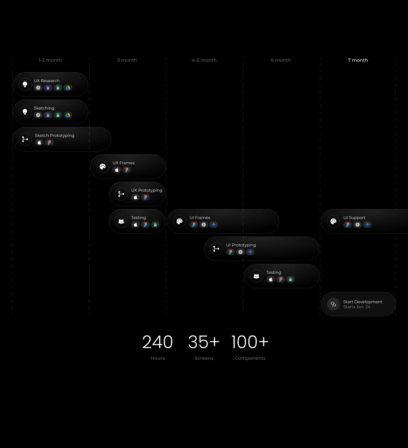
The schedule was fixed at twenty-four sprints, and the scope underneath it was not small. Research and sketching ran first, UI frames and prototyping overlapped in the middle, testing ran alongside both, and design support continued into the development start.

(Sprints)

24

(Hours)

240

(Screens)

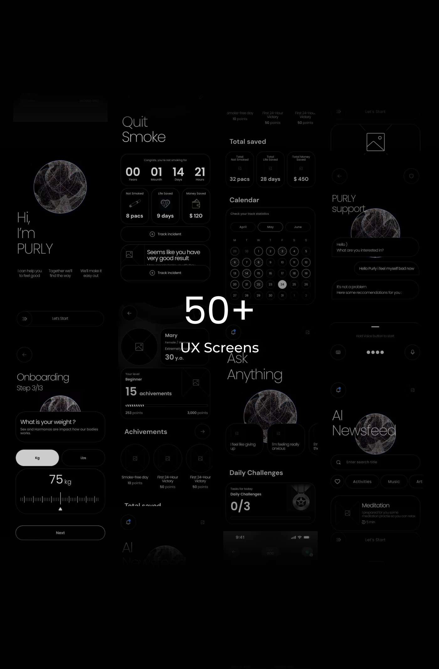
50+

(Components)

100+

Project timeline across seven months: research, sketching, UI frames, prototyping, testing and design support.
Seven months, four tracks, and testing running beside the drawing rather than after it.

What the research came back with

  1. 01

    Five apps in the category, read against the same four questions. Every one of them counted well. None of them changed what it said on day four. That gap is the product.

  2. 02

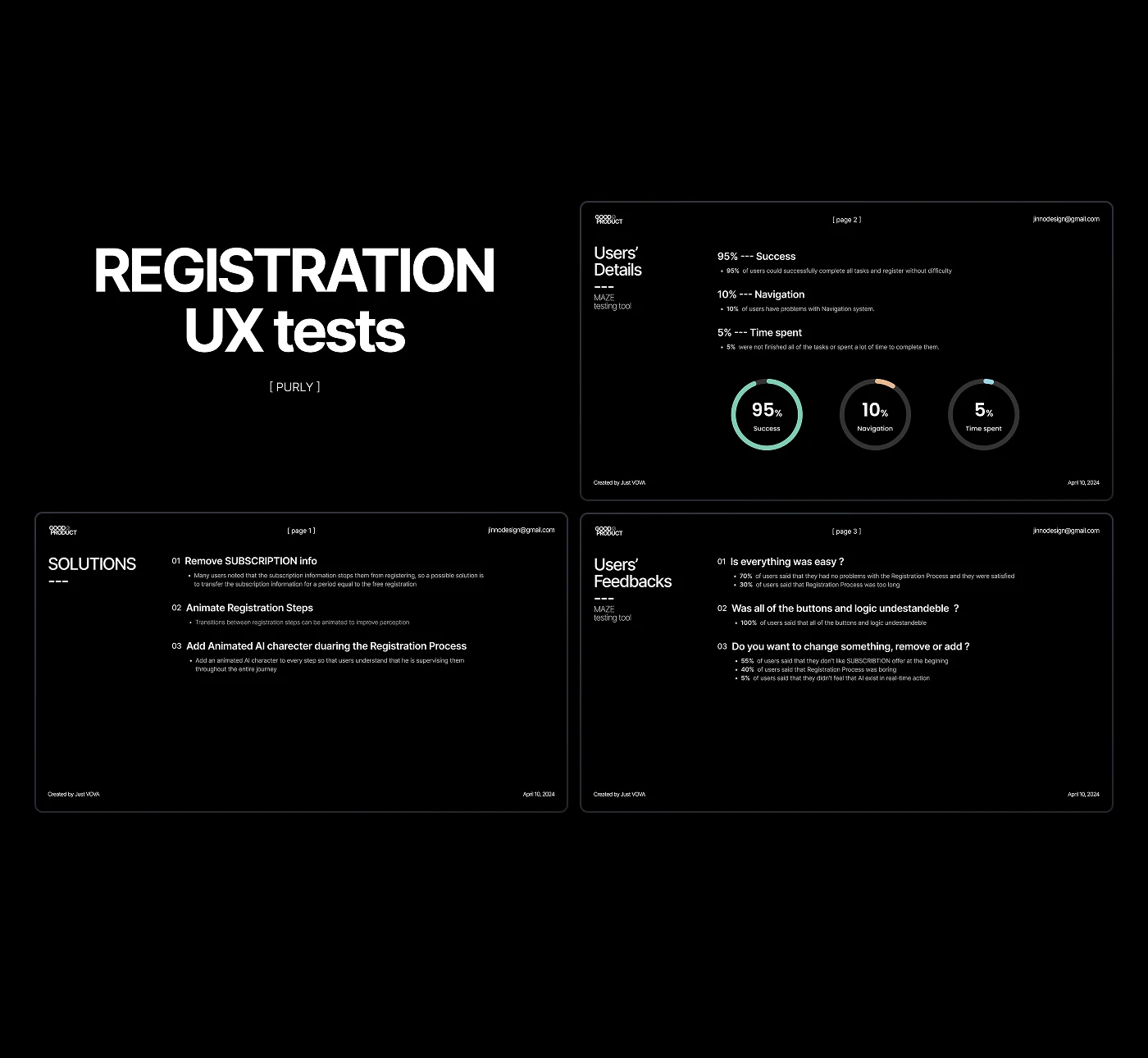
    Wireframe-stage testing on the sign-up flow: 95% got through, but the subscription step was where they stopped reading. It came out entirely.

  3. 03

    Participants were split before the session rather than after: people who had never seen the app, people who knew the pattern, and people with the skills to break it deliberately.

  4. 04

    Two directions, ten people, twenty-plus screens validated against them. Choosing here is what kept the palette from being re-argued in sprint sixteen.

  5. 05

    The ladder was built so that everything on it is reachable inside two years. That single constraint decides the levels, the point values and where the trophies sit.

Every section below opens with the finding it answers.

Movement I

The surface

01

One type family, one generated shape, one accent

Poppins carries the whole product. It is a geometric family with enough character to stay distinctive, simple but not plain, modern with a faint retro undertone — which is what let a dark, clinical subject read as calm rather than cold. Three sizes do the work: 63, 48 and 16.

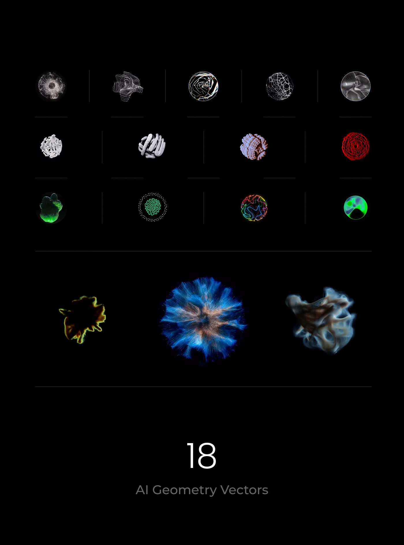
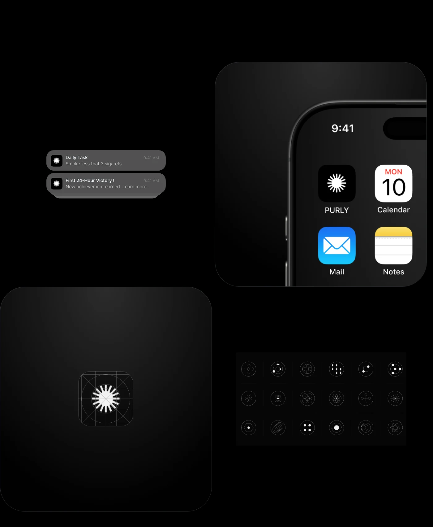
The one decorative element is a generated geometric form, drawn out into eighteen variants so the product has something of its own on every surface without repeating a single illustration. It becomes the app icon, the assistant, the empty states and the accent inside cards.
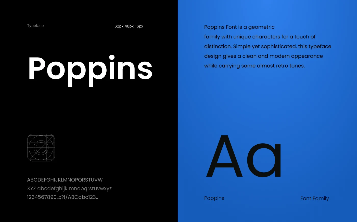
Poppins type specimen with the sizes used and the full character set.
Poppins at 63, 48 and 16. Geometric, distinctive, and warm enough for the subject.
The app icon on a home screen, the notification style and the icon set.
The same shape on the home screen, in the notifications and across the icon set.
Eighteen variants of the generated geometric form in monochrome and colour.
Eighteen variants of one generated form. No illustration is used twice.
More than fifty UX screens laid out together: onboarding, tracking, achievements, chat and feed.
Fifty-plus screens, and one grammar holding them together.

Movement II

Getting in

02

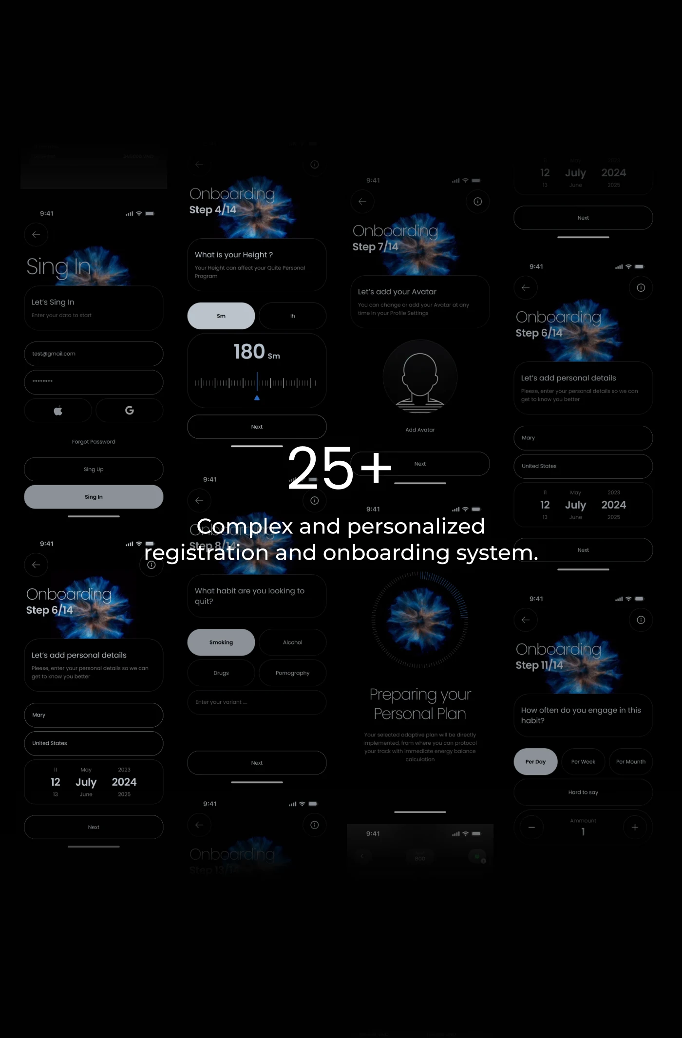
A registration and onboarding system of 25+ screens

Nothing about a personal plan can be personal if the product does not ask. ONBOARDING is the longest single flow in the app: sign-in, then a stepped questionnaire that collects the habit, the pattern of use, the physical baseline, the avatar and the personal details the plan is built from. The subscription step that testing removed used to sit here, four screens in.

The length is deliberate and the cost of it is paid in pacing. Each step carries one question and a progress marker, the input is the largest object on the screen, and the flow ends on a screen that says the plan is being prepared rather than dropping the person into an empty home.

A grid of onboarding screens: sign-in, stepped questions, weight input, habit choice, personal details and the plan being prepared.
One question per step, a marker that says how far along it is, and no empty landing at the end.
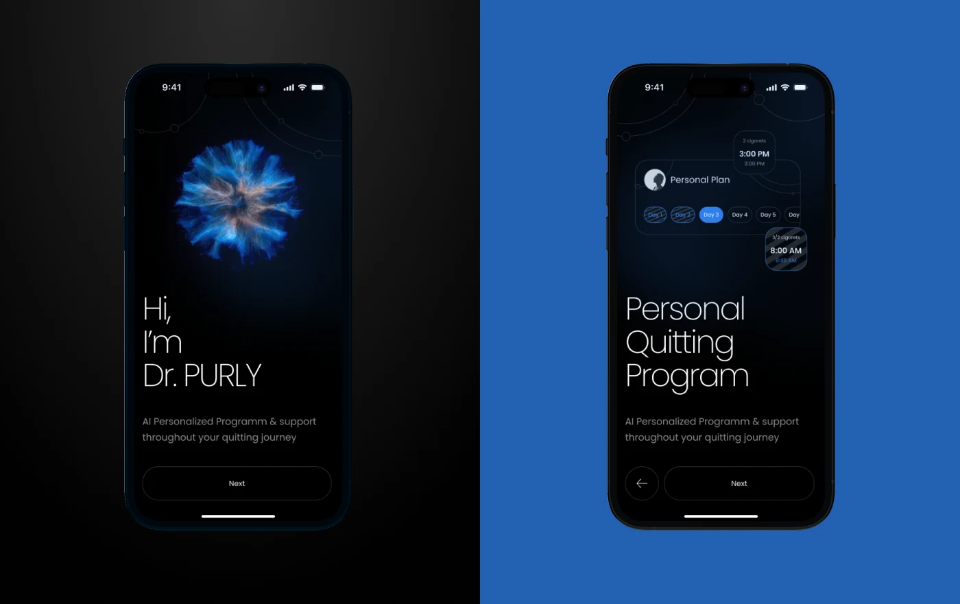
Two screens: the assistant introducing itself, and the personal quitting programme with a time selector.
The assistant introduces itself before it asks for anything, and the plan comes out with a schedule attached.

03

A main page with the tab bar taken out

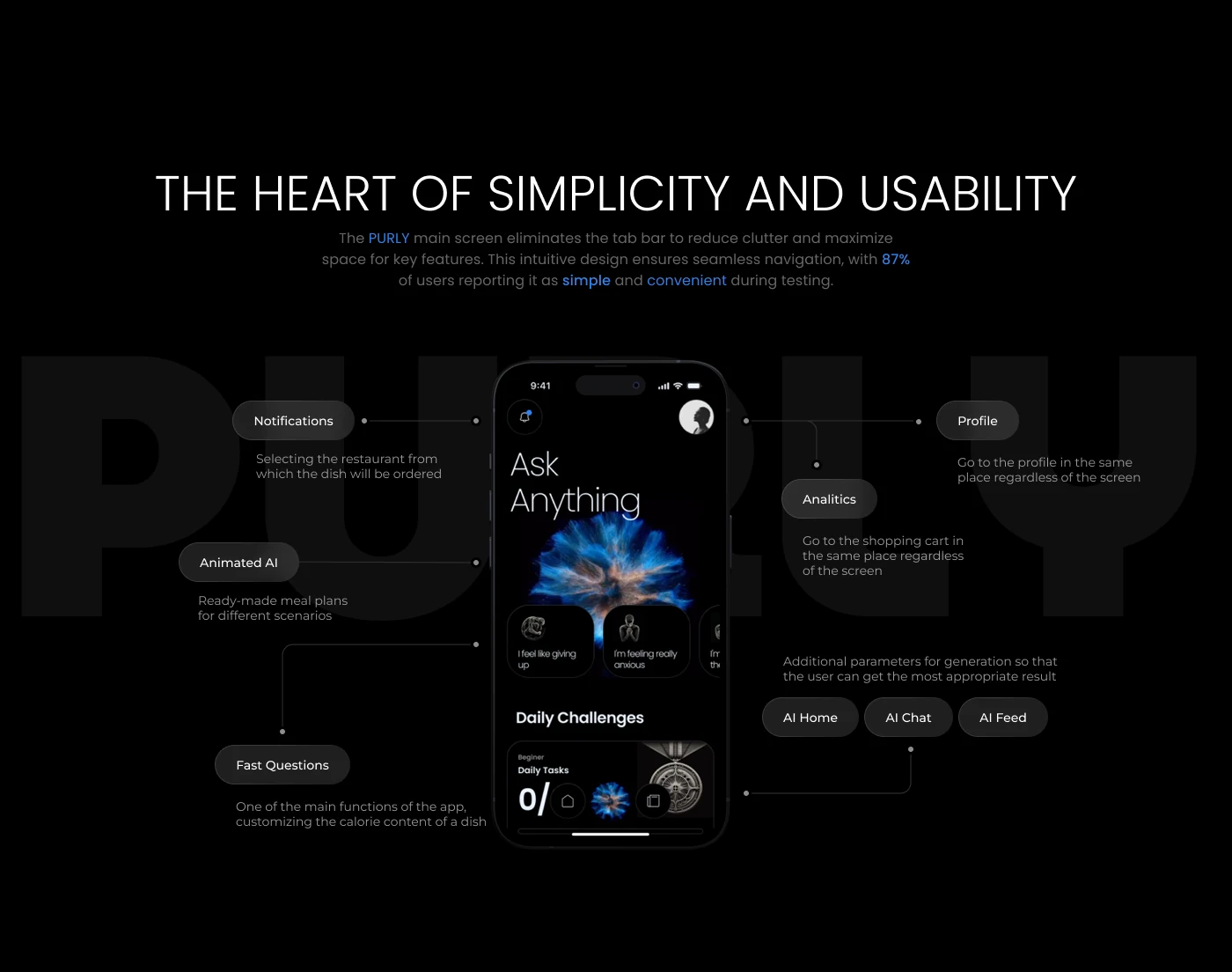
The home screen shows what is tracked in real time and only what is relevant right now: the current state, the daily challenges, the two questions the person is most likely to ask next. Everything else is one step away rather than permanently on screen.

The tab bar was removed to cut clutter and give the key features the whole surface. Notifications, the animated assistant, fast questions, the profile and the analytics all live in the same place regardless of the screen, so navigation stays in one grammar. In prototype testing, 87% of users described it as simple and convenient.

What it cost

Removing the tab bar removes the map with it. Nothing on screen tells a first-time user how many sections exist, and the onboarding has to carry that knowledge instead — which is part of why it runs as long as it does.

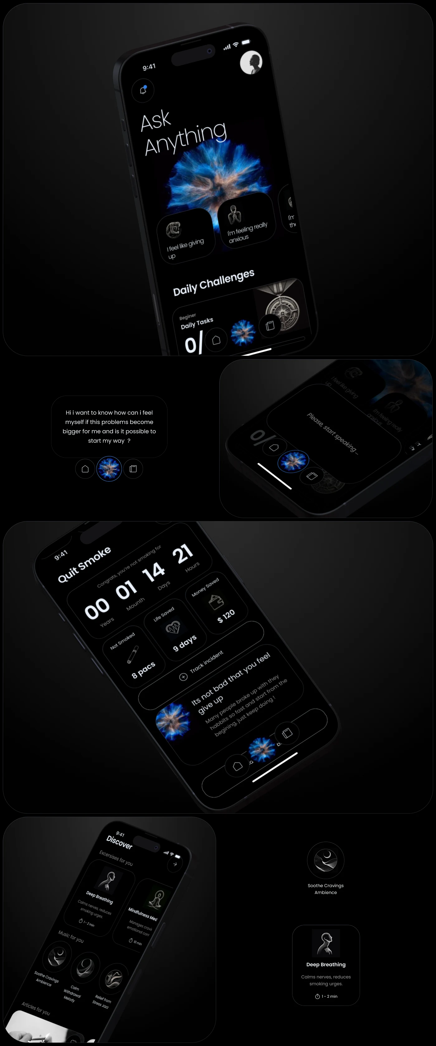
The main screen with daily challenges, the quit-smoking counter with its tiles, and the discover row.
The state, the day's challenges, and the two questions most likely to come next.
The main screen annotated with its five permanent controls: notifications, animated assistant, fast questions, profile and analytics.
Five things stay in the same place on every screen. Everything else moves.

Movement III

The daily loop

04

A tracker that keeps the history, not just the number

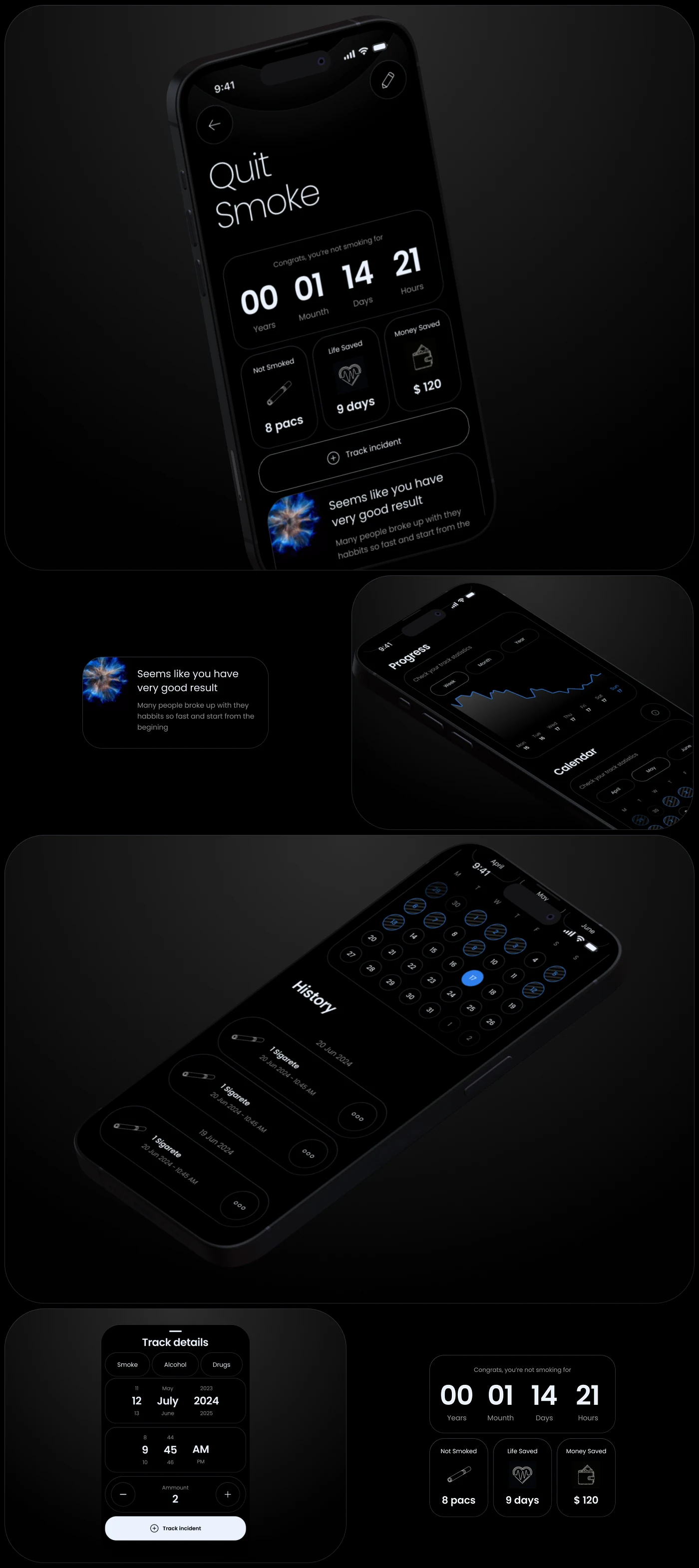
The TRACKER holds the whole record of the habit and lets a person read it back: the running count since the start, the tiles for what has been avoided and saved, the incident log with time and quantity, the progress curve and the calendar.

Logging a slip is a first-class action, not an admission tucked away in settings — the button sits directly under the counter. Advice is generated against the record rather than the calendar, so what the app says after a bad week is about that week.

The habit screen with a running counter and tiles, the history list, the progress curve, the calendar and the incident form.
Count, tiles, history, curve, calendar — and a way to write down the bad evening.

05

A feed curated against the habit, not against attention

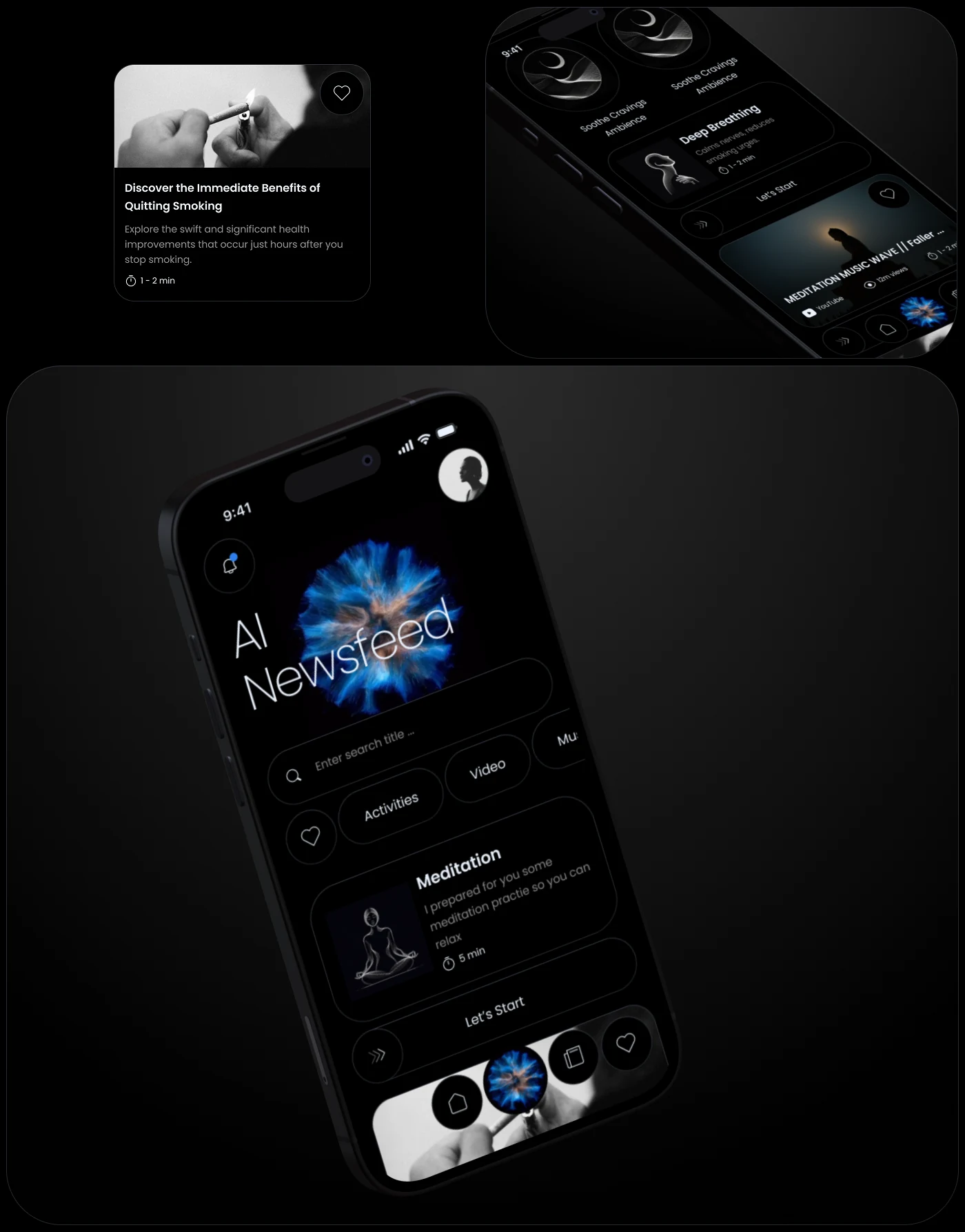
The AI FEED assembles a personal stream of articles, video, music and exercises tied to the specific habit being quit. Search and four filters sit above it, so a person who knows what they want does not have to scroll for it.

Every card states its type and its length before it is opened — a two-minute read, a fifteen-minute session — because the whole point is to be useful inside a window that is measured in minutes.

The AI feed with search, four filters and cards for meditation, video, music and articles.
Type and length on the card, before anyone commits to opening it.

06

A chat that answers at two in the morning

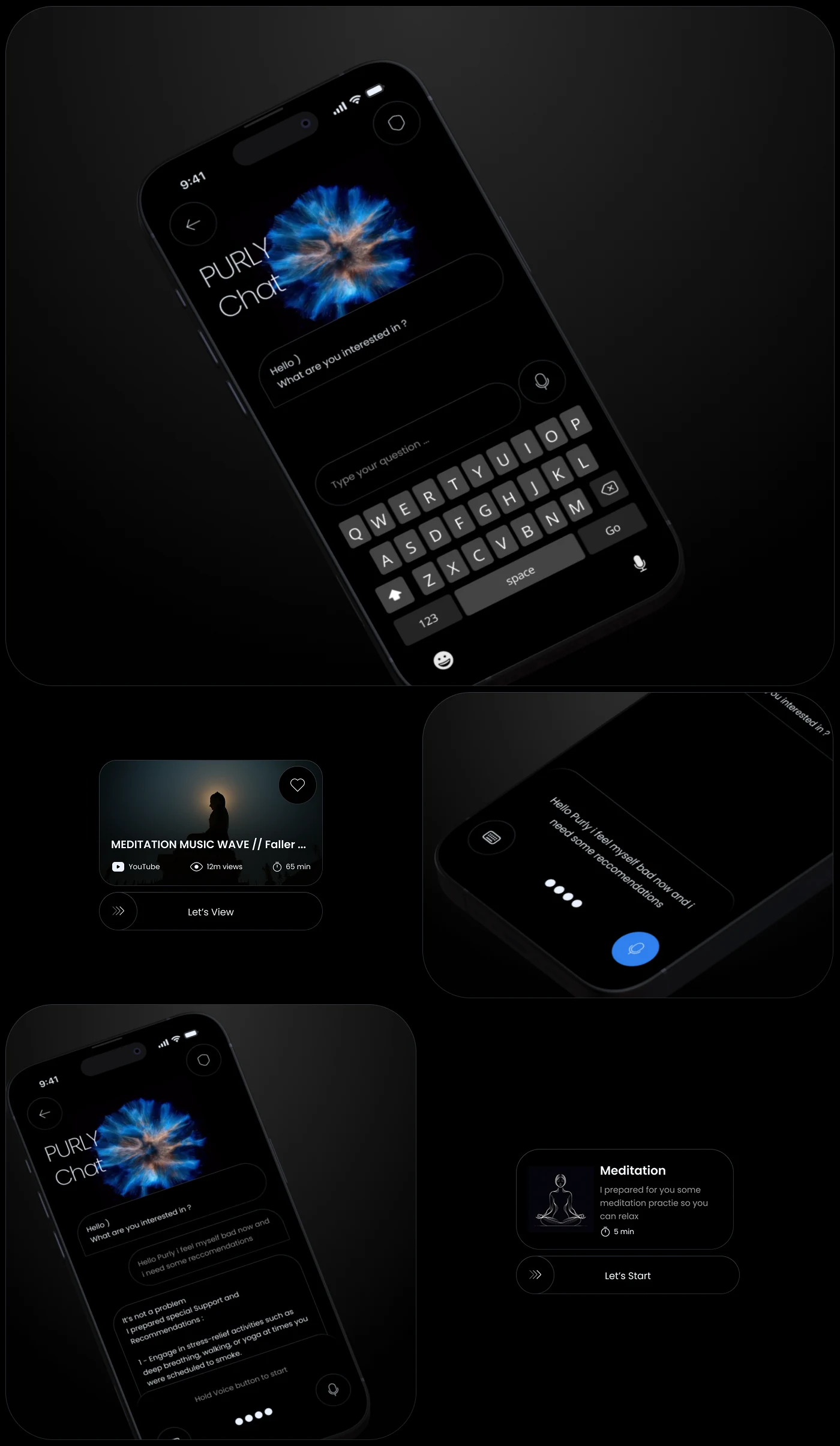
Cravings do not keep office hours, and the chat exists for the hours when nobody else is available. A person asks in their own words and gets a personalised answer back, with the option to be handed straight into an exercise or a track rather than another wall of text.

The assistant is the only animated object in the product, and it animates while it is thinking. That is the whole reason it exists as a shape rather than a label: waiting for an answer is the moment the product feels most like nothing is happening.

The chat screen with the keyboard open, the thinking state, and a card offering a meditation.
Ask in your own words; get handed an exercise, not another article.
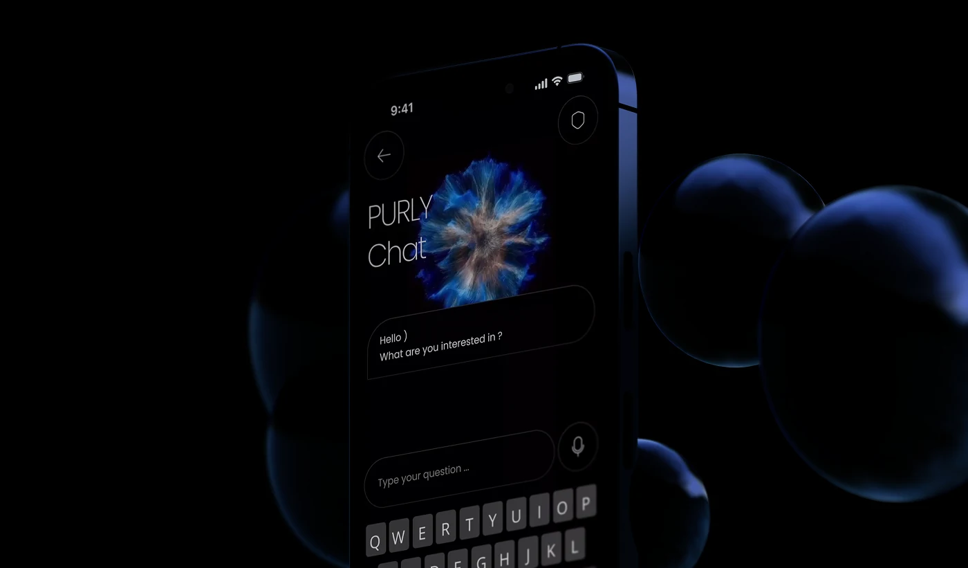
A render of the chat screen on a phone in the dark.
The assistant is the only thing on the surface that moves.

07

Exercises, music and articles built on medical analytics

The system offers exercises and music designed against medical analytics rather than assembled by taste, and articles drawn from medical research and tailored to the individual. This is the layer that answers the three minutes an urge actually lasts.

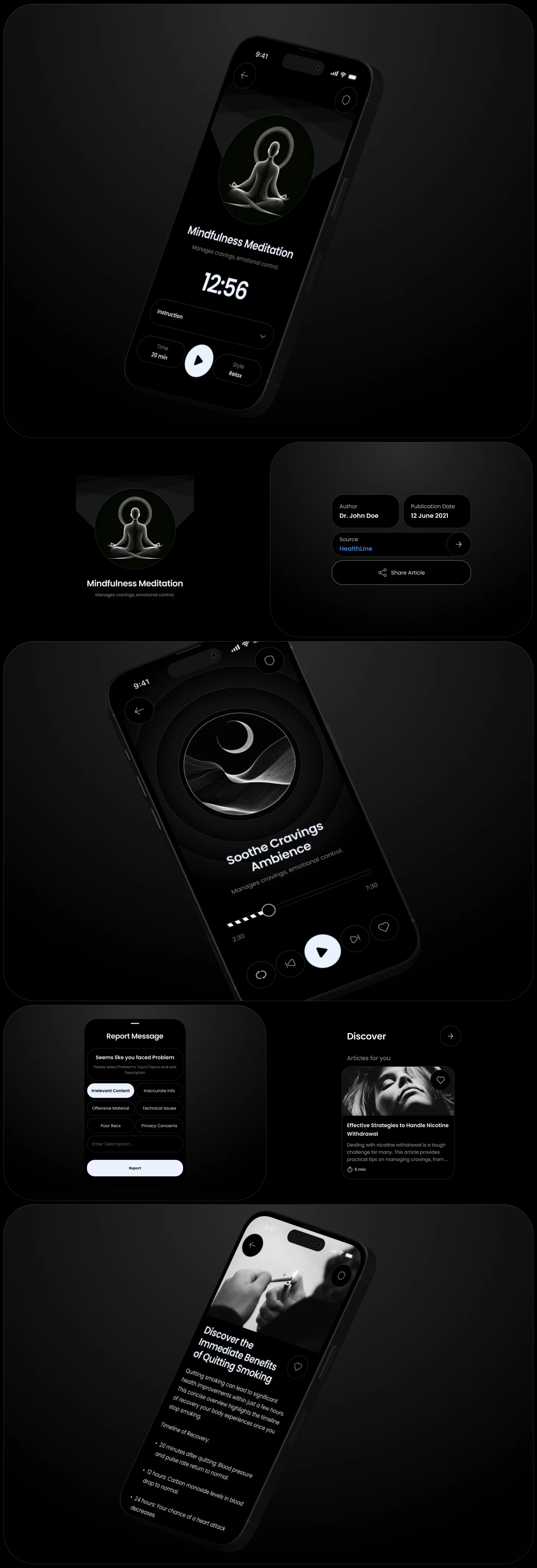
Every article carries its author, its publication date and its source, reachable from the article itself. A claim about what happens to a body twenty minutes after the last cigarette is either sourced or it is decoration, and the reporting control sits on the same screen for the case where it is neither.

A meditation player, an ambience track, the source card naming author, publication date and source, and an article about quitting.
Author, publication date, source. The claim travels with where it came from.

08

A reward ladder that ends inside two years

The gamification system is built so that every reward in it is reachable within two years. That single constraint decides the shape of the whole ladder: the levels, the point values, and where the trophies sit.

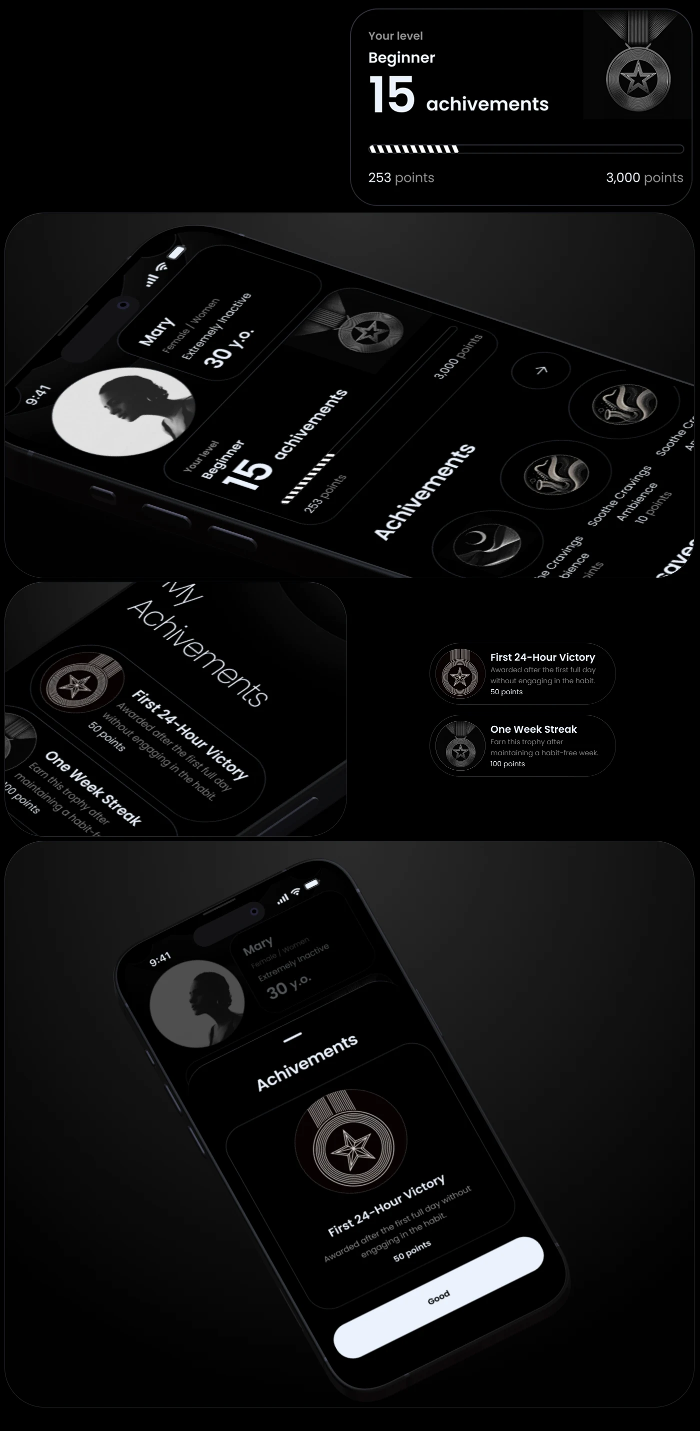
Levels are named rather than numbered, progress is shown as a filled bar against the next threshold, and the first trophy lands after twenty-four hours — the first interval in which quitting anything is genuinely difficult.

What it cost

A ceiling means the ladder runs out. Someone still in the app after two years has nothing left to earn, and the design has no answer for that person yet.

The level card with points against a threshold, the achievements row, and the first twenty-four-hour trophy.
Named levels, a bar against the next threshold, and a first trophy at twenty-four hours.

Movement IV

Looking back

09

A profile that answers «what has this actually got me»

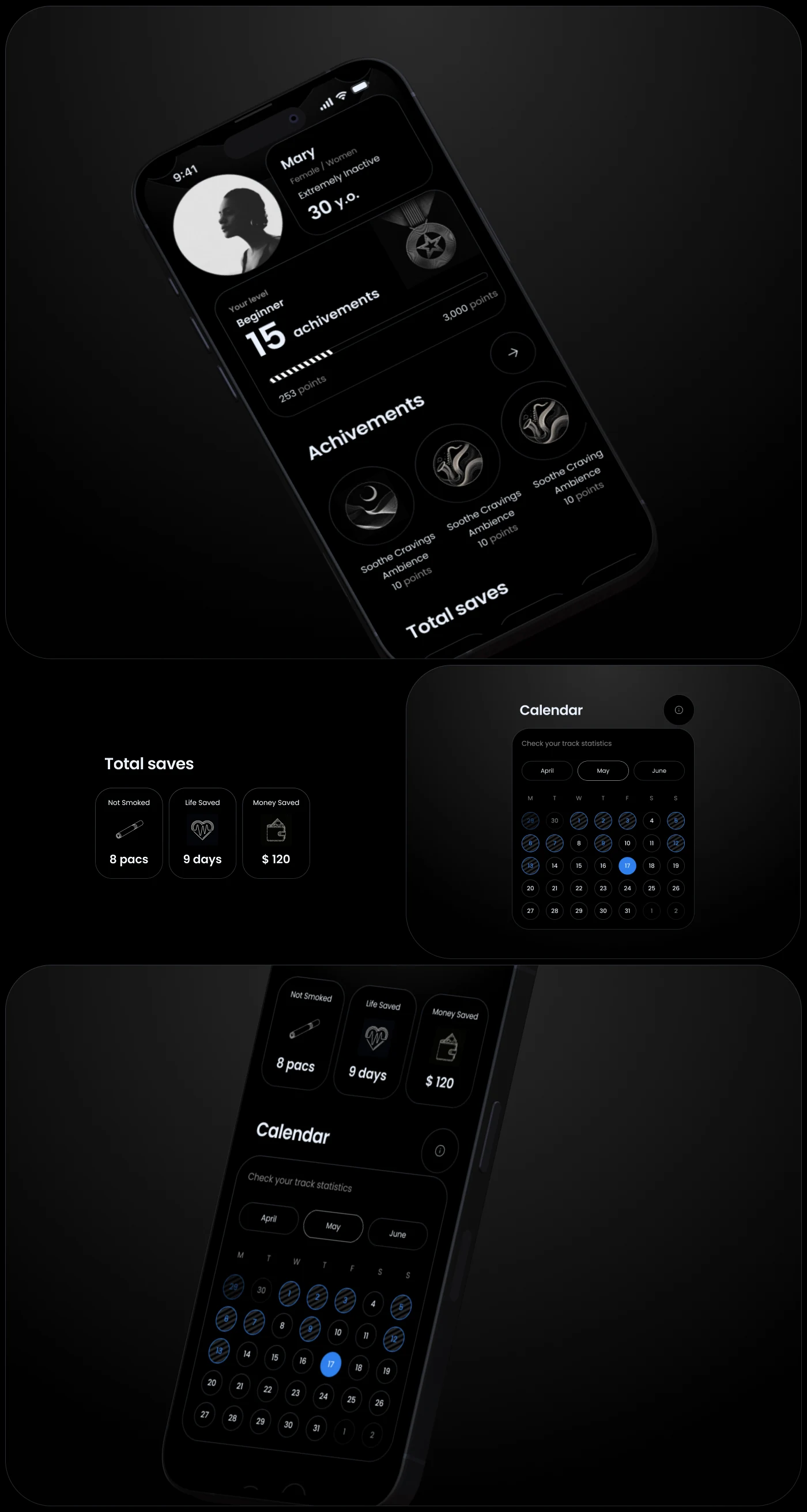
The profile collects the three things a person comes back to check: the rewards earned so far, the totals for what quitting has saved, and a calendar that shows the record as a shape rather than a number.

The savings tiles are the argument of the whole product in three figures — what was not consumed, what that is worth in time, what it is worth in money. They sit above the calendar because they are the reason someone opens the screen at all.

The profile with level and achievements, the total savings tiles, and the calendar view.
Rewards, totals, calendar — the three things people come back to check.

10

The same product on a tablet and on a wrist

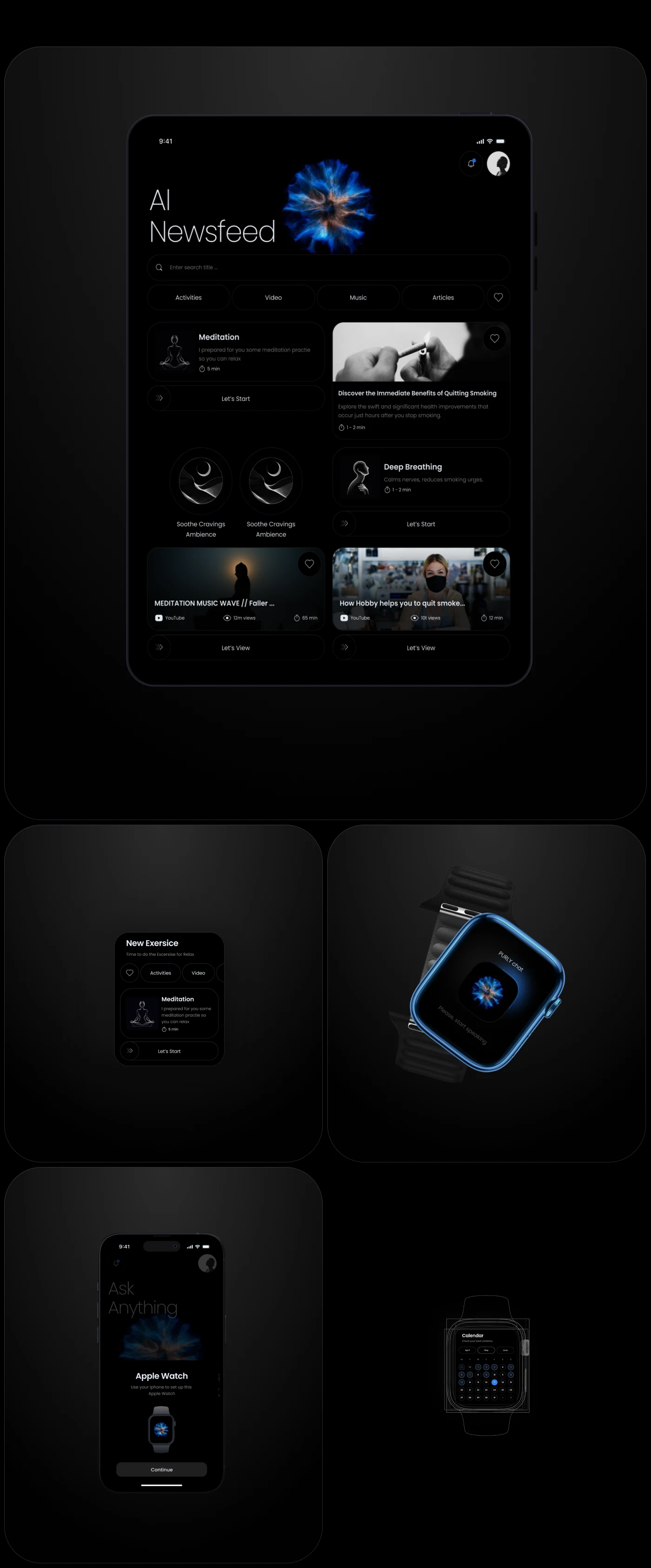
The feed is the part of the product that gains most from a larger screen: on a tablet it becomes a two-column reading surface instead of a single scroll, with the filters permanently visible.

The watch takes the opposite half. It carries the count, the next checkpoint and the exercise launcher, and nothing else — a wrist is a place to be reminded, not a place to read. Pairing is handled inside the phone app, in the same stepped pattern as onboarding.

The feed on a tablet in two columns, the watch face, and the pairing flow inside the phone app.
The tablet gets the reading. The watch gets the count and the way out of a craving.
How it was made UX Research and Project Structure, Files etc. Click to open section

The process

Structure first, drawing second

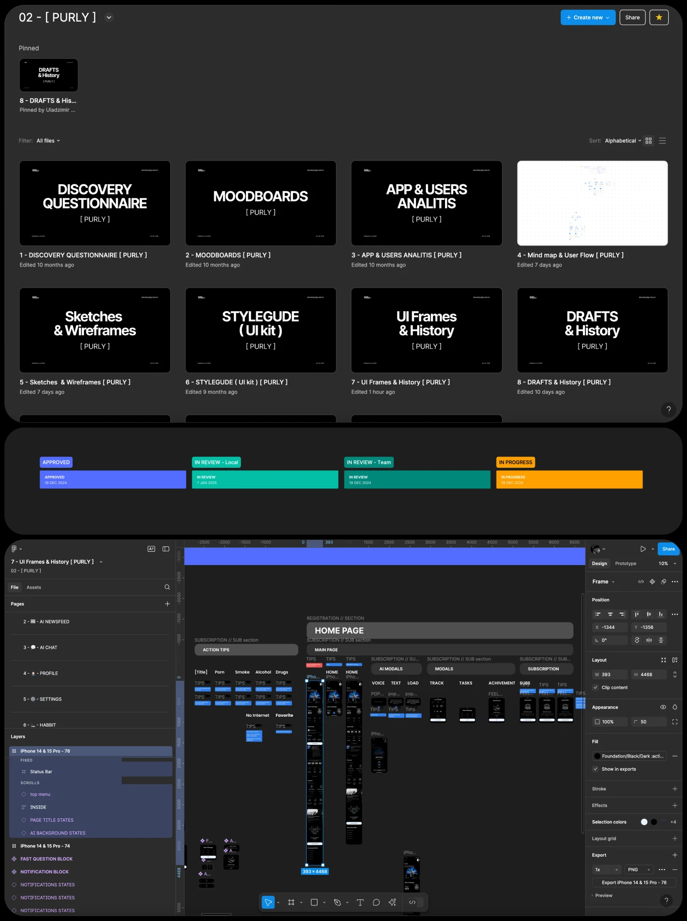
The project opened by structuring the workspace and setting explicit rules for how work moves through it: one file per stage, a naming scheme that survives a year, and a board where the state of every screen is readable without asking anyone.

It is the least glamorous part of a twenty-four-sprint engagement and the one that decides whether sprint eighteen is calm or not.

The project workspace: files per stage, a status board and the working file open.
One file per stage, one board, and the state of every screen visible without asking.

Discovery

Forty questions before the first sketch

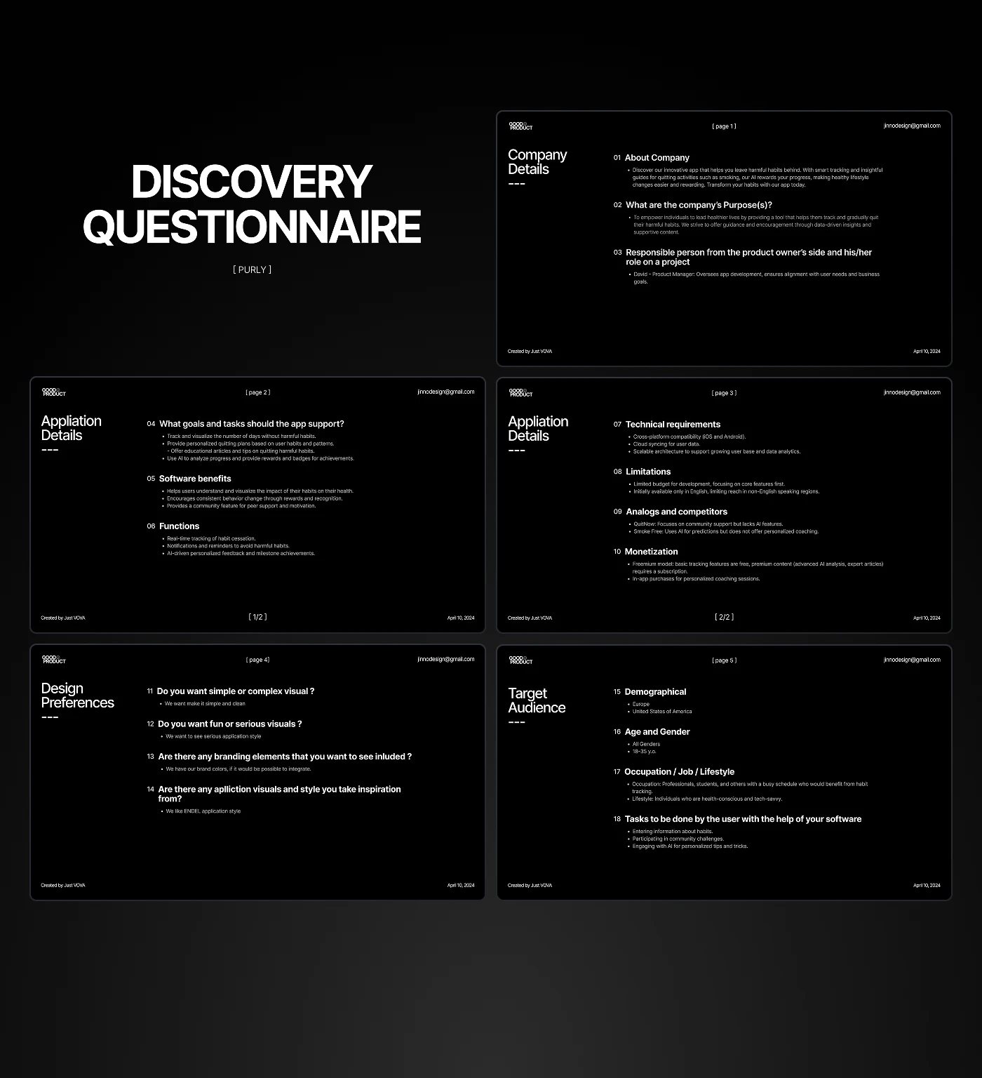
The goals were written down and fixed before the first sketch, across four analytics steps and more than forty questions. Their answers are what the rest of the project was argued against.

What the questionnaire covered
  • Company details — who the company is, what it does, what the product owner's and their own goals are
  • Application details — software benefits, functions, what tasks the app has to support
  • Technical requirements — platform compatibility, limitations, monetisation
  • Analogs and competitors — what already exists and what is wrong with it
  • Design preferences — simple or complex visuals, serious or joyful, existing branding, references
  • Target audience — demographics, age and gender, occupation, job, lifestyle

(Analytics steps)

04

(Questions)

40+

The discovery questionnaire laid out across six slides covering company, application, technical, design and audience.
The answers that the rest of the project was argued against.

Competitors

Five apps, read for what they get wrong

A competitor analysis identified strengths and weaknesses across five products in the category and, using their own open analytics, established the directions worth taking. Each was written up the same way — strengths, weaknesses, opportunities, threats — so the comparison is between the same five things every time.

The recurring weakness across the set was the one the brief had already named: everything counted, almost nothing adapted.

(Hours of research)

06

(Apps analysed)

05

Direction

Two moods, and one was chosen before a screen was drawn

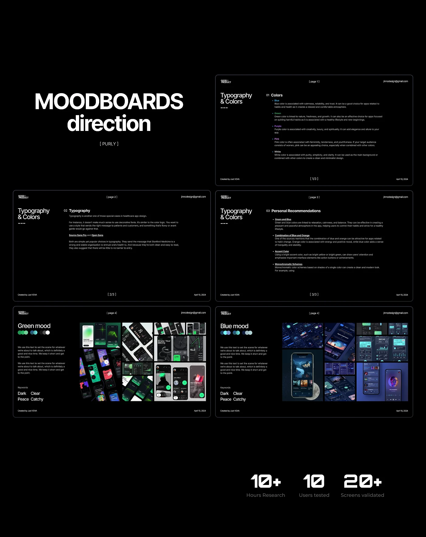
The direction was fixed against the analytics, and mood boards were assembled to settle it before any screen was drawn. Two survived to a real choice: a green one — dark, clear, calm — and a blue one, darker and closer to a night surface.

Ten people were shown the direction and more than twenty screens were validated against it before it was accepted. Choosing here rather than at UI stage is what kept the palette from being re-argued in sprint sixteen.

(Hours of research)

10+

(Users tested)

10

(Screens validated)

20+

Mood board slides on typography and colour, with the green and the blue direction side by side.
Green and blue, decided before a single screen was drawn.

Structure

The map before the screens

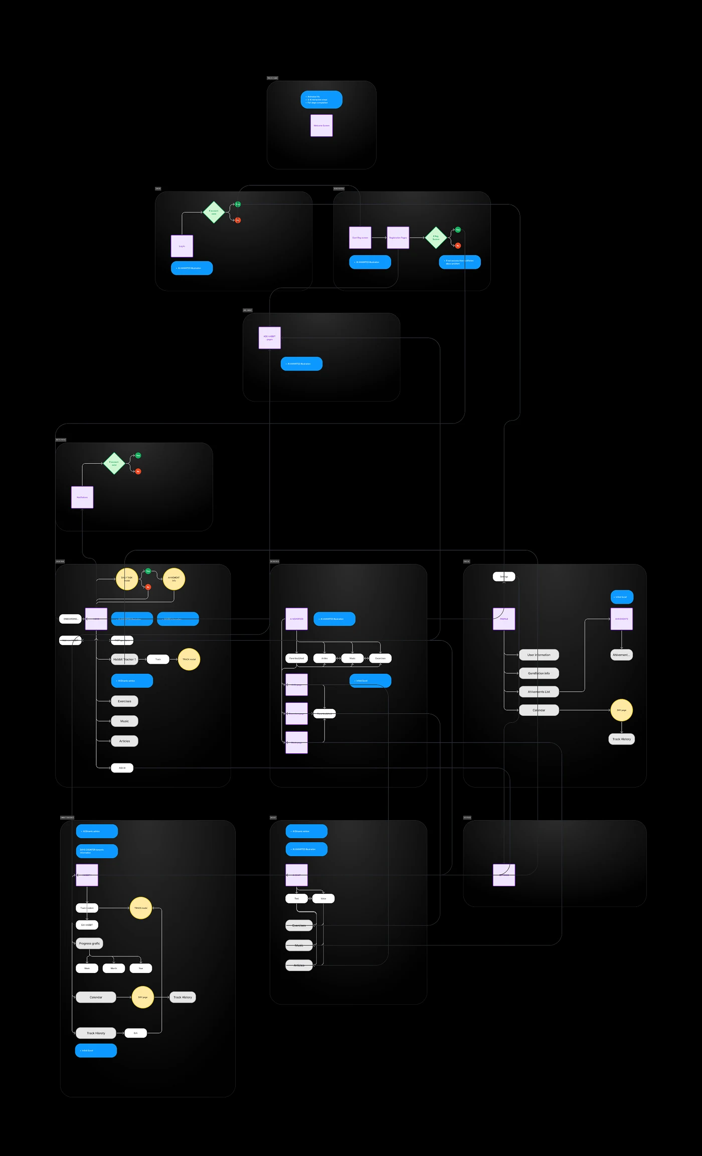
Working from the technical specification, the core functionality and the connections between its parts were defined as one map, and a user survey supplied the specific cases the app had to serve. Everything drawn later had a place on it before it was drawn.

The user map: entry, onboarding, home, tracking, feed, chat and profile with the connections between them.
Every screen had a place on the map before it had a layout.

Testing

Tested at wireframe stage, module by module

Testing ran both with the internal team and with potential users recruited for the round. At the UX wireframe stage it was run for each module of the application, whenever time and budget allowed — which is the honest version of that sentence, and the reason coverage is uneven across the app.

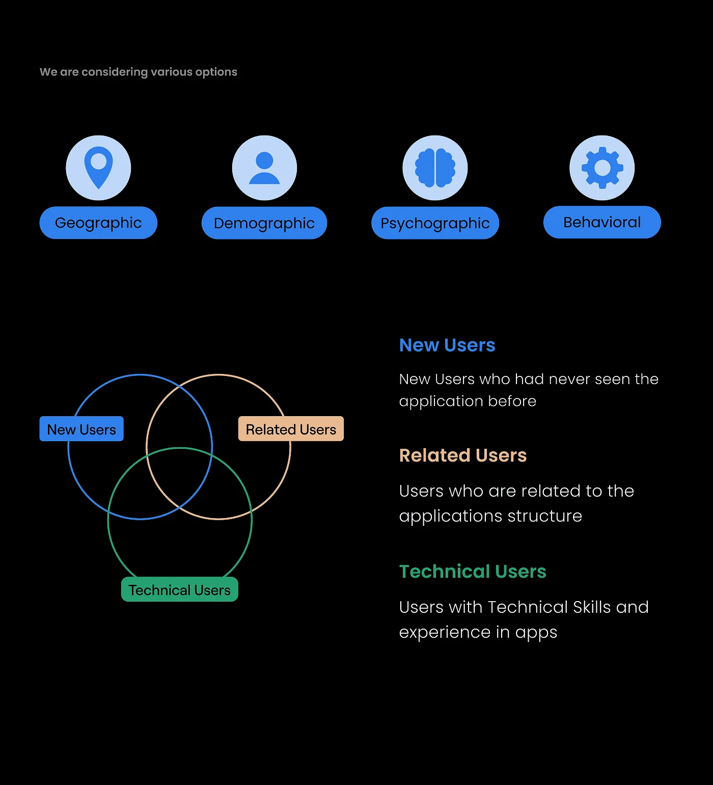
Participants were split before testing rather than after: new users who had never seen the app, related users familiar with the structure of applications like it, and technical users with the skills to break it on purpose. Geography, demographics, psychographics and behaviour were used to build the groups.

The four segmentation axes and the three participant groups: new, related and technical users.
Three groups, defined before the session rather than after it.
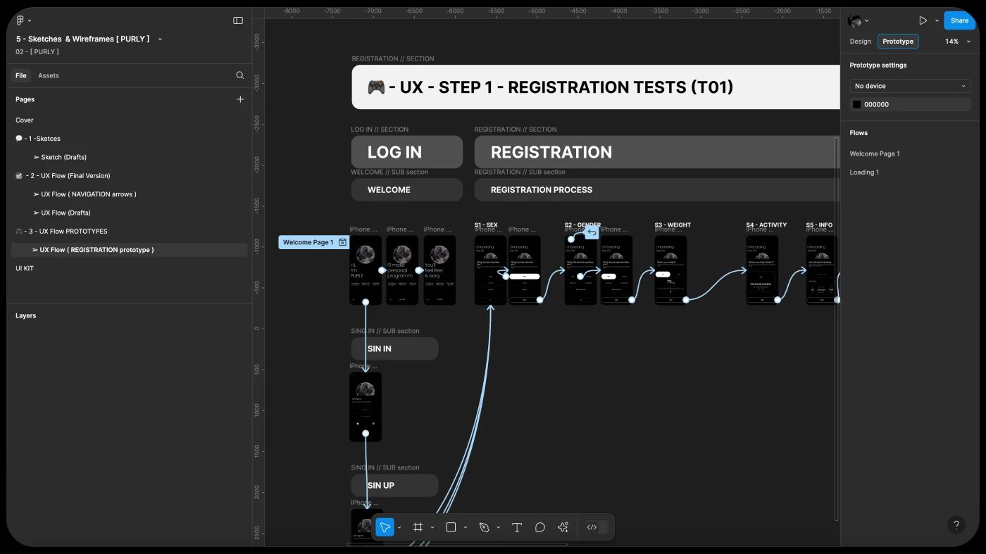
A clickable registration prototype wired up for the first test round.
Registration wired as a prototype, tested before any of it was styled.

(Success)

95%

(Navigation)

10%

(Time spent)

5%

Registration test results: task success, navigation problems and unfinished tasks as percentages.
The registration round, and the three fixes it produced.

What the round changed

The subscription step came out of registration entirely, the number of steps was cut, and an animated character was added to carry the person through what remained. All three came from watching people rather than from a review of the file.

UI

The palette and the assistant, tested as options

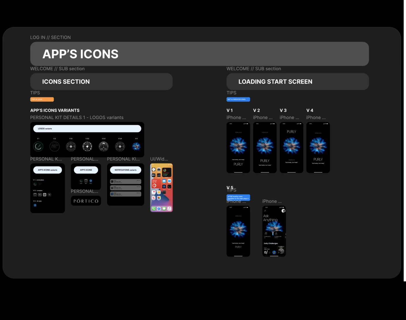
The UI leaned on the direction fixed at mood-board stage, and the palette and the assistant's animation were developed against it rather than around it. Both were tested as several options, not presented as one — the icon went through four variants and the loading state through several more, and the final set is the one that survived comparison.

The icon kit with its variants and the four loading-screen options.
The kit, and four ways the first screen could have loaded.
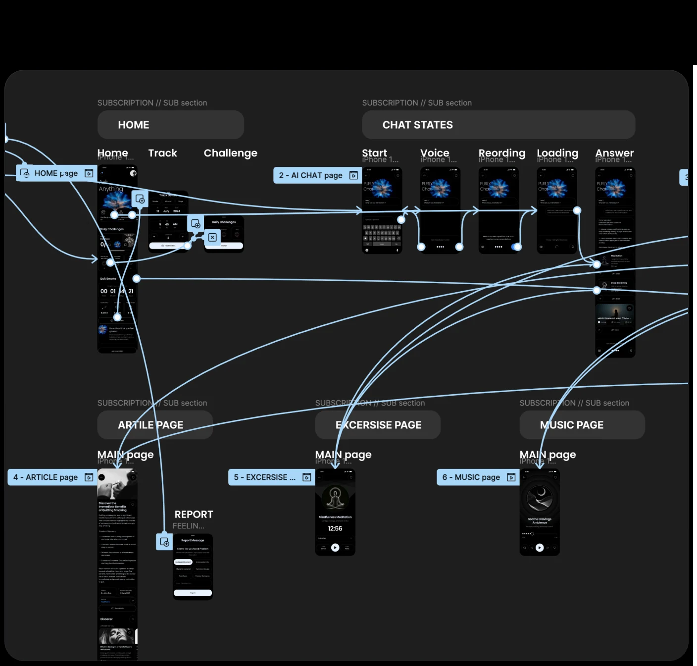
The prototype wiring across home, chat, article, exercise and music pages.
Every priority case wired end to end before a line of it was built.
Three variants of the generated form used for the assistant.
The assistant, in the three states it was tested in.

Result

What the prototype tests came back with

The final round ran on the Figma prototype, with the internal team and with potential users recruited for it. Nine in ten could name the brand's colours back after using the app, four in five had no trouble with the navigation, and most finished every task they were given.

These are prototype numbers, not production numbers. They say the design held up in the hands of people who had not seen it before — which is what a prototype test can say, and all it can say.

(Brand identity)

91%

(Navigation)

79%

(Tasks)

85%