EVVA - care coordinated by the people already in someone's life
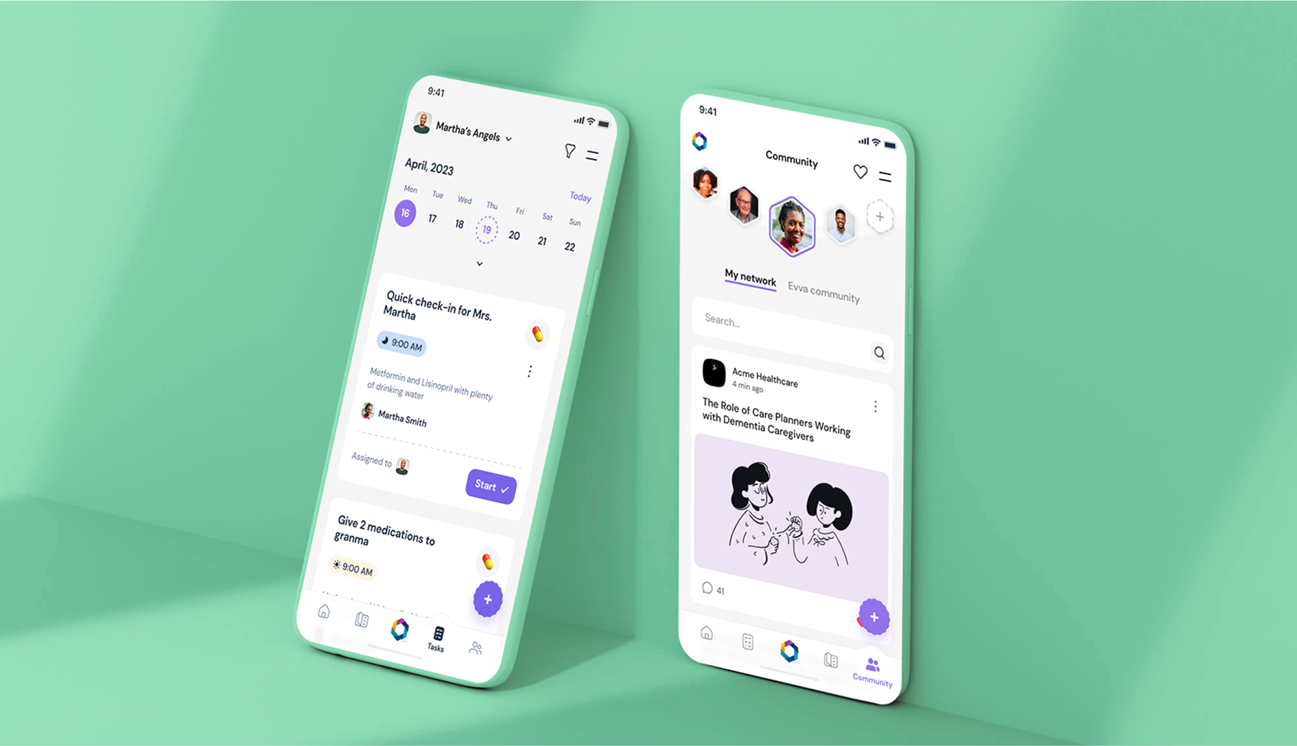
The people doing the caring here are family, not clinicians. A product for them cannot lean on training or on spare time: it has to be readable by whoever picks up the phone that evening, and it has to hold a whole group of them around one person at once.
Situation
A brand nobody could name, around a job nobody is trained for
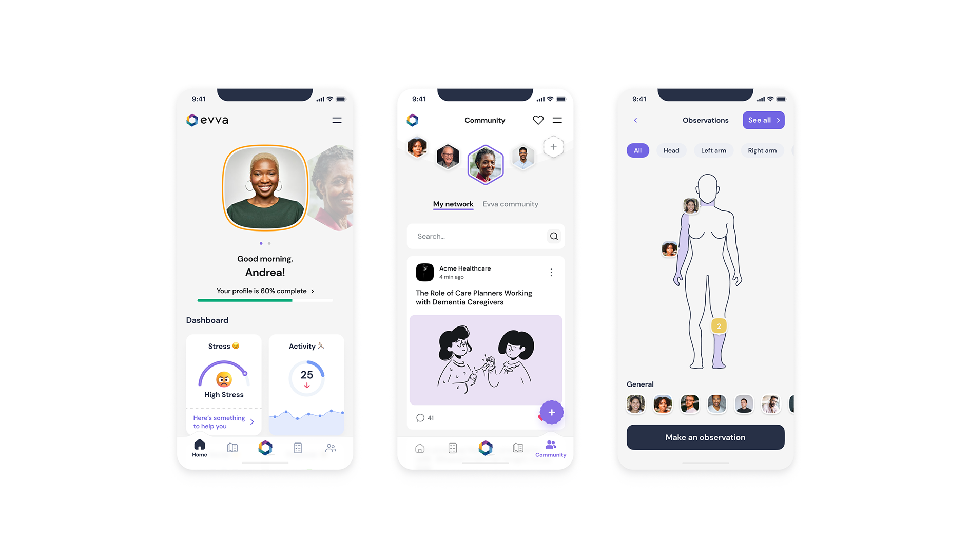
EVVA coordinates care for an elderly relative across the people already in that person’s life - family, neighbours, friends. The product stands on a community and on trackers that follow the relative’s condition, so that a group can hold the same picture without one of them carrying all of it.
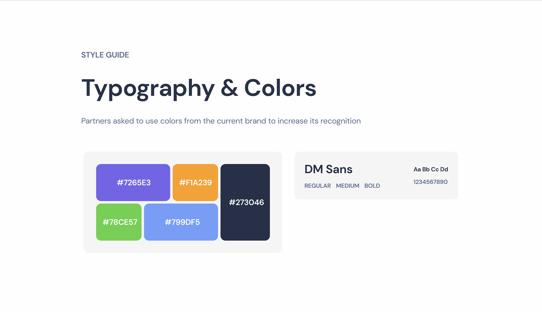
Two things were weak when the work started, and the research said so plainly: brand identity and engagement. The audience was 35 to 55, in the USA and England. The partners asked that the colours of the existing brand be kept - recognition was to be built on what they already had, not on a new palette.
Objectives
Four things the work was set against
01
Raise user engagement
02
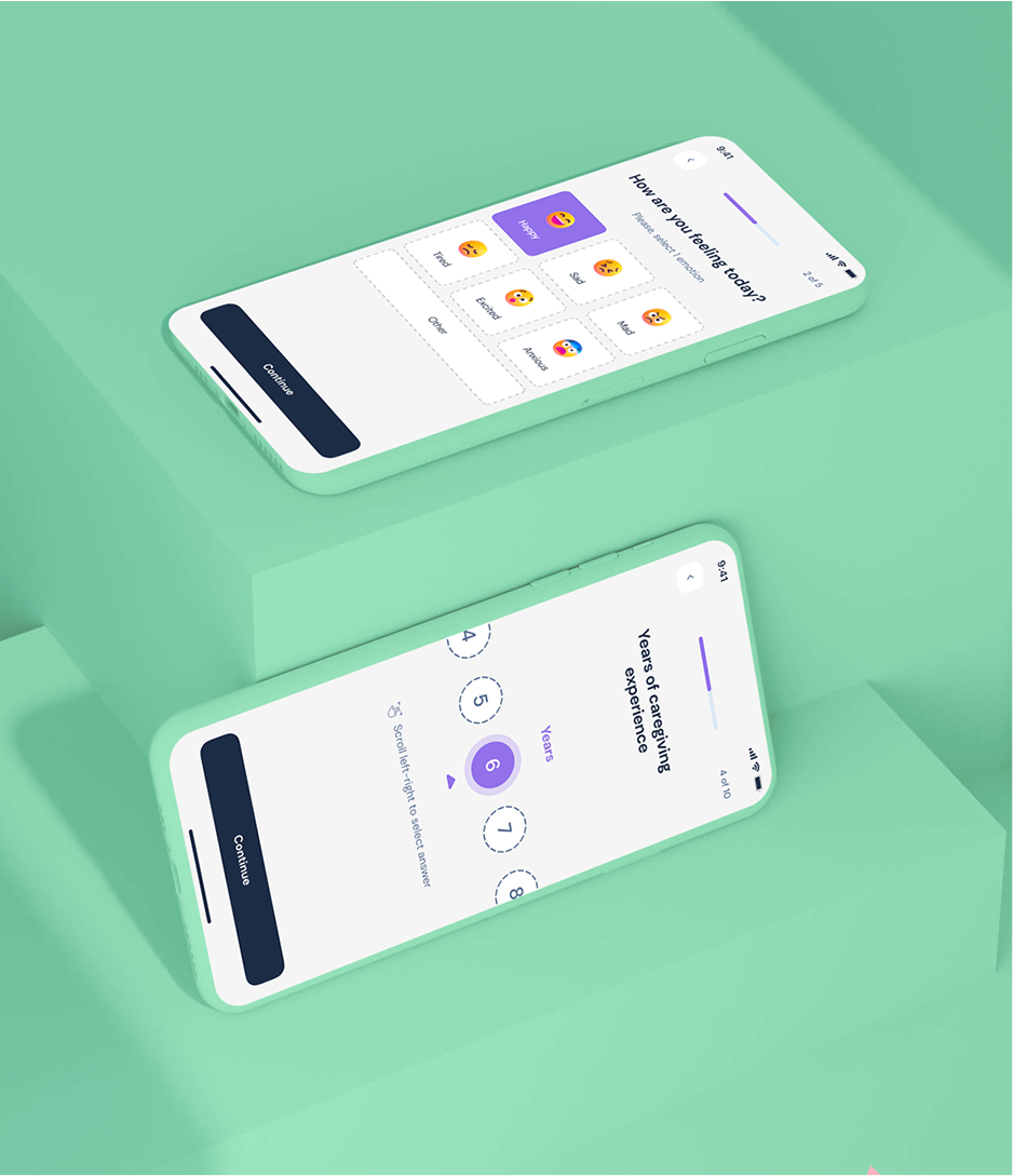
Rebuild onboarding
03
Rebuild navigation
04
Build brand recognition on the colours the partners already had
Method
How it was done
01
Read the brand and the audience before the product
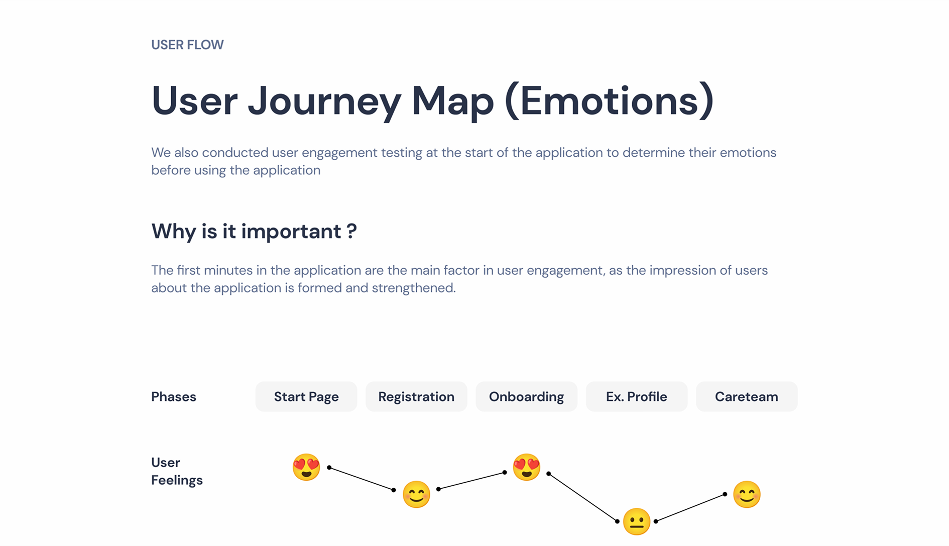
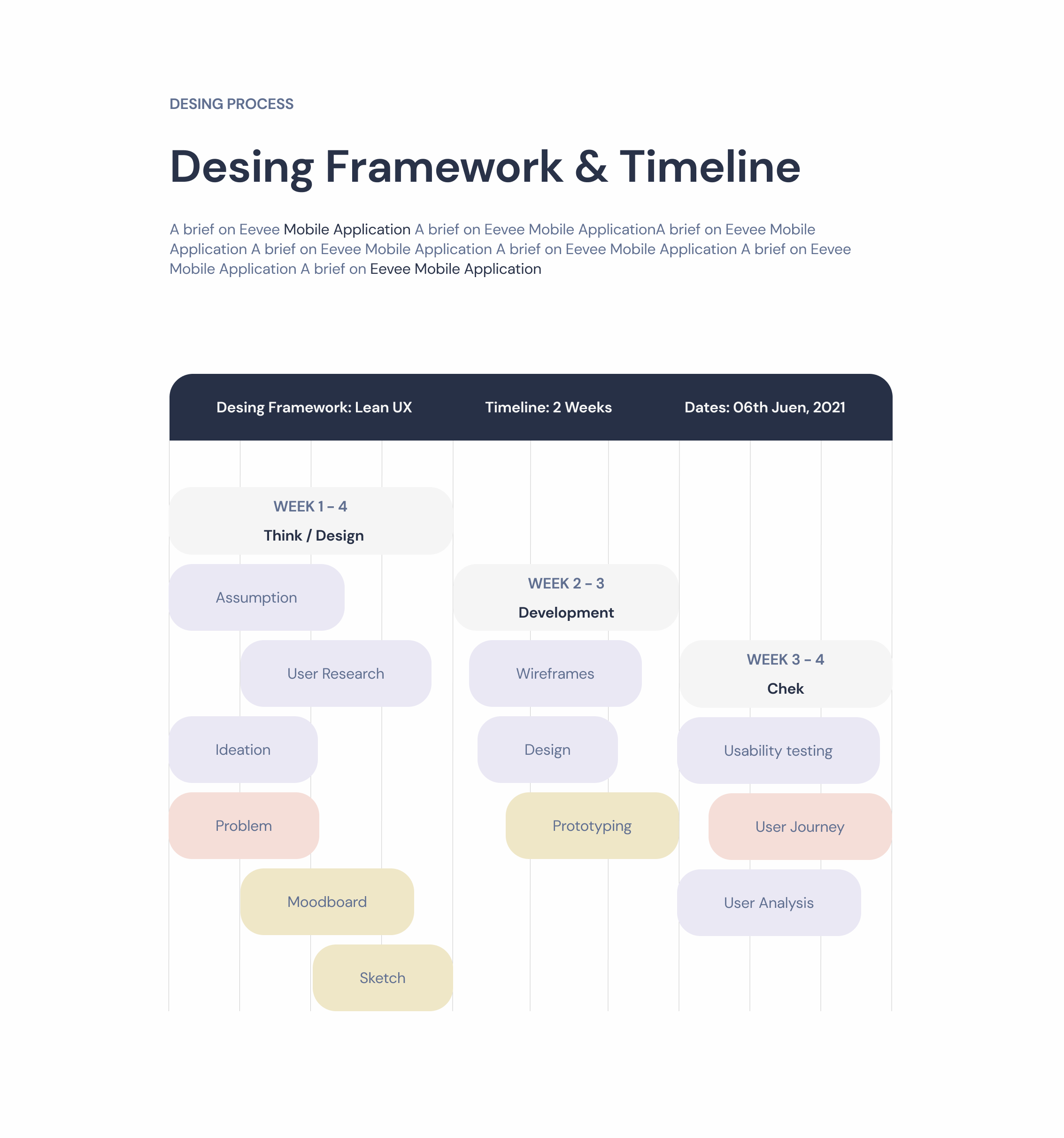
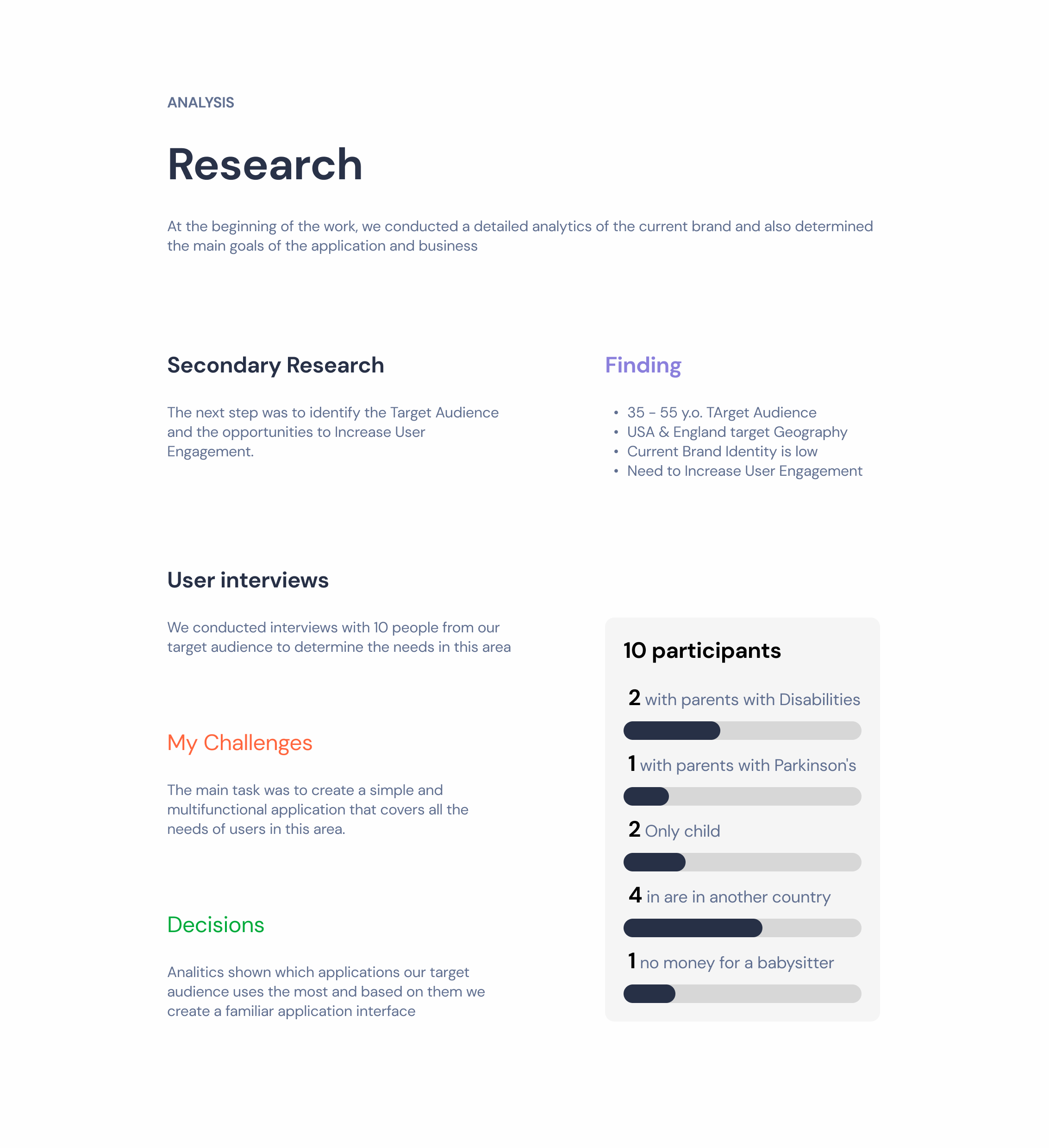
The work opened with an analytics pass over the existing brand and a written statement of what the application and the business were for, then desk research to set the audience and the places where engagement could be won: 35 to 55 years old, in the USA and England. Nothing was redrawn until all of it was on paper.
02
Ten interviews, picked for the situations that break the flow
Participants were chosen by circumstance rather than by convenience - a relative with Parkinson’s, an only child with nobody to share the load, four people living in a different country from the person they care for. Those are the cases a care app has to survive.
03
Rebuilt the UX
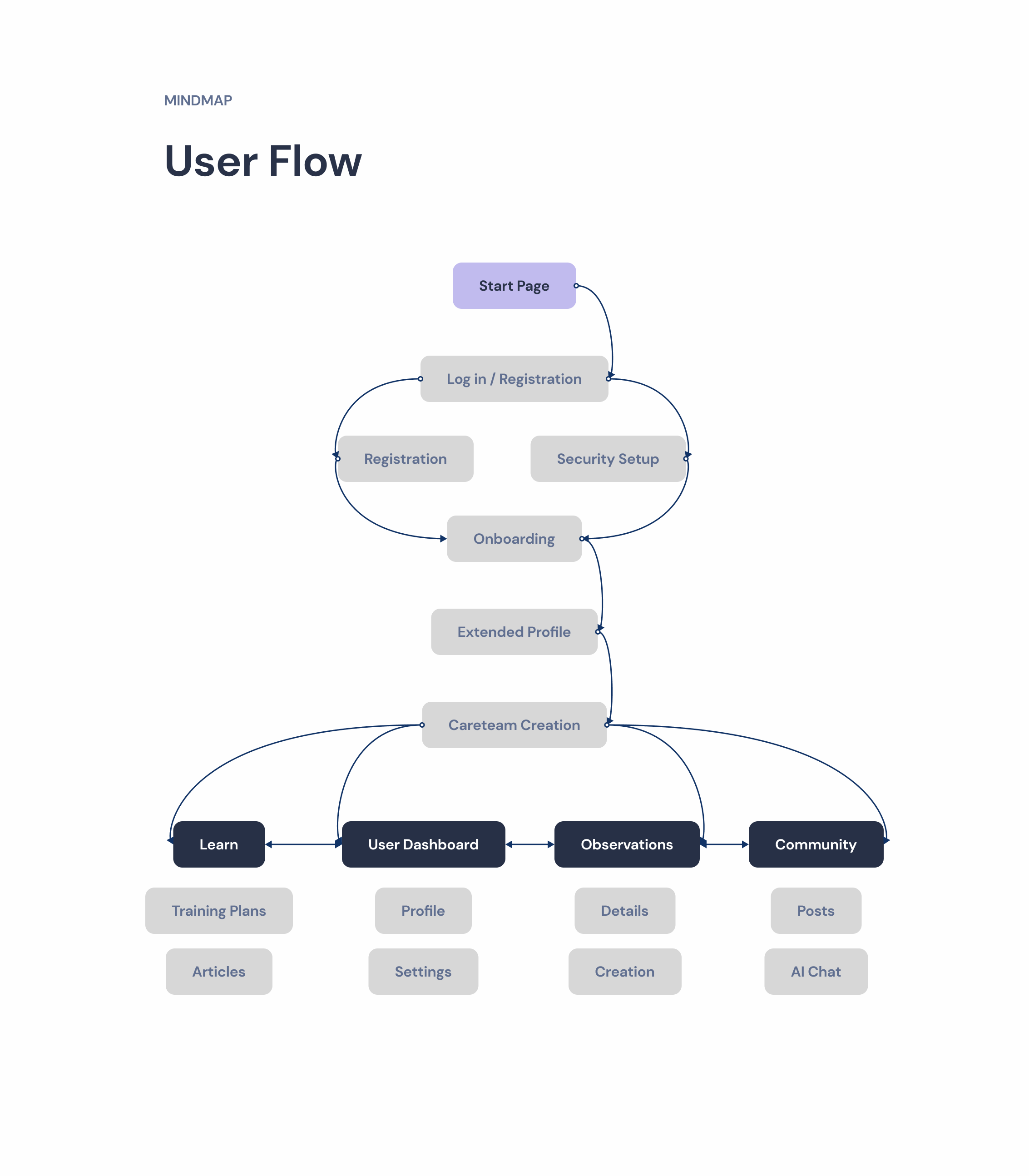
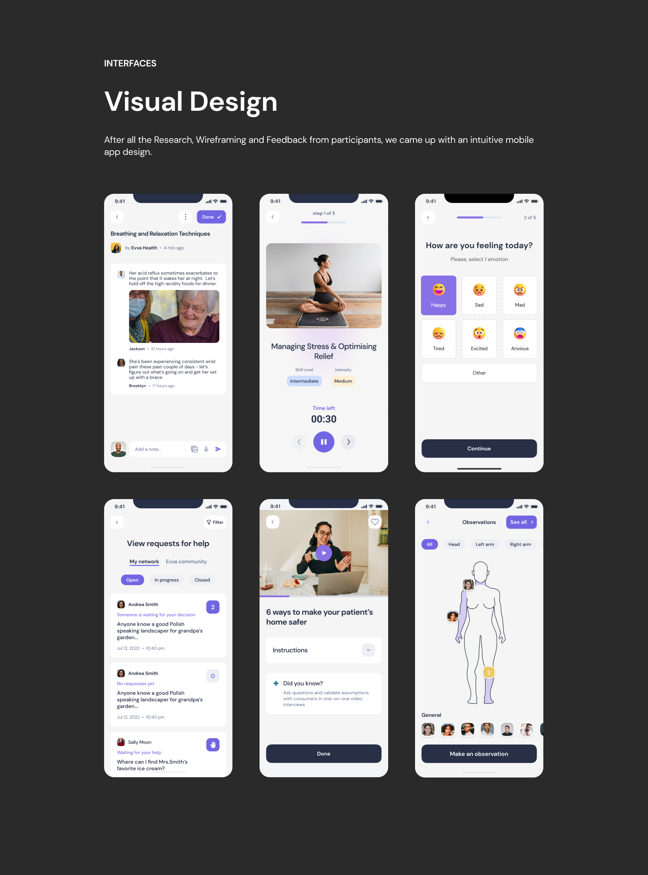
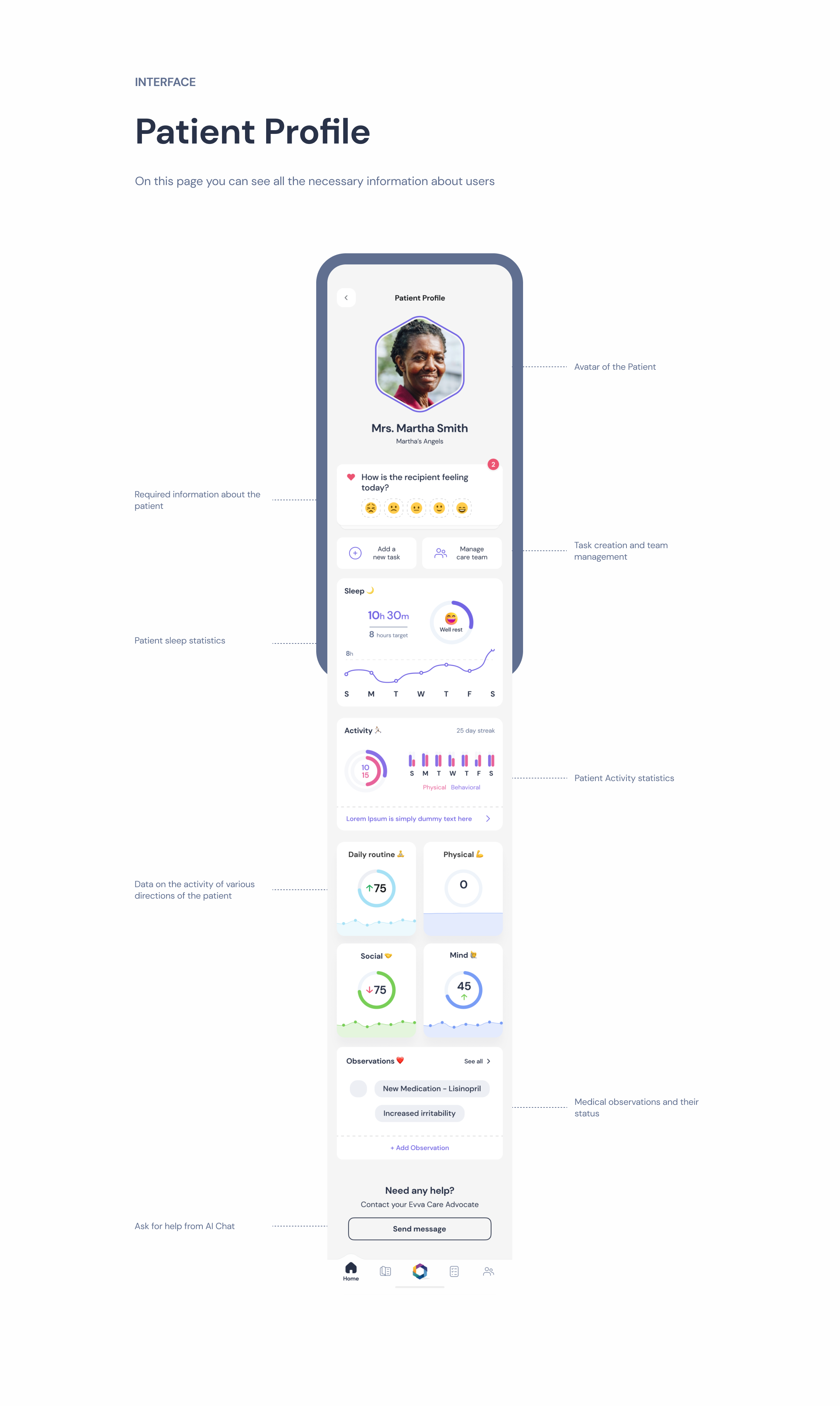
User flow, journey map and prototypes, with onboarding and navigation restructured against what the interviews said rather than against the old screens.
04
Rebuilt the UI inside the partners’ palette
Grid, the three-colour rule, the three-click rule, honest clickable areas - applied to a colour set that was given rather than chosen. What that cost is in the numbers below.
05
Tested locally and iterated
The prototype went through usability testing before and after the redesign, and the findings went back into the design.
Results
What the tests said
Success here was measured as engagement and brand recognition, through usability testing before and after the redesign - a different metric set from enterprise finance, and worth naming as such rather than hiding.
Brand-colour recall landed at 63%, the weakest number in this portfolio. It stands here because the reason is worth more than the figure: the palette was not the redesign’s to set. The partners asked for the extra colours of the existing brand to be kept, and every colour past the first two makes a single brand colour harder to name. Navigation, which the redesign did control, came back at 81%.
(Users with no navigation problems, after redesign)
81%
(Brand-colour recall, after redesign)
63%
(People interviewed)
10
(Objectives)
04
The full deckEvery screen and flow from the project presentation, in the order it was built (6 images)Click to open section
Financial projects