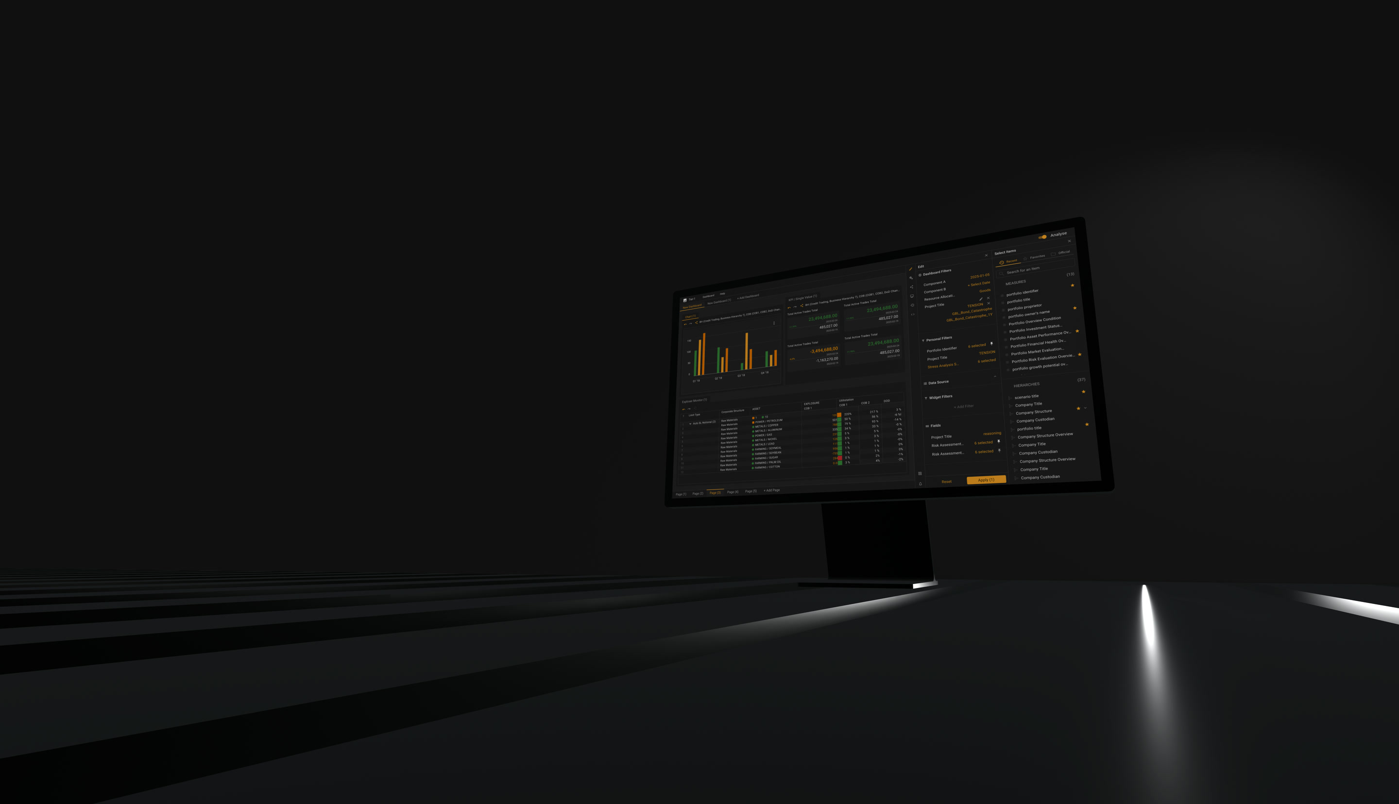
SUMU - a web MVP rebuilt as a native app
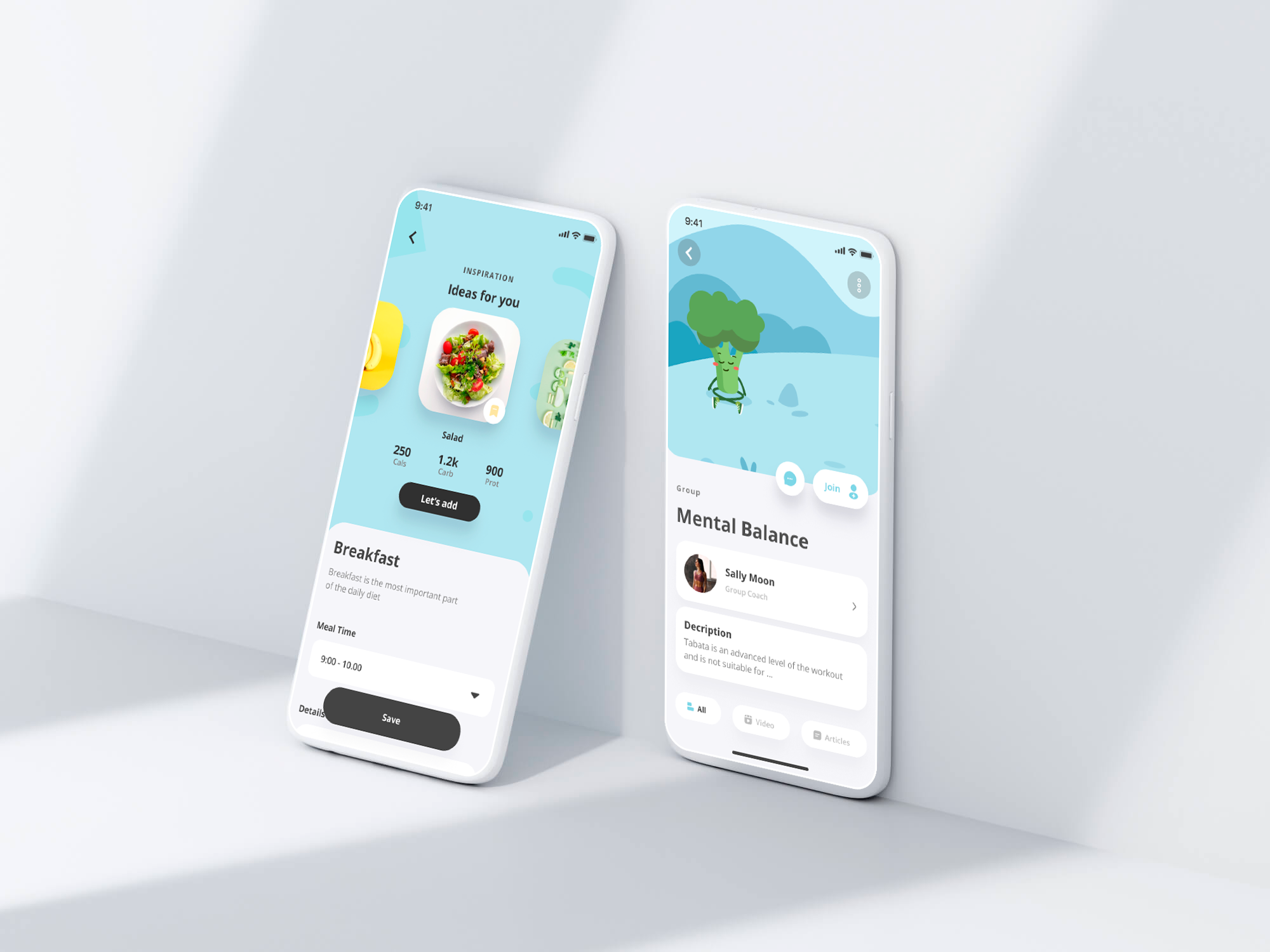
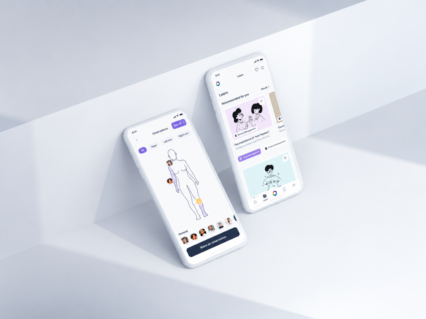
The partners had a web MVP that worked and still missed its goals. Wrapping it for mobile would have shipped sooner and changed nothing: the problems were in the flow, not in the platform.
Situation
A product with users, and goals it was not reaching
An existing web MVP was live and falling short of what the partners wanted from it. What they asked for says where it hurt: daily engagement, onboarding, navigation, and the flow through the product.
The brief was a redesign followed by native iOS and Android development - rebuilt rather than wrapped. Eleven people across product, design and engineering, the largest engagement of this portfolio.
Objectives
Five things the partners asked for
01
Raise daily engagement
02
Simplify onboarding
03
Simplify navigation
04
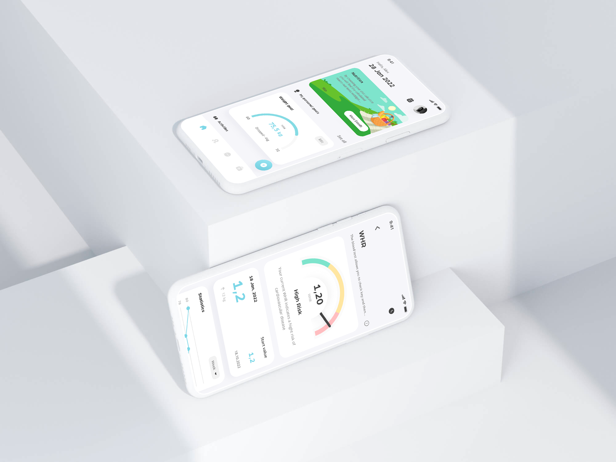
Simplify the user flow and improve the existing design
05
Build the new modules - frames and prototypes - against the technical requirements
Method
How it was done
01
Found the pains before redrawing anything
Existing user pains and analytics first, then custom user tests built for this product - the flow and the pain points were located, not assumed.
02
Rebuilt the UX
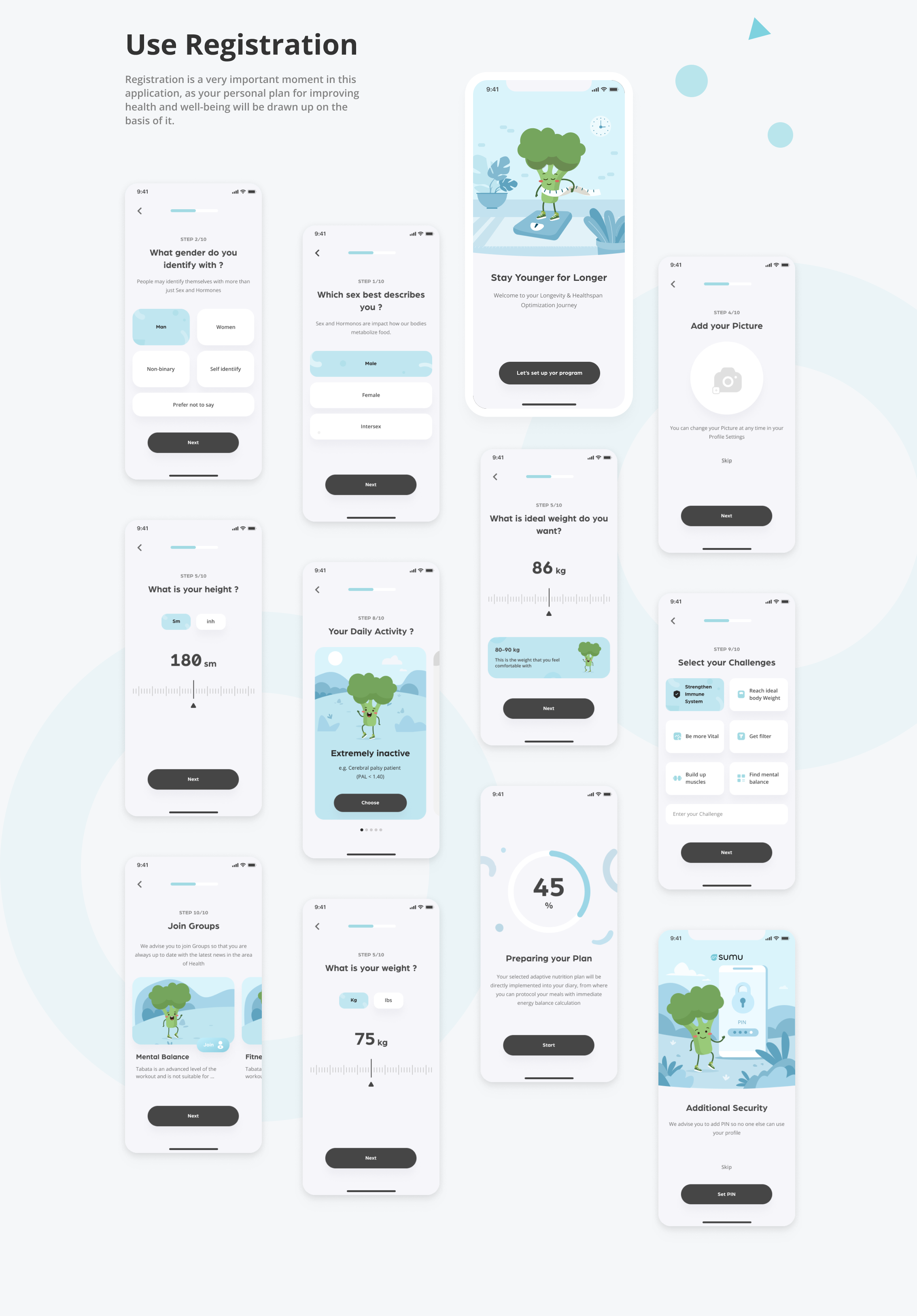
Flows, prototypes and interactive tests, with onboarding and navigation restructured against known patterns of the audience rather than against the old screens.
03
Rebuilt the UI
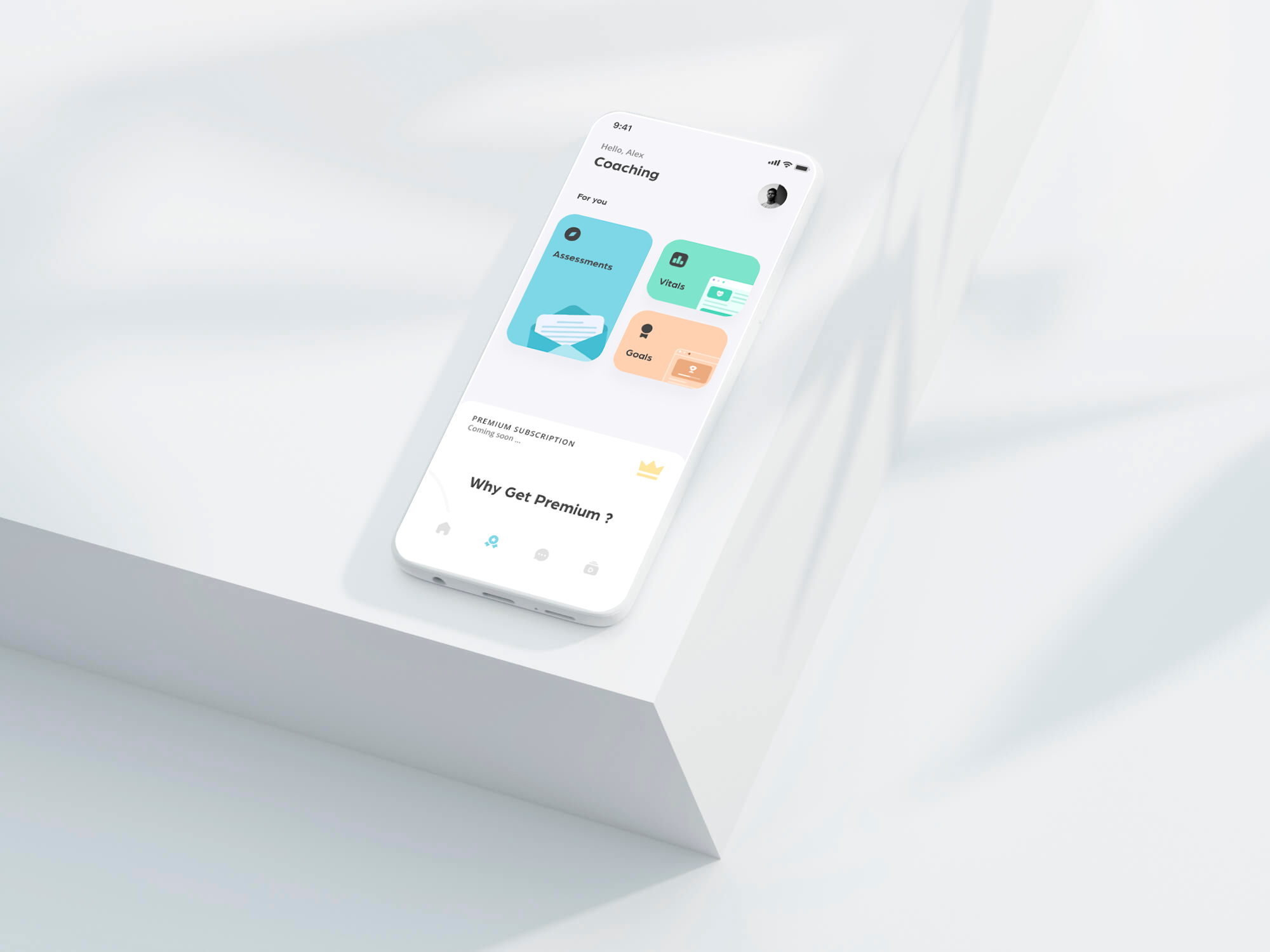
Grid, the three-colour rule, the three-click rule, honest clickable areas. The constraints were the point: they are what makes a health app readable at arm’s length.
04
Added illustration and a character
A guide character carried the gamification, so that progress had a voice instead of a progress bar.
05
Tested locally and iterated
The prototype went through usability testing before and after the redesign, and the findings went back into the design.
Results
What the tests said
Success here was measured as engagement and brand recognition, through usability testing before and after the redesign - a different metric set from enterprise finance, and worth naming as such rather than hiding.
(Brand-colour recall, after redesign)
93%
(Users with no navigation problems)
73%
(People in the team)
11
(Objectives)
05
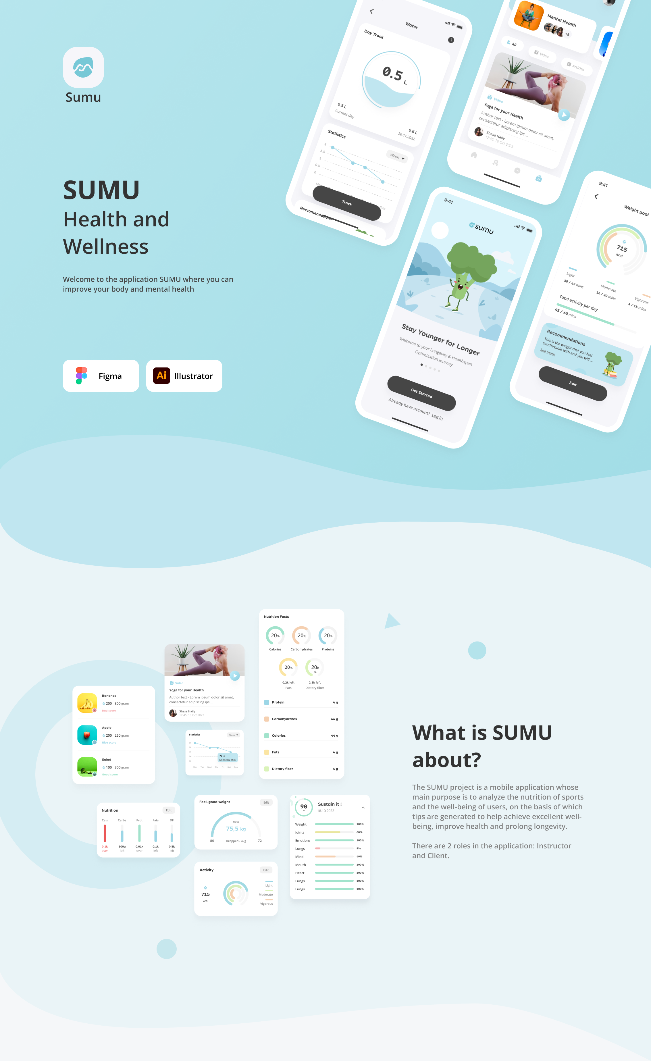
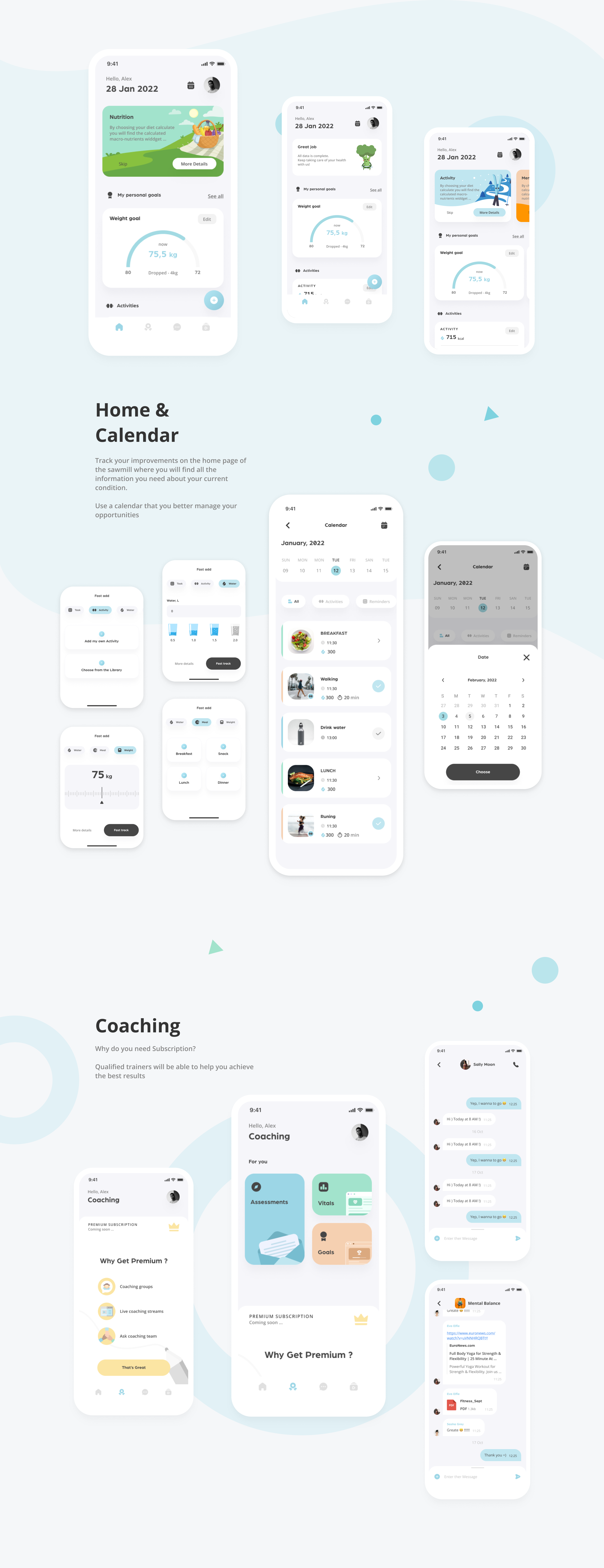
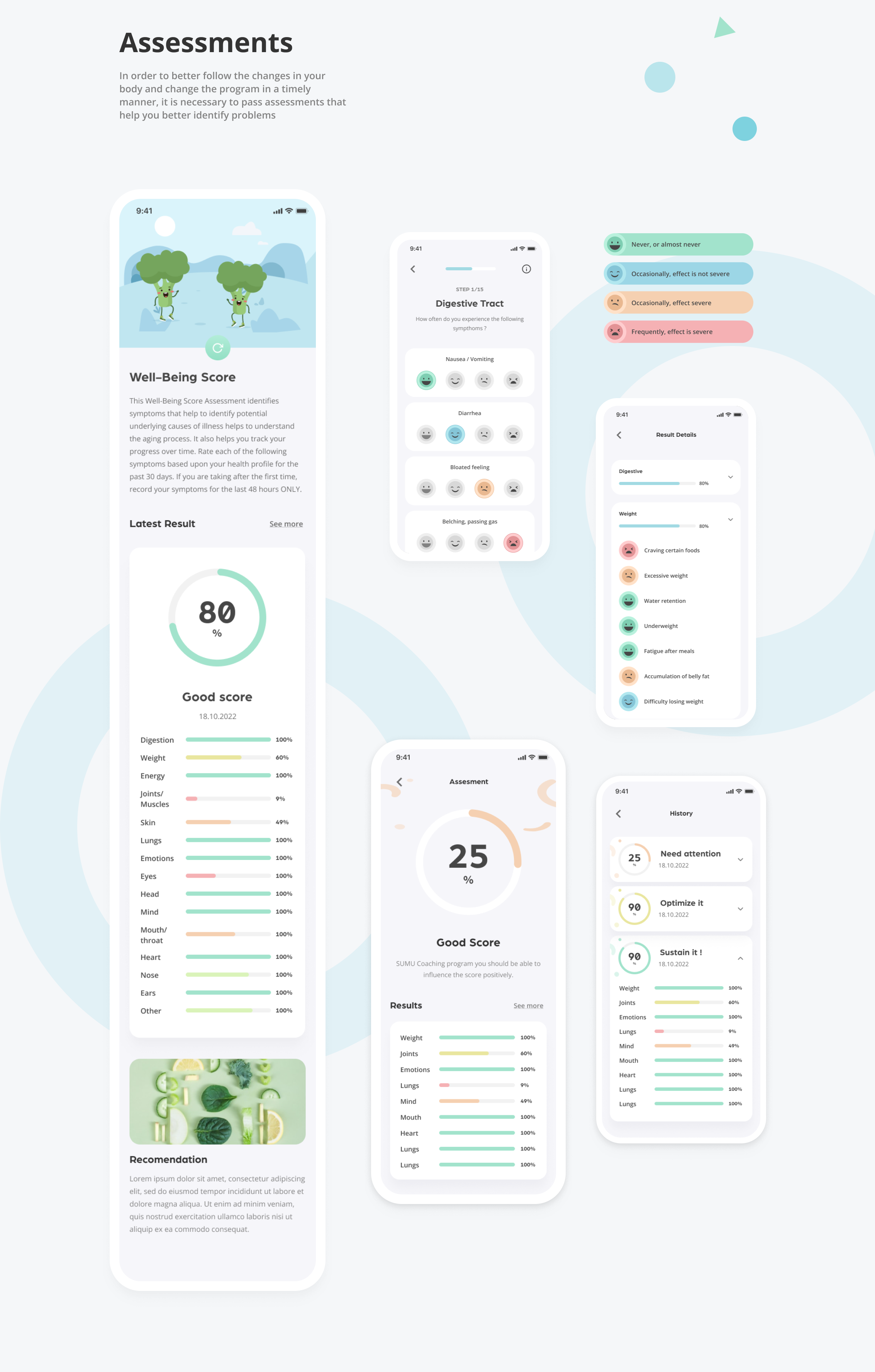
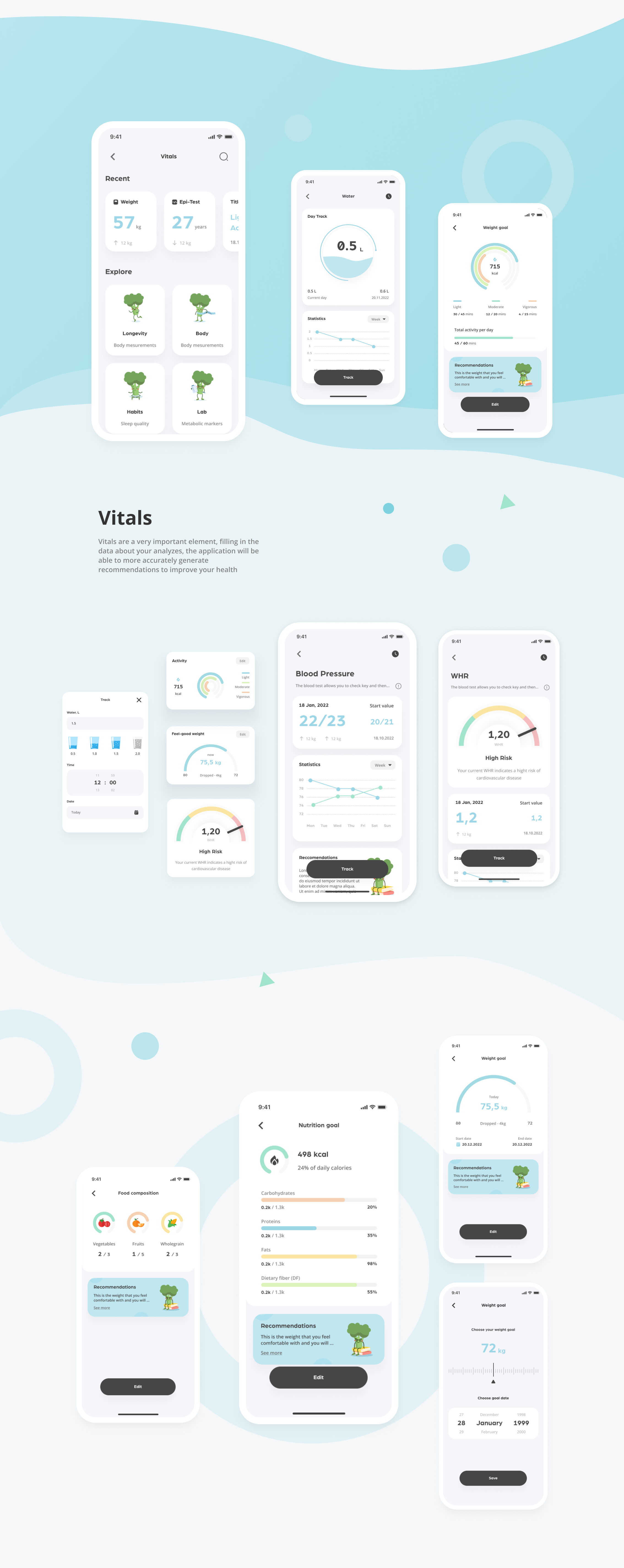
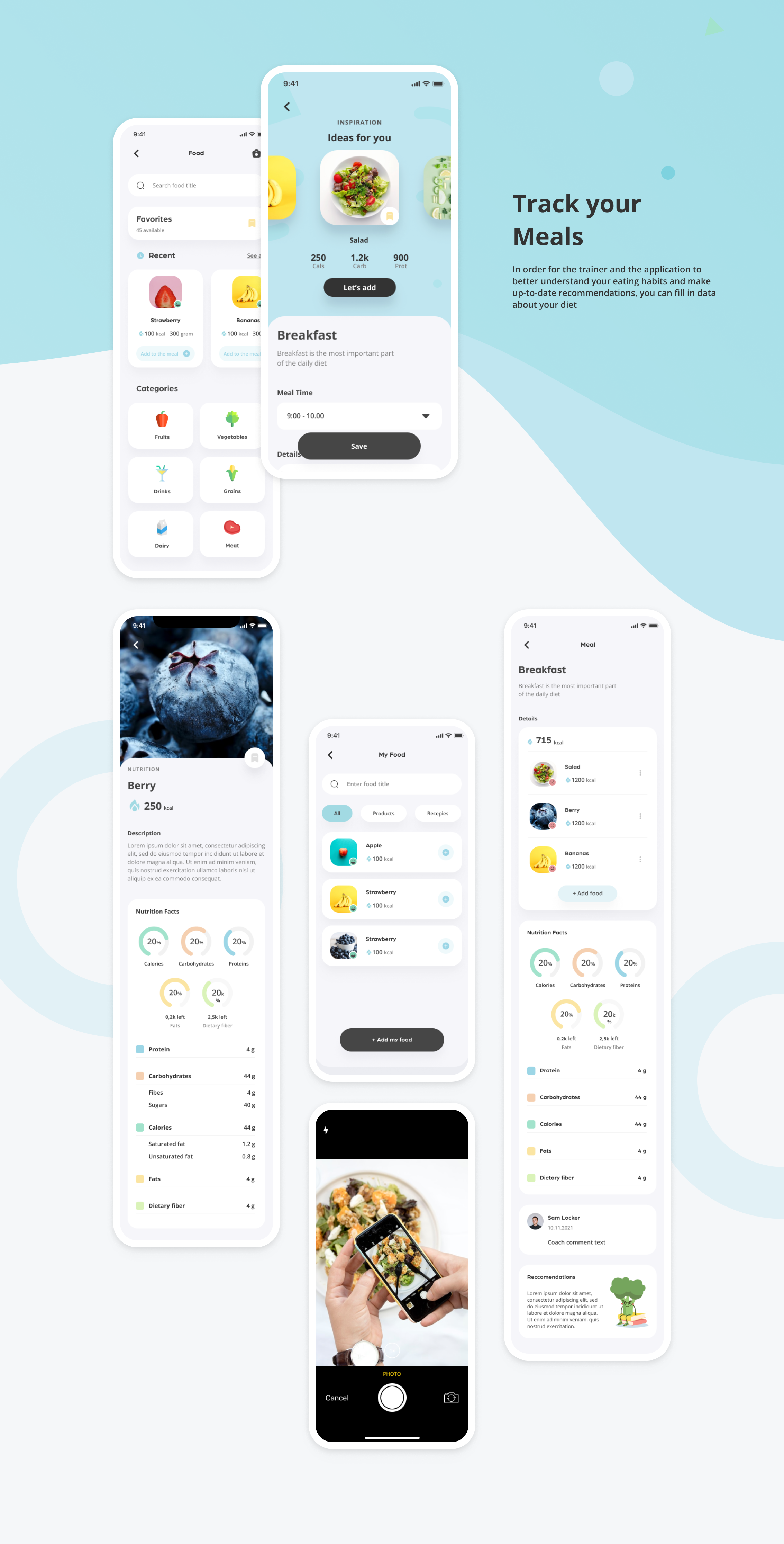
The full deckEvery screen and flow from the project presentation, in the order it was built (6 images)Click to open section
Financial projects